
Pearson-korrelasjon er en grunnleggende statistisk metode som brukes til å forstå de lineære sammenhengene mellom to kontinuerlige variabler. Pearson-korrelasjonskoeffisienten kvantifiserer styrken og retningen på disse sammenhengene, og gir viktig innsikt som kan brukes på en rekke områder, inkludert forskning, datavitenskap og daglig beslutningstaking. Denne artikkelen forklarer det grunnleggende ved Pearson-korrelasjon, inkludert definisjon, beregningsmetoder og praktiske anvendelser. Vi ser nærmere på hvordan dette statistiske verktøyet kan belyse mønstre i data, hvor viktig det er å forstå begrensningene, og hva som er beste praksis for nøyaktig tolkning.
Hva er Pearson-korrelasjon?
The Pearson correlation coefficient, or Pearson’s r, quantifies the strength and direction of a linear relationship between two continuous variables. Ranging from -1 til 1indikerer denne koeffisienten hvor tett datapunktene i et spredningsdiagram ligger på linje med en rett linje.
- En verdi på 1 innebærer en perfekt positiv lineær sammenheng, noe som betyr at når den ene variabelen øker, øker også den andre konsekvent.
- En verdi på -1 indikerer en perfekt negativ lineær sammenhengder den ene variabelen øker når den andre avtar.
- En verdi på 0 forslag ingen lineær korrelasjon, noe som betyr at variablene ikke har en lineær sammenheng.
Pearson-korrelasjon er mye brukt innen naturvitenskap, økonomi og samfunnsvitenskap for å avgjøre om to variabler beveger seg sammen og i hvilken grad. Den bidrar til å vurdere hvor sterkt variabler henger sammen, noe som gjør den til et viktig verktøy for dataanalyse og -tolkning.
Slik beregner du Pearson-korrelasjonskoeffisienten
Pearsons korrelasjonskoeffisient (r) beregnes ved hjelp av følgende formel:
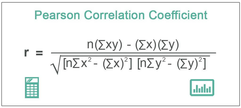
Hvor?
- x og y er de to variablene som sammenlignes.
- n er antall datapunkter.
- ∑xy er summen av produktet av parvise poengsummer (x og y).
- ∑x2 and ∑y2 er kvadratsummene for hver variabel.
Trinn-for-trinn-beregning:
- Samle inn data: Samle parvise verdier for variabler x og y.
Eksempel:
x=[1,2,3]
y=[4,5,6]
- Beregn summen for x og y:
∑x er summen av verdiene i x.
∑y er summen av verdiene i y.
For eksempel:
∑x=1+2+3=6
∑y=4+5+6=15
- Multipliser x og y for hvert par:
Multiply each pair of x and y values, and find ∑xy.
xy=[1×4,2×5,3×6]=[4,10,18]
∑xy=4+10+18=32
- Kvadrer hver x- og y-verdi:
Find the square of each x and y value, then sum them to get ∑x2 and ∑y2.
x2=[12,22,32]=[1,4,9]
∑x2=1+4+9=14
y2=[42,52,62]=[16,25,36]
∑y2=16+25+36=77
- Sett inn verdiene i Pearson-formelen: Sett nå verdiene inn i Pearsons korrelasjonsformel:
r = (n∑xy – ∑x∑y) / √[(n∑x² – (∑x)²) * (n∑y² – (∑y)²)]
r = (3 × 32 – 6 × 15) / √[(3 × 14 – (6)²) × (3 × 77 – (15)²)]
r = (96 – 90) / √[(42 – 36) × (231 – 225)]
r = 6 / √[6 × 6]
r = 6 / 6 = 1
I dette eksempelet er Pearsons korrelasjonskoeffisient 1, noe som indikerer en perfekt positiv lineær sammenheng mellom variablene x og y.
Denne trinnvise fremgangsmåten kan brukes på alle datasett for å beregne Pearson-korrelasjon manuelt. Programvareverktøy som Excel, Pythoneller statistikkpakker automatiserer ofte denne prosessen for større datasett.
Hvorfor Pearson-korrelasjon er viktig i statistisk analyse
I forskning
Den Pearson-korrelasjon er et viktig statistisk verktøy i forskning for å identifisere og kvantifisere styrken og retningen på lineære sammenhenger mellom to kontinuerlige variabler. Det hjelper forskere med å forstå om og hvor sterkt to variabler er relatert til hverandre, noe som kan gi innsikt i mønstre og trender i datasett.
Pearson-korrelasjon hjelper forskere med å avgjøre om variabler beveger seg sammen på en konsistent måte, enten positivt eller negativt. I et datasett som måler studietid og eksamensresultater, vil for eksempel en sterk positiv Pearson-korrelasjon tyde på at økt studietid er forbundet med høyere eksamensresultater. Motsatt kan en negativ korrelasjon tyde på at når den ene variabelen øker, reduseres den andre.
Eksempler på bruk innen ulike forskningsfelt:
Psykologi: Pearson-korrelasjon brukes ofte til å utforske sammenhenger mellom variabler som stressnivå og kognitiv ytelse. Forskere kan vurdere hvordan økt stress kan påvirke hukommelsen eller evnen til problemløsning.
Økonomi: Økonomer bruker Pearson-korrelasjon til å studere forholdet mellom variabler som inntekt og forbruk, eller inflasjon og arbeidsledighet, slik at de kan forstå hvordan økonomiske faktorer påvirker hverandre.
Medisin: I medisinsk forskning kan Pearson-korrelasjon identifisere sammenhenger mellom ulike helsemål. Forskere kan for eksempel undersøke sammenhengen mellom blodtrykksnivåer og risiko for hjertesykdom, noe som kan bidra til tidlig oppdagelse og strategier for forebyggende behandling.
Miljøvitenskap: Pearson-korrelasjon er nyttig når man skal utforske sammenhenger mellom miljøvariabler, for eksempel temperatur og avling, slik at forskere kan modellere hvordan klimaendringer påvirker landbruket.
Samlet sett er Pearson-korrelasjon et viktig verktøy på tvers av ulike forskningsfelt for å avdekke meningsfulle sammenhenger og veilede fremtidige studier, tiltak eller politiske beslutninger.
I hverdagen
Forståelse Pearson-korrelasjon kan være utrolig nyttig i den daglige beslutningsprosessen, ettersom det hjelper oss med å identifisere mønstre og sammenhenger mellom ulike variabler som påvirker våre rutiner og valg.
Praktiske anvendelser og eksempler:
Trening og helse: Pearson-korrelasjon kan brukes til å vurdere hvordan ulike faktorer, for eksempel treningsfrekvens og vekttap, henger sammen. Hvis man for eksempel følger treningsvaner og kroppsvekt over tid, kan det vise seg å være en positiv sammenheng mellom regelmessig fysisk aktivitet og vektreduksjon.
Personlig økonomi: I budsjettering kan Pearson-korrelasjon bidra til å analysere forholdet mellom forbruksvaner og sparing. Hvis man følger med på de månedlige utgiftene og spareraten, kan man finne en negativ korrelasjon, noe som indikerer at sparingen synker i takt med at utgiftene øker.
Vær og humør: En annen dagligdags bruk av korrelasjon kan være å forstå hvordan været påvirker humøret. For eksempel kan det være en positiv korrelasjon mellom solskinnsdager og bedre humør, mens regnværsdager kan korrelere med lavere energinivå eller tristhet.
Tidsstyring: Ved å sammenligne antall timer brukt på spesifikke oppgaver (f.eks. studietid) og produktivitet eller prestasjonsresultater (f.eks. karakterer eller arbeidseffektivitet), kan Pearson-korrelasjon hjelpe enkeltpersoner med å forstå hvordan tidsbruk påvirker resultatene.
Fordelene med å forstå korrelasjoner i vanlige scenarier:
Forbedret beslutningstaking: Når vi vet hvordan variabler henger sammen, kan vi ta informerte beslutninger. Hvis man for eksempel forstår sammenhengen mellom kosthold og helse, kan det føre til bedre matvaner som fremmer velvære.
Optimalisering av resultater: Folk kan bruke korrelasjoner til å optimalisere rutinene sine, for eksempel ved å finne ut hvordan søvnvarighet korrelerer med produktivitet og justere søvnplanene deretter for å maksimere effektiviteten.
Identifisere mønstre: Ved å gjenkjenne mønstre i daglige aktiviteter (som sammenhengen mellom skjermtid og anstrengte øyne) kan man endre atferd for å redusere de negative effektene og forbedre den generelle livskvaliteten.
Ved å bruke konseptet Pearson-korrelasjon i hverdagen kan folk få verdifull innsikt i hvordan ulike aspekter av rutinene deres virker sammen, slik at de kan ta proaktive valg som forbedrer helse, økonomi og velvære.
Tolkning av Pearson-korrelasjon
Verdier og betydning
Den Pearson-korrelasjonskoeffisient (r) varierer fra -1 til 1og hver verdi gir innsikt i arten og styrken av forholdet mellom to variabler. Ved å forstå disse verdiene blir det lettere å tolke korrelasjonens retning og grad.
Koeffisientverdier:
1: En verdi på +1 indikerer en perfekt positiv lineær sammenheng mellom to variabler, noe som betyr at når den ene variabelen øker, øker den andre proporsjonalt.
-1: En verdi på -1 indikerer en perfekt negativ lineær sammenhengder den ene variabelen øker, reduseres den andre proporsjonalt.
0: En verdi på 0 forslag ingen lineær sammenheng mellom variablene, noe som betyr at endringer i den ene variabelen ikke predikerer endringer i den andre.
Positive, negative og nullkorrelasjoner:
Positiv korrelasjon: Når r er positiv (f.eks. 0,5), betyr det at begge variablene har en tendens til å bevege seg i samme retning. Når temperaturen stiger, kan for eksempel iskremsalget øke, noe som viser en positiv korrelasjon.
Negativ korrelasjon: Når r er negativ (f.eks. -0,7), tyder det på at variablene beveger seg i motsatt retning. Et eksempel kan være forholdet mellom treningsfrekvens og kroppsfettprosent: Når treningsmengden øker, har kroppsfettet en tendens til å synke.
Null korrelasjon: En r av 0 betyr at det er ingen merkbar lineær sammenheng mellom variablene. Det er for eksempel ikke sikkert at det er noen lineær sammenheng mellom skostørrelse og intelligens.
Generelt sett:
0,7 til 1 eller -0,7 til -1 indikerer en sterk korrelasjon.
0,3 til 0,7 eller -0,3 til -0,7 gjenspeiler en moderat korrelasjon.
0 til 0,3 eller -0,3 til 0 betyr en svak korrelasjon.
Ved å forstå disse verdiene kan forskere og enkeltpersoner avgjøre hvor nært knyttet to variabler er til hverandre, og om forholdet er signifikant nok til å rettferdiggjøre videre oppmerksomhet eller tiltak.
Begrensninger
Mens Pearson-korrelasjon er et kraftig verktøy for å vurdere lineære sammenhenger mellom variabler, men det har sine begrensninger og er kanskje ikke egnet i alle situasjoner.
Situasjoner der Pearson-korrelasjon kanskje ikke er hensiktsmessig:
Ikke-lineære sammenhenger: Pearson-korrelasjon måler kun lineære sammenhengerPearson-korrelasjon er ikke nødvendigvis et nøyaktig uttrykk for styrken av sammenhengen i tilfeller der forholdet mellom variablene er krumt eller ikke-lineært. Hvis variablene for eksempel har et kvadratisk eller eksponentielt forhold, kan Pearson-korrelasjon undervurdere eller unnlate å fange opp det sanne forholdet.
Avvikere: Tilstedeværelsen av ekstremverdier (ekstremverdier) kan forvrenge Pearson-korrelasjonsresultatene betydelig og gi et misvisende bilde av det generelle forholdet mellom variablene. En enkelt ekstremverdi kan blåse korrelasjonsverdien kunstig opp eller ned.
Ikke-kontinuerlige variabler: Pearson-korrelasjon forutsetter at begge variablene er kontinuerlige og normalfordelte. Det er kanskje ikke hensiktsmessig for kategorisk eller ordinaldata, der sammenhengene ikke nødvendigvis er lineære eller numeriske.
Heteroskedastisitet: Når variabiliteten til en variabel varierer over hele variasjonsområdet til en annen variabel (dvs. når spredningen av datapunkter ikke er konstant), kan Pearson-korrelasjonen gi et unøyaktig mål på forholdet. Denne tilstanden er kjent som heteroskedastisitet, og det kan forvrenge koeffisienten.
Begrensning til kun lineære relasjoner: Pearson-korrelasjon måler spesifikt styrken og retningen på lineære sammenhenger. Hvis variablene er relatert på en ikke-lineær måte, vil ikke Pearson-korrelasjon oppdage dette. Hvis for eksempel en variabel øker i økende hastighet i forhold til en annen (som i et eksponentielt eller logaritmisk forhold), kan Pearson-korrelasjonen vise en svak eller ingen korrelasjon, til tross for at det finnes et sterkt forhold.
For å håndtere disse begrensningene kan forskere bruke andre metoder, for eksempel Spearman’s rank correlation for ordinaldata eller ikke-lineære regresjonsmodeller for bedre å fange opp komplekse sammenhenger. Selv om Pearson-korrelasjon er verdifull for lineære sammenhenger, må den brukes med varsomhet for å sikre at dataene oppfyller forutsetningene som kreves for nøyaktig tolkning.
Slik bruker du Pearson-korrelasjon
Verktøy og programvare
Beregning av Pearson-korrelasjon can be done manually, but it’s much more efficient and practical to use statistical tools and software. These tools can quickly compute the Pearson correlation coefficient, handle large datasets, and offer additional statistical features for comprehensive analysis. There are several popular software and tools available for calculating Pearson correlation:
Microsoft Excel: Et mye brukt verktøy med innebygde funksjoner for å beregne Pearson-korrelasjon, noe som gjør det tilgjengelig for grunnleggende statistiske oppgaver.
SPSS (Statistical Package for the Social Sciences): Denne kraftige programvaren er utviklet for statistisk analyse og brukes ofte innen samfunnsvitenskap og medisinsk forskning.
Programmeringsspråket R: Et gratis programmeringsspråk med åpen kildekode som er spesielt utviklet for dataanalyse og statistikk. R tilbyr omfattende fleksibilitet og tilpasningsmuligheter.
Python (med biblioteker som Pandas og NumPy): Python er et annet kraftig språk med åpen kildekode for dataanalyse, med brukervennlige biblioteker som forenkler beregningen av Pearson-korrelasjon.
GraphPad Prism: Denne programvaren er populær innen biologiske fag og tilbyr et intuitivt grensesnitt for statistisk analyse, inkludert Pearson-korrelasjon.
Grunnleggende veiledning i bruk av disse analyseverktøyene:
Microsoft Excel:
- Legg inn dataene i to kolonner, én for hver variabel.
- Bruk den innebygde funksjonen =CORREL(array1, array2) til å beregne Pearson-korrelasjon mellom de to datasettene.
SPSS:
- Importer dataene dine til SPSS.
- Gå til Analyser > Korrelere > Bivariatog velg variablene som skal analyseres.
- Choose “Pearson” under the correlation coefficient options and click “OK.”
R-programmering:
- Legg inn dataene dine i R som vektorer eller datarammer.
- Use the function cor(x, y, method = “pearson”) to calculate the Pearson correlation.
Python (Pandas/NumPy):
- Last inn dataene dine ved hjelp av Pandas.
- Use df[‘variable1’].corr(df[‘variable2’]) to compute the Pearson correlation between two columns.
GraphPad Prism:
- Legg inn dataene dine i programvaren.
- Select the “Correlation” analysis option, choose Pearson correlation, and the software will generate the correlation coefficient along with a visual scatterplot.
Disse verktøyene beregner ikke bare Pearson-korrelasjonskoeffisienten, men gir også grafiske resultater, p-verdier og andre statistiske mål som hjelper deg med å tolke dataene. Når du forstår hvordan du bruker disse verktøyene, kan du utføre effektive og nøyaktige korrelasjonsanalyser, noe som er avgjørende for forskning og datadrevne beslutninger.
Her finner du statistikk om infografikk og visuell design
Praktiske tips for bruk av Pearson-korrelasjon
Forberedelse av data og kontroller før beregning av korrelasjon:
Sikre datakvalitet: Kontroller at dataene er nøyaktige og fullstendige. Se etter og ta hånd om eventuelle manglende verdier, da de kan forvrenge resultatene. Ufullstendige data kan føre til feil korrelasjonskoeffisienter eller misvisende tolkninger.
Sjekk for linearitet: Pearson correlation measures linear relationships. Before calculation, plot your data using a scatterplot to visually assess if the relationship between the variables is linear. If the data shows a non-linear pattern, consider alternative methods, such as Spearman’s rank correlation or non-linear regression.
Bekreft normalitet: Pearson-korrelasjon forutsetter at dataene for hver variabel er tilnærmet normalfordelte. Selv om den er noe robust overfor avvik fra normalfordeling, kan betydelige avvik påvirke påliteligheten til resultatene. Bruk histogrammer eller normalitetstester for å sjekke fordelingen av dataene dine.
Standardiser data: Hvis variablene måles i ulike enheter eller skalaer, bør du vurdere å standardisere dem. Dette trinnet sikrer at sammenligningen ikke påvirkes av måleskalaen, selv om Pearson-korrelasjonen i seg selv er skalainvariant.
Vanlige feil å unngå når du tolker resultater:
Overvurdering av styrke: En høy Pearson-korrelasjonskoeffisient betyr ikke at det er en årsakssammenheng. Korrelasjon måler bare styrken i en lineær sammenheng, ikke hvorvidt en variabel forårsaker endringer i en annen. Unngå å trekke forhastede konklusjoner om årsakssammenhenger utelukkende basert på korrelasjon.
Ignorerer ekstremverdier: Ekstremverdier kan påvirke Pearson-korrelasjonskoeffisienten i uforholdsmessig stor grad, noe som kan føre til misvisende resultater. Identifiser og vurder effekten av ekstremverdier på analysen. Noen ganger kan fjerning eller justering av ekstremverdier gi et klarere bilde av forholdet.
Feiltolkning av nullkorrelasjon: En Pearson-korrelasjon på null indikerer ingen lineær sammenheng, men det betyr ikke at det ikke er noen sammenheng i det hele tatt. Variablene kan fortsatt være relatert på en ikke-lineær måte, så vurder andre statistiske metoder hvis du mistenker en ikke-lineær sammenheng.
Forveksler korrelasjon med årsakssammenheng: Husk at korrelasjon ikke er ensbetydende med årsakssammenheng. To variabler kan være korrelert på grunn av påvirkningen fra en tredje, uobservert variabel. Ta alltid hensyn til den bredere konteksten, og bruk flere metoder for å utforske potensielle årsakssammenhenger.
Neglisjering av størrelsen på utvalget: Små utvalgsstørrelser kan føre til ustabile og upålitelige korrelasjonsestimater. Sørg for at utvalgsstørrelsen er tilstrekkelig til å gi et pålitelig mål på korrelasjonen. Større utvalg gir generelt mer nøyaktige og stabile korrelasjonskoeffisienter.
Viktige lærdommer og betraktninger
Pearson-korrelasjon er et grunnleggende statistisk verktøy som brukes til å måle styrken og retningen på lineære sammenhenger mellom to kontinuerlige variabler. Verktøyet gir verdifull innsikt på en rekke områder, fra forskning til hverdagsliv, og bidrar til å identifisere og kvantifisere sammenhenger i data. Ved å forstå hvordan man beregner og tolker Pearson-korrelasjon på riktig måte, kan forskere og enkeltpersoner ta informerte beslutninger basert på styrken i sammenhengene mellom variabler.
However, recognizing its limitations, particularly its focus on linear relationships and sensitivity to outliers, is crucial. Proper data preparation and avoiding common pitfalls—such as confusing correlation with causation—are essential for accurate analysis. Using Pearson correlation appropriately and considering its constraints allows you to effectively leverage this tool to gain meaningful insights and make better decisions.
Bla gjennom mer enn 75 000 vitenskapelig nøyaktige illustrasjoner på mer enn 80 populære områder
Mind the Graph is a powerful tool designed to assist scientists in visually communicating complex research findings. With access to over 75,000 scientifically accurate illustrations across 80+ popular fields, researchers can easily find visual elements that enhance their presentations, papers, and reports. The platform’s wide range of illustrations ensures that scientists can create clear, engaging visuals tailored to their specific area of study, whether in biology, chemistry, medicine, or other disciplines. This vast library not only saves time but also allows for more effective communication of data, making scientific information accessible and understandable to both experts and the general public.


Abonner på nyhetsbrevet vårt
Eksklusivt innhold av høy kvalitet om effektiv visuell
kommunikasjon innen vitenskap.