Gallery
Poster Maker
Templates
Pricing
Custom Design
About Us
Blog
Login
Start Now
Back
infographics tools
Inspiration
Tutorials
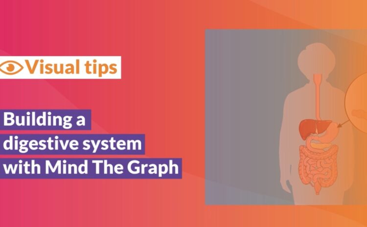
Tutorial video: Building a digestive system
2 min read
05/28/2020
anatomy
English
Chinese
Czech
Dutch
French
German
Italian
Indonesian
Japanese
Korean
Polish
Portuguese
Russian
Spanish
Turkish
Ukrainian
Swedish
Romanian
Bulgarian
Finnish
Greek
Hungarian
Norwegian
Danish
Estonian
Slovenian
Lithuanian
Latvian
Slovak
English