3 min läsning
03/19/2018
Den vetenskapliga bloggen Mind The Graph är tänkt att hjälpa forskare att lära sig hur man kommunicerar vetenskap på ett okomplicerat sätt.
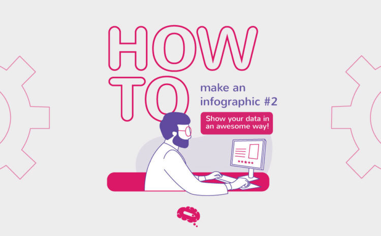
Detta är det tredje inlägget i serien Hur man gör en infografik. Om du missade det senaste inlägget kan du läsa det här. Nu när du känner till ditt brännande problem, huvudfrågan i din forskning, och även har data för att besvara denna fråga, är det dags att välja det bästa sättet att visa det [...]
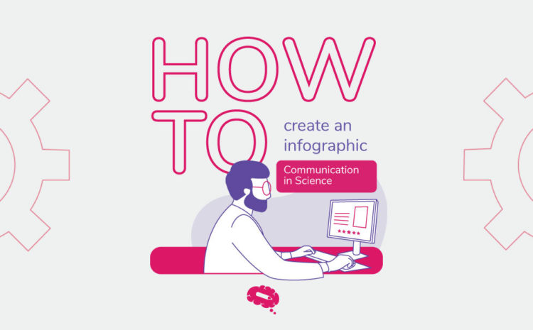
Hur man skapar en infografikserie Detta är det andra inlägget i serien Hur [...].
Upptäck hur man gör en infografik Kommunikation är en viktig del av det vetenskapliga livet. Och [...]
Vi firar idag Darwins dag, för att hedra Charles Darwins födelse den 02/12/1809. Darwin [...]
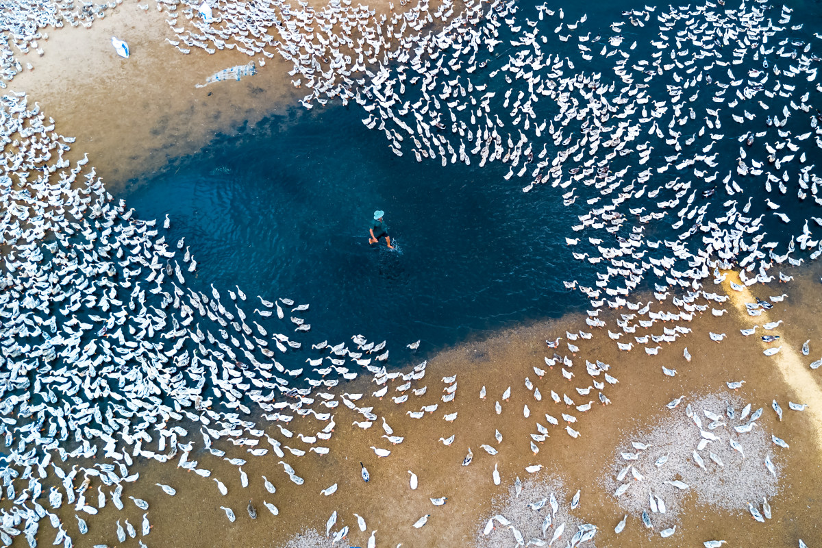
SkyPixel är världens största tävling i flygfotografering och har tagit emot över 44 000 [...].
En vetenskaplig och teknisk innovation utvecklas i takt med ljusets hastighet, medan en vetenskaplig kommunikation [...].
Ibland innebär det att vara forskare att uppleva ovanliga eller roliga situationer under arbetet. Rutinen att [...]
Hej på er! Idag ska jag dela med mig av mina favoritlänkar om vetenskap som jag fick reda på i dagarna. [...]
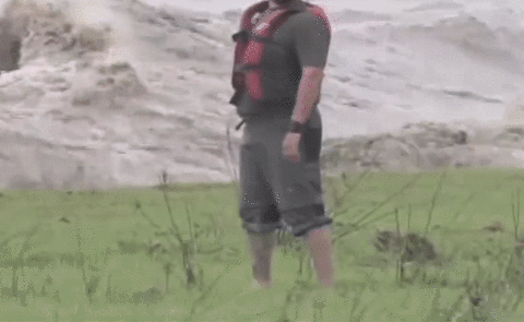
Det är fredag och vi förtjänar en liten paus. Jag vet, många forskare arbetar och skriver [...]
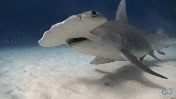
I filmer är hajar vanligtvis orädda rovdjur, kötthungriga monster. Men i verkligheten är de [...]
Nästan lika viktigt som att ha gedigna resultat om din forskning är att presentera dem väl. [...]
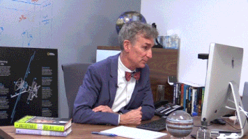
Du förtjänar en kort paus på jobbet för att se detta. Vetenskap är trots allt inte bara [...].
Vi gillar verkligen att visa upp våra användares fantastiska arbete - särskilt om de är [...]