
Fabricio Pamplona, co-founder of online infographic maker for scientists Mind the Graph, explores how infographics and visuals can be a powerful tool for communicating complex scientific and medical information to patients and other audiences. Enjoy subscription for a reduced price in November.
Why should academic care about visual communication in science?
As a seasoned academic, I’ve navigated the intricate labyrinth of scientific and medical information, often dense and challenging to decipher. This journey has led me to a powerful tool that I believe is indispensable for young scientists: scientific infographics. In our digital age, where information is abundant yet attention spans are limited, infographics serve as a bridge, transforming complex data into visually engaging and understandable formats.
My advice to fellow scientists is simple yet profound: embrace the power of visual communication. It’s not just about making your work ‘look pretty’; it’s about enhancing comprehension, engagement, and retention of the information you’re conveying. Whether you’re presenting at a conference, publishing a paper, or teaching, incorporating well-designed infographics can significantly elevate your impact. In this blog post, I will explore how these visual tools are not just an accessory but a necessity in our quest to make science more accessible and engaging, especially in an academic setting where clarity and precision are paramount.

What are the challenges when communicating scientific information?
Attention spans are short, and manufacturers and other medical companies only have a short window to grab their audience. Therefore, presenting this information in a way that’s easy to digest for non-technical audiences is critical.
It’s no secret that medical technology is a complex subject, every product has its own features, benefits and technical information that audiences must process. The Ebbinghaus Forgetting Curve tells us that humans forget approximately 50% of information within an hour of learning it, so leaving a lasting impression is critical.
Research has consistently shown that when visuals accompany learning material, students demonstrate better recall and understanding of the subject matter. For young scientists, this means leveraging infographics in your studies, presentations, and publications can significantly enhance your learning and communication capabilities.
Imagine sitting through a lecture where the professor drones on about intricate molecular structures or statistical data analysis. Now, contrast that with a scenario where those same concepts are illustrated through vibrant, well-designed infographics. The difference is stark. Infographics not only capture your attention but also help in better retention of information. They break down intricate theories and data into digestible chunks, making learning more efficient and less overwhelming.
So, as you delve into your scientific endeavors, ask yourself: how can you transform your complex findings into visually compelling stories? The answer to this question could very well be the key to not just understanding science better but also sharing your passion for it more effectively with the world.
Upgrade your visual design with Mind the Graph for only 1 USD in November
What are the benefits of visuals over text-based information?
Research has taught us that we’re much better at learning content from pictures than text. In fact, the human brain processes images around 60,000 times faster than text, which is remarkable when we think about the variety of images that are out there. The picture superiority effect also tells us that images are more memorable than text. Images can help companies attract attention, communicate concepts quickly and easily and even influence decisions.
We all remember those posters hanging in hospital waiting rooms and doctor’s surgeries, and why? Because they were short and snappy, using effective, but poignant graphics. However, the medical industry is still heavily reliant on written content for communication. Picture this, if a patient buys a new glucose monitor patch, then viewing visual guide will be far more effective than reading text-based instructions.
How good visual communication helped me stand out as a scientist in academia
Reflecting on my own journey in academia, I can confidently say that embracing visual communication has been a game changer in my scientific career. Early on, I realized that the dense, text-heavy presentations and publications typical in our field often failed to capture the audience’s attention or effectively communicate complex ideas. By integrating well-designed infographics into my work, I noticed a significant shift in how my peers and mentors engaged with my research.
In conferences, my posters garnished with clear, concise infographics drew larger crowds and sparked more in-depth discussions. My publications, enhanced with visuals that simplified complex data, received higher citations and broader readership. This wasn’t just about adding visual elements; it was about rethinking how to communicate science in a way that resonates with the audience.
The most profound impact was in teaching. Using infographics as educational tools, I saw a notable increase in student engagement and comprehension. It was rewarding to see concepts, once considered daunting, becoming accessible and exciting to learn. This approach not only improved my effectiveness as an educator but also established my reputation as an innovative thinker in my field.
Incorporating good visual communication helped me stand out in academia, not merely for the novelty of using visuals, but because it demonstrated a deep understanding of effective communication in science. It’s a testament to the fact that in the world of scientific research and education, it’s not always just about what you say, but how you visually convey it. For aspiring scientists, developing this skill could be your key to making a lasting impact in the scientific community.
What role can visuals play in academia and education?
Visual communication in academia and education is not just an add-on; it’s a powerful tool that can transform the way information is absorbed and retained. Recognizing this, I founded Mind the Graph, a platform dedicated to empowering academics with the tools to create stunning visuals for their scientific discoveries. Our mission was clear: to bridge the gap between complex scientific information and visual clarity, making it accessible and engaging for a diverse audience.
The challenge in academia, especially in fields like science and medicine, is presenting intricate data and concepts in a way that is both comprehensible and captivating. Traditional methods of teaching and presenting often fail to fully engage the audience or convey the essence of the research. This is where Mind the Graph steps in. We realized that while images are crucial, the difficulty lies in finding visuals that accurately represent the nuances of medical procedures and scientific details. To address this, we have curated a vast library of precise medical illustrations and scientific graphics, providing a resource where academics can easily find and use high-quality visuals.
Since its inception, Mind the Graph has been instrumental in assisting over a million academics, including scientists, teachers, professors, and students. Our platform has enabled them to effectively communicate their research and teachings through visually appealing and informative infographics, presentations, posters, and graphical abstracts. The impact has been profound, with users reporting enhanced audience engagement, clearer understanding of complex topics, and a noticeable improvement in the overall quality of academic and scientific communication.
The graphic making tool and illustration gallery offered by Mind the Graph are specifically designed to cater to the unique needs of the scientific and medical community. Our user-friendly interface allows even those with minimal graphic design experience to create professional-level visuals. This ease of access to high-quality, accurate illustrations has democratized the process of visual communication in academia, making it a staple in the toolkit of modern educators and researchers.
For more information about how Mind the Graph can revolutionize your academic presentations and publications, I invite you to visit our website. Whether you’re a seasoned researcher, a budding scientist, or an educator looking to enhance your teaching methods, Mind the Graph offers the resources to bring your scientific communication to the next level.
Design Tip #1: Designing infographics for Maximum Impact: What are the key elements to learn?
As young scientists embarking on the journey of visual communication, it’s crucial to understand the art and science behind creating effective infographics. A well-designed infographic is more than just an aesthetically pleasing representation of data; it’s a carefully crafted tool that communicates complex information in an accessible manner. Here are some key design principles to consider:
- Simplicity is Key: The primary goal of an infographic is to simplify complex information. Avoid clutter and focus on the essential elements. Use clear, concise language and visuals that directly support your main message.
- Accuracy Matters: In scientific communication, accuracy is non-negotiable. Ensure that your infographics are factually correct and represent data in a way that is true to the source. Misrepresenting or oversimplifying can lead to misinformation.
- Clarity and Readability: Choose fonts and colors that enhance readability. The information should flow logically, guiding the viewer through the data in a coherent sequence. Pay attention to the hierarchy of information, emphasizing key points through size, color, or placement.
- Engage Your Audience: Consider your audience’s background and what might appeal to them. An effective infographic resonates with its viewers, making the information relatable and engaging. Use metaphors or familiar scenarios to illustrate complex ideas.
- Consistency in Style: Maintain a consistent style throughout your infographic. This includes color schemes, font choices, and illustration styles. Consistency helps in creating a professional and credible visual piece.
Remember, the power of an infographic lies in its ability to make complex scientific concepts accessible and engaging. As you develop your skills in creating infographics, continually ask yourself: Does this visual aid make the information clearer? Does it engage my intended audience? The answers to these questions will guide you in crafting infographics that not only look good but also significantly enhance the communication of scientific information.
Design Tip #2: Balancing Information Density and Aesthetics in Scientific Infographics
Expanding upon the design principles for effective scientific infographics, it’s important to strike a balance between information density and aesthetics. This balance is crucial in ensuring that your infographic is not just informative but also visually appealing.
- Information Density: Be mindful of how much information you pack into your infographic. Overloading it with data can overwhelm your audience, while too little information might render it ineffective. The key is to distill the essence of your data or concept into a form that is both comprehensive and approachable.
- Visual Hierarchy: Establish a visual hierarchy to guide the viewer’s eye through the infographic. Use scale, color, and spatial relationships to signal the importance of different elements. Larger, bolder elements will capture attention first, so use these for your main points.
- Color Psychology: Color choices can significantly impact the readability and emotional response to your infographic. Utilize colors that enhance the comprehension of the content. For instance, using contrasting colors for background and text improves readability, while color schemes can be used to evoke specific moods or highlight important data.
Design Tip #3: Innovative Use of Graphics and Data Visualization in Scientific Infographics
Moving forward, young scientists should also consider innovative approaches to graphics and data visualization in their infographics.
- Creative Data Visualization: Traditional charts and graphs are effective, but exploring creative data visualization techniques can make your infographic stand out. Think about unique ways to represent data, like using icons or illustrations that relate to your topic, or experimenting with infographics that are interactive in digital formats.
- Contextual Imagery: Use imagery that adds context to your data. For example, if your infographic is about environmental science, incorporating relevant nature imagery can make it more relatable and engaging. However, ensure that the imagery supports and does not distract from the data.
- Consistent Theming: Develop a consistent theme throughout your infographic that ties the design elements together. This could be a recurring shape, a specific set of colors, or a particular style of illustration. A consistent theme gives your infographic a cohesive and professional appearance.
- Adapting to Different Formats: Be aware of different formats where your infographic might be displayed. What works on a poster may not work on a mobile screen. Design with adaptability in mind, ensuring that your infographic is effective across various platforms.
These additional principles emphasize the importance of balancing information with visual appeal, using innovative data visualization techniques, and ensuring adaptability across different formats. As you grow in your scientific career, refining your skills in infographic design will not only enhance your ability to communicate complex information but also set you apart as a scientist who truly understands the power of visual storytelling
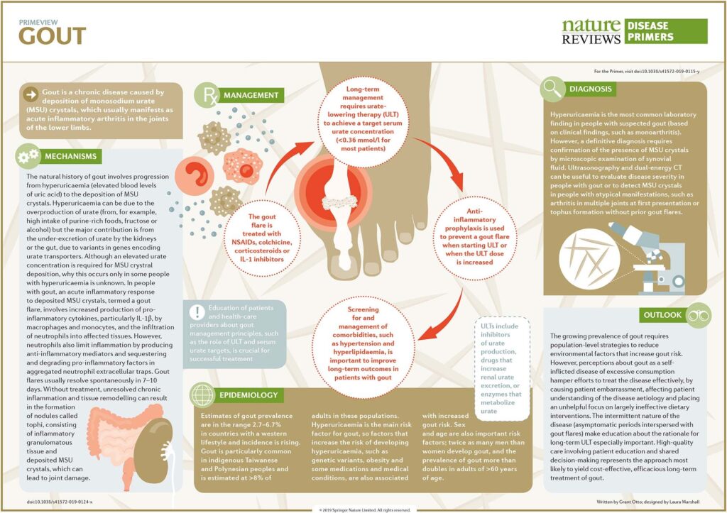
Last, but not least: How can infographics bridge the understanding gap for medical procedures and treatments?
In the medical field, where communication can quite literally be a matter of life and death, the importance of clarity cannot be overstated. As a young scientist or medical professional, it’s crucial to recognize that what seems straightforward to you might be perplexing to patients and the general public. This is where the power of infographics becomes evident. By transforming complex medical data and procedures into clear, visually engaging formats, infographics can significantly enhance patient understanding and engagement.
Consider the challenge of explaining a chronic disease’s pathophysiology or the intricacies of a new treatment regimen. Text-heavy explanations can be daunting and often fail to resonate with patients. However, an infographic, with its concise and visually appealing representation, can demystify these concepts, making them more accessible. This is not just about simplification; it’s about effective communication. A well-designed infographic can convey what paragraphs of text sometimes cannot, bridging the gap between medical jargon and patient comprehension. Try to create medical infographics with Mind the Graph, promotional subscription for only 1 USD in November!
Moreover, in public health campaigns, infographics have proven invaluable. They can distill essential health information into easily understandable and shareable content, reaching a broader audience. For example, during public health crises like the COVID-19 pandemic, infographics played a key role in disseminating crucial information about the virus, safety protocols, and vaccination programs.
As you embark on your career in the sciences, remember that your ability to communicate effectively with non-specialists is as important as your technical skills. Infographics are not just a tool for simplification but a medium for empowerment, enabling patients and the public to make informed decisions about their health. This aspect of communication is integral to the ethos of medical science and public health, and mastering it can make a significant difference in the lives of many.
Conclusion: Embracing the Future of Infographics in Academia and Medicine
As we reflect on the transformative role of infographics in the realms of academia and medicine, it’s evident that we are just scratching the surface of their potential. The evolution of visual communication tools, powered by advancements in technology, is continuously reshaping how we share and consume complex scientific information. The future promises even more innovative and impactful ways to utilize visual aids in science communication.
With the rise of digital technology and interactive media, we can anticipate a new era of infographics that are not only visually compelling but also interactive and immersive. Imagine infographics that allow viewers to explore data in a multidimensional space, or augmented reality (AR) tools that bring scientific concepts to life right before our eyes. These advancements will further enhance the effectiveness of visual aids, making scientific information more accessible, engaging, and understandable to a broader audience. Check your design skill in MTG.
As educators, scientists, and medical professionals, we have a unique opportunity to be at the forefront of this evolution. By embracing these tools, we can significantly amplify the impact of our work. The ability to clearly and creatively communicate complex ideas is becoming increasingly vital in a world inundated with information. Infographics and visual aids are not just tools for simplification; they are instruments of empowerment, enabling us to convey our discoveries and knowledge in ways that inspire, educate, and innovate.
Therefore, I encourage my peers in the academic and medical communities to not only utilize these tools but to actively explore and contribute to their advancement. By doing so, we can ensure that the future of scientific communication is not only more efficient but also more inclusive and engaging for all. The journey of integrating visual communication into our work is an exciting one, and it’s a path that promises to lead to greater understanding and appreciation of the incredible world of science.


Subscribe to our newsletter
Exclusive high quality content about effective visual
communication in science.