This is the sixth post in the series How to make an infographic. If you missed the last post, you can read it here.
If you are reading this text, you are probably following our series of tutorials How to make an infographic. Today, I’ll talk about the most common mistakes in creating infographics. If you experience any of these difficulties, or another one that was not mentioned here, feel free to tell us.
Said that, let’s learn How to make an infographic – or how NOT to make an infographic
01. Data Misunderstanding
Many infographics display data inefficiently or that tends the reader to misunderstandings. Make sure you have chosen the right chart type for what you want to highlight in your infographic. Also, be sure to pay attention to things like ordering, labeling, color use, or comparison. These things can have a huge impact on the success of your data visualization.
Our tips:
If you want to compare an independent value, you should use a bar chart, a column chart, a bubble chart, or bubble cloud. However, to compare parts of a whole, it will probably be better to use a pie chart, donut chart, or tree map. If what you need to display are continuous changes over time, try using a line chart or an area chart.
Stacked chart: Use a stacked bar chart or stacked column chart to compare categories and parts of a whole. A stacked area chart should be used to compare trends over time.
2. Redundancy
Your infographic needs to tell a story with consistency (storytelling). However, many people think that all parts of the infographic need to reinforce the same idea, which can result in redundancy. This defeats the initial purpose of create an infographic, which is to display your data visually, making it easier and quicker to understand the main content. Too many information and a lot of text can work against you.
Our tips: See if you can condense, cut or clarify your infographic content. You need to be able to combine graphics, adjust labels, remove prominent phrases, and so on.
3. “Comic Sans” or 50 different types of typography
Choosing the typeface that will be used in your infographic is really important. This will help you to make an infographic more professional and provide an intuitive experience to the reader. Especially if your infographic is for a banner or presentation where readers will be at a considerable distance, test if your text is easy to be seen and read. Separate paragraphs and headlines clearly and do not use many different fonts.
Our tip: Choose at most 3 or 4 and maintain consistency. Also, choose fonts that are more professionals and easy to read like helvetica, gothan, . You can use a different and cool font to the headline, but avoid the “comic sans” effect.
4. Crazy colors everywhere
We always want to make an infographic to be eye-catching or bold. Well, the colors are a good ally in this mission. However, they can be your worst enemy too. It all depends of your palette. The colors of an infographic should increase understanding, such as an accent color to call attention to your burning problem or a data point. But this doesn’t mean neon type on black, ok? Ok. Pay attention to the contrast between text and images, so that the viewer’s eyes do not feel pain.
The colors aren’t there just to be beautiful, they are there to pass on a message too. Your message. Use them to improve understanding.
Our tip: Choose 1 or 2 main colors. See this post to learn more about infographic colors.
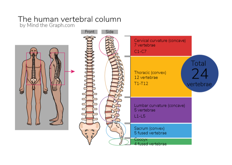
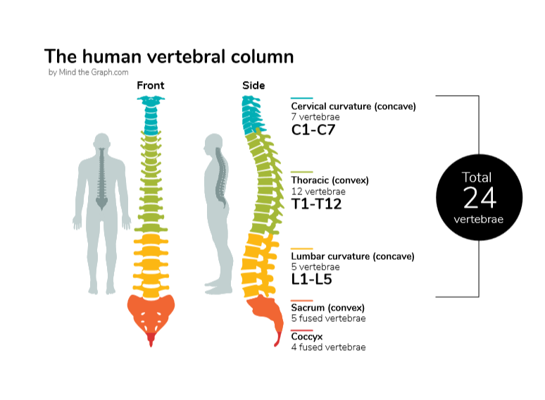
If you highlight everything, anything will be highlighted. This infographic below is a great example of a color improvement made by our designer.

5. A messy (or no one) Hierarchy
What block of text your public need to look at first? What is the main content that all your readers should know? Like I said before, What is your burning problem? You need to deliver a clear message, but this is impossible if the reader does not even know what to see first.
Our tip: Always draw a sketch before jumping into design. Also, structure your creation around your burning problem to guide your reader through the content.
6. Small monsters
You know, the devil is in the details. Small little things that individually may not seem so significant. However, collectively they can cause a huge damage to your creation. Pay attention to sloppy alignment, inconsistent illustration styles, or spacing.
Our tip: Review and review. Ask someone else to review. Make a checklist of what needs to be reviewed.
It is easy to miss a detail, however we are here to help you! Get a checklist for free and review your infographic. Just click the link below:
If you haven’t joined Mind the graph yet, our tip is: Start now. You are learning how to make an infographic and to use a great platform will be helpful to you.
How to make an infograpic post series by Mind the Graph:
- Post #1 – Communication in science
- Post #2 – Make your data Awesome
- Post #3 – The right kind of chart
- Post #4 – Let’s talk about colors!
- Post #5 – Less is more: minimalist infographic design
- Post #6 – Mistakes to avoid in science communication
- Post #7 – A shortcut summary to GET IT DONE
The posts are a guide, made by our designers. They make the amazing illustrations and templates you see on our platform. Also, you can get for free our ebook. Learn how to make science infographics and improve your presentations

Subscribe to our newsletter
Exclusive high quality content about effective visual
communication in science.


