A prestigious medical journal founded in 1823, The Lancet publishes high-impact papers in clinical medicine, global health, and public health. Among clinicians, researchers, and policymakers worldwide, The Lancet sets the standard for quality and rigor in medical publishing. The Lancet publishes papers that not only contribute to scientific knowledge but also influence healthcare policies and practices worldwide.
It is crucial to make your research stand out in the competitive world of academic publishing. Graphic abstracts have become a powerful tool to boost the visibility and impact of scholarly articles. Visual abstracts are designed to quickly communicate to a broad audience the key findings of your study. Graphic abstracts convey complex ideas using images, diagrams, and minimal text, unlike traditional abstracts that are heavy on text. In today’s fast-paced digital environment, this approach makes your work more accessible, engaging, and memorable.
Anyone seeking to publish in The Lancet should adhere to its specific guidelines for graphical abstracts due to its prestigious status. This guide aims to simplify the creation of a graphical abstract tailored to The Lancet’s standards. From conceptualizing your abstract to finalizing it for submission, this guide will guide you through the key steps. The following guidelines will help you write a compelling graphical abstract that meets The Lancet’s requirements and maximizes your research’s impact.
Understanding The Lancet’s Requirements
To ensure that your research is effectively communicated and well received by The Lancet’s diverse readership, it is essential that you create a graphical abstract that meets its standards. Here is a detailed breakdown of The Lancet’s specific guidelines, key elements, and technical specifications.
Specific Guidelines Provided by The Lancet for Graphical Abstracts
There is a high emphasis on clarity and precision in the Lancet’s graphical abstracts. An engaging and easily understandable visual summary of your research is the objective, which should appeal to clinicians, researchers, and policymakers alike. The guidelines typically emphasize the following:
- Function and Purpose: A graphical abstract should convey your research’s essence succinctly. It should highlight the primary findings or the most critical message of the study in a visual format. Keep the image simple and avoid unnecessary details that could confuse the reader or clutter the image.
- Consistency with Manuscript: The graphical abstract should align with the content and conclusions of your manuscript. The visual representation must be a faithful and accurate summary of your research, not just a decorative element.
- Adherence to Ethical Standards: Like textual content, the graphical abstract must adhere to ethical standards. As part of this process, any third-party content should be properly cited, data should be presented properly, and plagiarism should be avoided.
Key Elements to Include
To create a compelling graphical abstract, The Lancet recommends focusing on the following key elements:
- Clarity: The abstract should be straightforward and easy to understand at a glance. It should be obvious to the viewer what the main idea is without requiring them to read the associated manuscript. An abstract may be the first and sometimes the only thing a reader sees, so it is vital to make the abstract visually appealing.
- Relevance: Every element of the graphical abstract should be directly related to the core findings of your research. Do not include extraneous information or too complex graphics that do not contribute to your study’s understanding.
- Keep it simple: While it’s tempting to create a detailed and elaborate design, simplicity is often more effective. Keep your icons simple, your labels clear, and your text minimal. In order to convey the research highlights effortlessly, the design shouldn’t overwhelm the viewer.
- Consistency: Ensure that the visual style is consistent throughout the abstract. Create a cohesive look by using uniform color schemes, font styles, and layouts. This consistency helps in making the abstract more professional and easier to interpret.
- Scientific Accuracy: All visual elements should accurately represent the data and findings. The graphs, charts, or images used must be scientifically accurate and scaled appropriately.
Technical Specifications
There are specific technical guidelines for graphical abstracts in The Lancet to ensure that they are of high quality and meet the journal’s publication standards. The following are the essential technical specifications you need to follow:
- Size and Dimensions: The graphical abstract should typically be 9 cm x 9 cm, fitting within a single-column format. However, always check the latest guidelines, as these dimensions can sometimes vary depending on the section of the journal or the type of article.
- Resolution: Publishing high-resolution images is essential. Print and digital versions of The Lancet are required to meet a 300 DPI (dots per inch) minimum resolution requirement.
- File Format: TIFF, EPS, and high-resolution JPEG are the preferred file formats. In addition to maintaining image quality, these formats are compatible with the journal’s publishing system. PNG and GIF files with low resolution should be avoided.
- Color Mode: Use the RGB color model for any graphical abstract intended for online publication. The CMYK color model should be used if the abstract will be printed. Colors should be distinctive and easy to distinguish, especially for viewers with color vision impairments.
- Text and Font: The text within the graphical abstract should be legible when viewed at 100% zoom. If your abstract is published at a reduced size, use a sans-serif font such as Arial or Helvetica. To avoid clutter, keep the text to a minimum.
By following these guidelines, you ensure that your graphical abstract is visually appealing and complies with The Lancet’s standards, increasing the likelihood that your research will make an impact.
Conceptualizing Your Graphical Abstract
Identify the Key Message of Your Research
For a graphical abstract to be successful, it must convey the main message of the research in a clear and concise manner. One or two sentences should summarize the most important findings or conclusions of your study. A key message is the discovery of a new biomarker for early disease detection, for instance. Your research should be novel, significant, and impactful. It is important that your graphical abstract communicates this message at a glance so that readers are clear about what your study is adding to the field.
Brainstorm Visual Metaphors or Concepts
After you have determined your key message, think about how you are going to convey it visually. By using visual metaphors, complex ideas can be translated into simple, easily understandable images. A butterfly emerging from a chrysalis might be an appropriate image for your research involving transformation. To illustrate the spread of a disease, you might use a branching tree or a network.
Take into account abstract representations that are aligned with your research. The use of arrows can indicate direction or change, the use of circles can indicate cycles or completeness, and the use of grids can show data or structure. Use visuals that relate to your findings and are easy to understand. Sketch out a few ideas, even if they’re rough. This initial brainstorming phase is about exploring different ways to visually communicate your research, so don’t be afraid to get creative.
Keep the Target Audience in Mind
Clinical practitioners, researchers, and policymakers are among the audience of The Lancet. Think about what will resonate most with these groups when conceptualizing your graphical abstract. The methodological or scientific innovations of your work might be more interesting to researchers than clear, direct visuals that demonstrate clinical relevance. The implications for public health or the broader implications might be on the minds of policymakers.
You should tailor your graphical abstract to highlight aspects of your research that will be most meaningful to your intended audience. Consider the practical outcomes of your study if it has immediate clinical applications. Focus on broader implications and potential changes arising from your research if it contributes to policy discussions.
Do not use overly technical jargon or complex imagery that may alienate non-specialists. It is important to make your research accessible and engaging to as many people as possible, without compromising accuracy or detail.
Graphical abstract can be viewed in several ways, so if you want to understand it in detail read our blog post “What Is A Graphical Abstract?“.
Designing the Graphical Abstract
Choosing the Right Tools
The right tools can drastically improve the quality and efficiency of your design process when creating a graphical abstract for The Lancet. The following software and tool recommendations are provided:
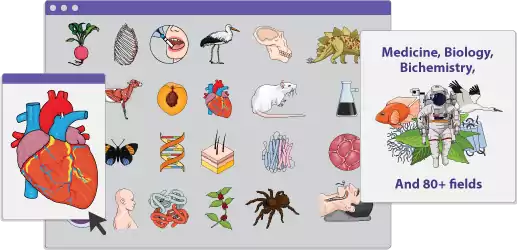
- Mind the Graph: This tool is specifically designed for researchers who need to create scientific illustrations. It offers a range of customizable templates and scientific icons, making it easier to produce high-quality graphical abstracts that effectively communicate complex information.
- Adobe Illustrator: A professional-grade vector graphics editor, Adobe Illustrator offers unparalleled control over every aspect of your design. A high-resolution, detailed graphical abstract requiring precision is best created with this program. Although it is easier to learn, it is better suited to those with some design experience.
- Canva: Canva is a user-friendly, web-based design tool that provides a wide range of templates and design elements. Despite not having extensive design experience, it is a great choice for those who want to create a polished, professional-looking graphical abstract. You can experiment with different layouts and styles with Canva’s drag-and-drop interface.
- BioRender: A tool designed specifically for life sciences, BioRender offers pre-made scientific icons and templates. It’s particularly useful for medical and biological research, as it simplifies the process of creating visuals that are both accurate and visually appealing.
Tips on Using Templates or Starting from Scratch
- Using Templates: If you’re new to design or pressed for time, starting with a template can be a great way to ensure your graphical abstract is visually balanced and adheres to design best practices. You can customize templates in most research tools, such as Canva and BioRender. It is important that the template you choose is aligned with The Lancet’s guidelines and your research focus.
- Starting from Scratch: For those with more design experience or specific needs that aren’t met by templates, creating your graphical abstract from scratch allows for complete creative freedom. During this process, it’s crucial to maintain a clear structure, ensuring that your design conveys the key message of your research without overwhelming the viewer.
Crafting a Visual Narrative
Graphical abstracts are more than just images and texts; they’re visual narratives that guide the viewer through your research findings. A visual story can be crafted in the following ways:
Use of Color, Shapes, and Symbols
- Color: Use color strategically to highlight the most critical aspects of your research. While contrasting colors can draw attention to key findings, consistent color schemes can help to differentiate between different sections or processes. Don’t overload the design with colors, as this can make it appear cluttered.
- Shapes and Symbols: Shapes and symbols can be powerful tools for conveying complex ideas succinctly. The direction of causality of a disease can be indicated by an arrow, while the cycle or process can be represented by a circle. Your audience should understand and appreciate symbols that are universally understood.
Balancing Text and Imagery
- Text: While images are the primary focus of a graphical abstract, text plays a crucial role in clarifying and reinforcing the visual message. When labeling diagrams or highlighting key findings, use concise, clear language. Make use of bullet points and short phrases rather than dense paragraphs.
- Imagery: The images in your graphical abstract should work in harmony with the text to tell a coherent story. Whether you’re illustrating a process, showing data, or providing context, make sure the imagery is directly related to your research.
Ensuring Readability and Accessibility
- Font Choices: Select fonts that are easy to read at various sizes. Many people prefer sans-serif fonts such as Arial or Helvetica due to their clarity. It is best to avoid decorative fonts that might be difficult to read.
- Accessibility: Consider how your graphical abstract will be viewed on different devices and by diverse audiences. Color contrast should be strong enough for viewers who are color blind, and text should be large enough to be read on small screens. Readers who are visually impaired can also benefit from alt-text descriptions for visuals.
Common Pitfalls to Avoid
In spite of your best efforts and tools, there are a number of common mistakes you can make to undermine the effectiveness of your graphical abstract. Watch out for these pitfalls:
- Overcomplicating the Design
A cluttered and confusing graphical abstract can result from including every detail of your research. Be clear and straightforward in your presentation of the most critical findings. It’s important to keep in mind that the goal is to attract readers’ attention, not to overwhelm them.
- Misalignment with the Research Message
The key message of your research should be visualized in your graphical abstract. When your design doesn’t match your findings, it can create confusion and reduce your impact. You should ensure that every element of your design contributes to a coherent narrative that accurately reflects the research you’ve done before finalizing the design.
- Ignoring The Lancet’s Guidelines
In addition to size and format guidelines, The Lancet also requires specific content requirements for graphical abstracts. Failure to adhere to these guidelines can result in your abstract being rejected or requiring significant revisions. Make sure that your final product meets The Lancet’s requirements before starting the design process.
When you carefully choose your tools, craft a thoughtful visual narrative, and avoid common pitfalls, your graphical abstract will not only meet The Lancet’s standards but also enhance your research’s visibility and impact.
Finalizing Your Graphical Abstract
It’s crucial to ensure that your graphical abstract meets all the necessary standards before submitting it. By reviewing your work thoroughly, you can avoid common mistakes and improve its quality. To guide your review process, here is a checklist:
- Clarity: Ensure that the core message of your research is clearly communicated. Avoid unnecessary jargon or complex terminology. Ensure that the visuals are easy to understand and that the presentation is clear.
- Alignment with Research: Verify that the graphical abstract accurately reflects the main findings and objectives of your research. You should ensure that all graphic elements (symbols, icons, text) relate directly to your study. Research papers shouldn’t introduce new information in their abstracts that isn’t covered in them.
- Compliance with Guidelines: Review The Lancet’s specific guidelines on graphical abstracts, including dimensions, file format, and resolution. Follow The Lancet’s style and tone when writing the abstract. Verify that the size and font of any textual elements comply with the Lancet’s guidelines.
Seeking Feedback
After completing your review, it’s essential to seek feedback from others who can offer fresh perspectives:
- Colleagues and Peers: Share your graphical abstract with colleagues familiar with your research to get their insights. Ask them to identify any areas where the message might be unclear or where the design might be improved. It may be necessary to revise the visual elements if their interpretations don’t align with your intentions.
- Design Experts: If possible, consult with a design expert or someone with experience in creating graphical abstracts. A color scheme, layout, and visual balance can be discussed with them. Your abstract may also be improved by a designer pointing out flaws in the design or suggesting better ways to convey your message.
- Target Audience: Get feedback from individuals who represent the target audience of your research (e.g., clinicians, researchers, policymakers). The abstract should be engaging and easy to understand, as their perspective is crucial to your success.
Making Revisions Based on Feedback
Once you’ve gathered feedback, it’s time to make any necessary revisions:
- Focus on the most critical feedback that directly impacts your graphical abstract’s clarity and accuracy. Prioritize changes that improve your research results’ communication over suggestions related to design improvements.
- Refine the visual elements based on feedback received. Assure that all revisions adhere to The Lancet’s guidelines and that the overall design remains cohesive.
- Ensure your abstract still effectively communicates your research after making revisions by reviewing the clarity checklist. To confirm that the revisions have improved the abstract, consider seeking a second round of feedback.
Final Compliance Check
Make sure your graphical abstract is fully compliant with The Lancet’s guidelines. Ensure that the abstract is ready for submission by checking the file format, resolution, and dimensions. You will significantly increase the overall impact of your publication in The Lancet if you finalize your graphical abstract with careful review and feedback.
Submitting to The Lancet
How to Submit Your Graphical Abstract Along with Your Manuscript
You can significantly enhance the visibility and impact of your research by including a well-crafted graphical abstract when submitting a manuscript to The Lancet. To ensure your graphical abstract is submitted correctly, follow these steps:
- Prepare Your Files: Ensure your graphical abstract meets The Lancet’s technical requirements, including format (usually JPEG, PNG, or TIFF), resolution (typically 300 dpi), and dimensions. Make sure the key message of your manuscript is conveyed in your graphical abstract.
- Incorporate the Graphical Abstract in the Submission System: The Lancet’s online submission system allows you to upload supplementary files, including graphical abstracts. You will be asked to upload additional files during the submission process-this is where your graphical abstract should be included. The title should be clearly labeled (e.g., “Graphical Abstract”).
- Provide a Brief Description: Some submission systems require a brief description of the graphical abstract. Describe your research in a concise caption or explanation that complements your abstract.
- Review Submission: Before finalizing your submission, review all uploaded files, including your graphical abstract, to ensure they are correctly attached and formatted. For technical or submission errors to be avoided, this review step is crucial.
Common Issues During Submission and How to Avoid Them
Submitting to a prestigious journal like The Lancet can be a meticulous process, and several issues may arise during the submission of a graphical abstract:
- File Format Errors: Ensure that your graphical abstract is in the correct file format and meets the resolution and size requirements specified by The Lancet. Rejection or resubmission may result from using an incorrect format (e.g., a low-resolution image).
- Misalignment with Manuscript Content: A graphical abstract that does not clearly represent the manuscript’s findings can confuse reviewers and readers. Make sure that your graphical abstract captures the key points of your manuscript and summarizes the research effectively.
- Overloading the Visual: Avoid cramming too much information into the graphical abstract. The effectiveness of a design can be undermined by a cluttered or overly complex layout. Don’t stray from the main point and simplify as much as possible.
- Technical Issues in the Submission System: Occasionally, submission platforms may have technical glitches, leading to failed uploads or corrupted files. Keep backup copies of all files and ensure your internet connection is stable to avoid this. You may contact the journal’s support team for assistance if you encounter persistent problems.
Importance of Following Up on Your Submission
After submitting your manuscript and graphical abstract, it’s important to stay proactive:
- Track Submission Status: Regularly check the status of your submission through The Lancet’s submission portal. It is important to keep track of any updates or requests for revisions so you can respond promptly and keep the review process moving.
- Addressing Feedback: If the editorial team requests revisions to your graphical abstract, address their feedback swiftly and accurately. A delay in submitting a response or an incomplete response can slow down the publication process.
- Confirmation of Acceptance: Once your manuscript and graphical abstract are accepted, you’ll receive a confirmation email. Make sure all details of the acceptance, including the graphical abstract, are correct.
- Engage with Post-Publication Promotion: After publication, actively promote your research and graphical abstract through social media, academic networks, and conferences. Your work can have a greater reach and impact if you engage with your audience post-publication.
Your graphical abstract will contribute positively to the overall impact of your manuscript in The Lancet if you follow these steps.
Visualise Research Paper In An Engaging Way
Engage your audience with visually appealing visuals crafted from your research, saving you time and capturing their attention. Whether it’s intricate data sets or complex concepts, Mind the Graph empowers you to create engaging infographics. Our intuitive platform allows you to quickly create stunning visuals that effectively communicate your ideas. Our team of experts is available to provide you with support and guidance if needed. Start creating today and make a lasting impression. Visit our website for more information.

Subscribe to our newsletter
Exclusive high quality content about effective visual
communication in science.

