This is one of our favorite topics to write about. How to create a graphical abstract for the National Library of Medicine. Wonder why? Oh dear! Isn’t it obvious, it’s about making graphical abstracts! It’s about converting science into the most popular format for the readers. Here at Mind the Graph we love it. This article introduces you to the basic principles of graphical abstract making and how to create a graphical abstract for the National Library of Medicine. Learn the essentials of crafting an effective graphical abstract for your research submissions here!
Understanding A Graphical Abstract
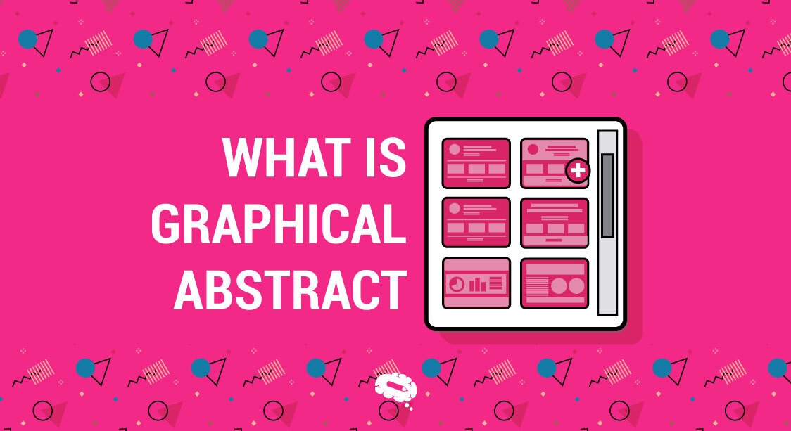
What Is A Graphical Abstract?
A graphical abstract is a visual presentation of major findings or the core content of a research paper that will help its readers understand the study at a glance. This includes an image, diagram, or another kind of visual element that catches, in a fairly general way, the core message, methodologies used, and conclusions of the research.
An abstract image is important in research communication as it provides enhanced exposure and access by engaging a large readership, many of whom may not be specialists in the area. It allows them to comprehend easily the reasoning behind the research study, thereby increasing the chances of its dissemination and further citation. Again, this increases the opportunity for interdisciplinary collaboration and knowledge transfer.
An effective graphical abstract should contain the following properties to ensure that this tool works effectively in the research communication process:
- Clarity
The visual elements should be clear and easy to understand, avoiding unnecessary complexity. The main message should be immediately apparent.
- Simplicity
It should focus on the essential aspects of the research without overcrowding with too much information. A simple and clean design helps in better comprehension.
- Relevance
The visuals must be directly relevant to the study’s main findings or methods. Every element included should serve a purpose in illustrating the research.
- Visual Appeal
An effective graphical abstract is visually attractive, using colors, fonts, and layout thoughtfully to draw attention and facilitate readability.
- Informative
It should effectively convey the core message of the research, including key results, methodology, and conclusions, in an easily digestible way.
- Self-Contained
The graphical abstract should stand alone, providing sufficient context and information without requiring additional explanation or reference to the text.
- Consistency
The design should be consistent with the rest of the paper in terms of style and terminology, maintaining a professional and cohesive presentation.
- Accessibility
It should be designed with accessibility in mind, ensuring that it can be understood by a wide audience, including those who might have visual impairments or are not experts in the field.
- Conciseness
Due to its limited size and time spent to grasp the take-home message, the graphical abstract should be concise, distilling the essence of the research into a format that can be quickly reviewed.
- Engagement
It should be engaging and interesting, sparking curiosity and encouraging the viewer to read the full paper for more detailed information.
Well, if this all is too overwhelming for you and you need help in creating your graphical abstract, relax! Just create a free account with Mind the Graph and follow our lead. Mind the Graph gives you everything you need to design a great Graphical Abstract.

Use MTG Templates And Give Shape To Your Idea
Mind the Graph has pre-formed templates for the scientific community. Select the template and start putting your research data in it; Choose a harmonious color palette to maintain a cohesive look; Ensure there is sufficient contrast between text and background, and between different visual elements. This helps in making the abstract readable and the important parts stand out. Use clean, professional, and easily readable fonts. Sans-serif fonts like Arial, Helvetica, or Calibri are generally more readable on screens.
Our simple selection tools at the top of the canvas page will guide you to get the best look.
Composition And Layout
Organizing Information Hierarchically
Establish a clear typographic hierarchy. Use different sizes, weights, or colors to differentiate between headings, subheadings, and body text. Keep text aligned consistently, whether left-aligned, center-aligned, or justified, to maintain a clean and orderly appearance.
Use Of Space And Visual Flow
Use adequate spacing between lines of text (line-height) and between different text blocks to enhance readability and prevent the design from feeling cluttered.
Content Considerations For A Graphical Abstract
Identifying Key Findings
An attractive graphical abstract requires well-thought-out content so that the research can be effectively communicated. Key findings are important to be identified since this representation is of the most significant results of your research: those related to your study and of the highest impact.
Represent these through suitable visual formats—in charts, graphs, or illustrations—and present the results in an instantly understandable format. Answer this question to emphasize your main message: What is the major result or conclusion of your study? Use this design technique to have the main message stand out in a graphical abstract: a bold color, larger fonts, and strategic placements.
The main message shall be concise, such that no clutter is allowed to dilute its effect. Novel contributions usually concern parts of your research that distinguish it from previous works; for instance, new methods, novel discoveries, or unusual applications.
Focusing On Novel Contributions
Emphasize striking visual elements that point to novel contributions and accompany them with brief contextualization in the framework of the bigger picture, so that the readers may realize their meaning and possible influence. You will be able to come up with a graphical abstract that embodies such content considerations to communicate the most important aspects of your research enough to your readers, who will then easily grasp and appreciate it.
BANNER GA MAKER
Visual Representations through illustrations
Mind the Graph gives you the option to work on any type of graph that you would like to beautify. Select from the “chart” tab of the platform and explore the opportunity to represent your data in colorful ways.
Choosing Appropriate Graph Types
Proper selection of graphical abstraction requires proper visual representations that are capable of adequately communicating research findings. Of these, selecting the right graph types is one of the most important steps. Specific graph formats are more suitable and useful for representing the different types of data and results.
For instance, bar charts are useful when comparing quantities across categories, line graphs when one has to show trends over time, and scatter plots when showing relationships between variables. The graph type should be such that the data is as self-explanatory as possible in the plot, so the reader gets an immediate understanding of it. Avoid complicated or unusual graph forms that confuse rather than clarify information in a presentation.
Using Symbols And Icons Effectively
Symbols and icons, much like creative graphics, can bring tremendous improvement in clarity and vividness if applied appropriately in graphical abstracts. Symbols and icons can, with ultra-ease, communicate complex ideas, processes, or categories quickly, hence making the abstract more accessible to a wide array of audiences. They must be intuitive and universally recognizable to avoid misinterpretation. In addition, consistency within the usage of symbols and icons supports both a cohesive and professional look.
For example, if there is one design of an icon or identity used throughout the abstract to refer to one variable or concept, that would stress its importance and improve knowledge retention. Careful placement and sizing ensure that their addition enhances the design without overwhelming the delivered key message. Proper graph types and effective usage of symbols and icons can merge a graphical abstract by delivering sophisticated research findings in simple and visually appealing ways.
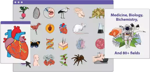
Mind the Graph gives you options for selecting icons from thousands of scientifically designed icons. Use petri plates, wire loops, BALBc, and a lot more relatable icons from our gallery!
Common Pitfalls To Avoid
Overcomplication
When creating a graphical abstract, it’s crucial to avoid common pitfalls that can undermine its effectiveness. One major issue is overcomplication. A graphical abstract should simplify complex information, not make it more confusing.
Including too many elements, colors, or data points can overwhelm the viewer and obscure the main message. It’s important to focus on the most critical aspects of the research and present them in a clear, concise manner. This can be achieved by using a clean layout, limiting the number of colors, and ensuring that every element has a purpose.
Misleading Representations
Another major pitfall involves misleading representations, such as those produced by many different ways in which data is presented and thus a distortion of the research findings, like manipulating the axes of a graph to exaggerate any trends, inappropriate graph types misrepresenting the true data, or highlighting only certain data points while all else is ignored.
Be honest and accurate in your data visualization by ensuring appropriate scales and labeled axes, showing units, and avoiding the various visual tricks that may prove misleading for the audience.
Finalizing And Submitting The Graphical Abstract
Final Checks
Please make sure that the graphical abstract prepared is in alignment with NLM guidelines. It is always useful to ask Peers for their feedback and improvise the abstract based on them.
Submission Process
Don’t forget the Format specifications! This may be tricky to handle but it can not stop you from your submission. This is the final stage and once you have gathered all accompanying documentation requirements your research is ready to be submitted to the NLM.
Mind the Graph Is The Best!
Yes, we say it with this confidence because we know it! Believe us, try out our platform and you will be amazed to see how easy it is to prepare a graphical abstract. Use thousands of illustrations and templates to prepare your graphical abstract. Good luck with the submission!

Subscribe to our newsletter
Exclusive high quality content about effective visual
communication in science.