Imagine stepping onto a stage, ready to capture your audience with a riveting presentation. You’ve meticulously prepared every word, pieced together compelling data, and crafted visuals that will make an impact. Yet there’s one crucial element you might have overlooked: the font. Selecting the best font for a presentation is like choosing the right attire for an interview—it sets the first impression and rolls out the tone for what’s to come.
Introduction: Importance of Choosing the Right Font for Presentations
In this digital age, where presentations are ubiquitous across industries, choosing the right font has never been more significant. It’s not just about aesthetics; it pertains directly to how effectively you communicate your message. The importance of selecting a suitable font resonates through every PowerPoint presentation fonts every slide, the best presentation fonts every heading, and every bullet point on-screen.
Understand the Impact of Font Choice on the Effectiveness of a Presentation
Every choice in your presentation design contributes to how your audience comprehends and retains information. Your chosen font carries weight – quite literally in terms of design, as well as metaphorically speaking due to its psychological impact. A font can alter the reading speed, affect mood, and even influence interpretative reasoning. With carefully selected typography, you can enhance comprehension and persuade your audience more efficiently.
How Fonts Can Enhance or Detract from the Overall Message and Visual Appeal
Fonts possess their own personality—a silent voice that speaks volumes before a single actual word is registered by listeners. Choose one font correctly and watch your words leap off the screen with vibrancy and clarity; choose poorly and risk muddying your message or distracting viewers with unnecessary flamboyance or illegibility. Remember, while content is king, typeface is certainly the queen holding court over visual appeal—the sovereign guide leading eyes effortlessly from one point to another.
Serif Fonts: Classic and Timeless Options for Presentations
Explanation of serif fonts and their characteristics
When you’re crafting a presentation, the font you choose is your silent ally—it conveys tone, reinforces the theme, and contributes significantly to first impressions. In that context, serif fonts are akin to a well-tailored suit: classic, timeless, and conveying a sense of authority. But what exactly makes a serif font style a serif?
Serifs themselves are the small lines or strokes attached to the end of larger strokes in letters. Picture the Times New Roman font; those little “feet” at the base of each character epitomize serifs. This style standard font itself has roots in ancient Roman inscriptions—a testament indeed to its enduring appeal.
The presence of serifs adds structure and formality to text that can lead one’s eye along lines of type—a boon for readability especially in print. However, it’s not just about utility: serifs also imbue text with an air of sophistication and credibility. And crucially for presenters, it’s this traditional nuance that often aligns with corporate or academic settings.
Best serif fonts for presentations, including examples like Times New Roman, Georgia, and Garamond
While there’s no one-size-fits-all answer when selecting your typographic partner-in-arms, several basic sans serif font fonts have proven particularly effective within presentation contexts:
- Times New Roman: The quintessential choice for delivering polished prose without distraction or risk – very much like choosing vanilla ice cream at a gelato shop full of exotic flavors.
- Georgia: Unlike the more compact Times New Roman, Georgia extends sideways with wider characters—an asset when projecting onto large screens where every millimeter matters.
- Garamond: If elegance had a typeface form, Garamond might be it; it brings an old-style feel that suggests tradition yet somehow doesn’t seem outdated.
Each font has its flair while maintaining clarity from afar—a critical factor during slide shows presented on projectors or monitors. Keep these choices in your arsenal as fail-safe options whether you’re aiming to persuade steadfast academics or engage seasoned professionals; they’re synergistic complements to any substantial content worth listening to—or better yet—acting upon after the applause fades out.
Sans Serif Fonts: Clean and Modern Choices for Presentations
Introduction to sans serif fonts and their attributes
When you’re aiming for a sleek, contemporary vibe in other fonts in your presentation, sans serif fonts are my first recommendation. These thin sans serif fonts lack the small decorative lines—or serifs—at the ends of strokes that their counterpart serif fonts possess. The result is a clean and simplified look that’s highly adaptable to digital screens where clarity is paramount.
Attributes of sans serif fonts include:
- Simplicity: Their straightforward design cuts the frills away, leaving legible and uncluttered text.
- Modern Feel: They exude an aura of modernity and progressiveness.
- Versatility: Sans serif fonts can be incredibly versatile, functioning well across titles, body texts, and logos alike.
These characteristics have made modern sans serif font fonts immensely popular in not only presentations but also in web design and corporate branding.
Top sans serif fonts for presentations, such as Arial, Helvetica, and Calibri
Choosing the best PowerPoint fonts and the right top-quality PowerPoint font can truly transform your presentation’s impact. Here are some top sans-serif choices that combine readability with style:
- Arial: A ubiquitous font known for its wide availability and clear legibility. It works exceptionally well for both headings and body text.
- Helvetica: Celebrated for its versatility, Helvetica has gained almost legendary status in design circles. Its neutral appearance makes it suitable for any type of presentation.
- Calibri: Introduced as the default font in Microsoft Office applications, Calibri has become widely used due to its warm and soft character.
Each font from this trio brings something distinct to your presentation—Arial is like a reliable old friend; Helvetica gives off an air of professionalism; while Calibri feels more casual yet retains formality when needed. For a balanced classic presentation font that reads well without distracting from your message or visuals, integrating one of these popular sans serif font workhorses should be considered.
Script and Decorative Fonts: When to Use and When to Avoid
Discussion on script fonts and their appropriate usage in presentations
When we turn our focus to the realm of script fonts, imagery of sweeping curves and elegant flourishes come to mind. Script fonts imitate the fluidity of human handwriting, often with various stroke weights and distinctive flair. They can instill a sense of personal touch or artistic sophistication into your slides. Yet, there’s a caveat; due to their intricate nature, they’re not always an effortless read from afar.
Appropriate use involves deploying script fonts sparingly. Consider them for:
- Title slides or introduction screens where you aim to make a bold statement
- Quotations that merit special attention or display touches of personality
- Specific industries such as wedding planning or luxury brands that benefit from their sophisticated vibe
A good guideline is if there’s emotional weight or stylistic nuance necessary, script fonts could be just what you need.
Considerations when using decorative fonts in presentations
On another note, decorative fonts are akin to wearing flamboyant clothing — they can dazzle but also overwhelm when used excessively. These eye-catching custom fonts can present unique styles that can complement themes ranging from retro to futuristic.
Before incorporating decorative typography consider these points:
- Legibility: Always preview these fanciful types at different sizes and distances to ensure legibility.
- Context relevance: Design elements should coalesce around your message rather than steer away from it.
- Text quantity: If you have dense text blocks, keep them in simpler font styles for ease of reading; reserve the razzmatazz for headers.
Remember that moderation is key with these expressive typefaces. Overuse confounds readability and may create visual chaos, diluting your core message. Whether it’s invoking elegance through a script font or stirring excitement with a decorative one, mindfulness about your audience’s experience will steer you right.
To sum up: while selecting scripts and decorative typefaces for your presentation can inject panache into individual slides, overuse may risk clarity for style—it’s about finding that sweet spot where design complements content without overshadowing it. Choose wisely!
Top Recommended Fonts for Presentations
Whether you’re aiming to convey innovation or instill confidence, the font you choose is a silent ambassador of your presentation’s message. Let’s delve into some of the top choices of standard fonts favored by presenters around the globe.
Helvetica: Versatile font suitable for various presentation themes
I would be remiss if I didn’t start with Helvetica. It’s not just a crowd-pleaser; it’s a chameleon in the world of typography. Born in 1957 in Switzerland, Helvetica has earned its reputation as an exceptionally versatile choice for almost any presentation theme, thriving equally well in corporate boardrooms and creative expos alike.
- Uniform and Neutral: Its clean, uniform lines are pleasing to the eye and don’t detract from your content.
- Legibility: With exceptional clarity, it’s easily readable even at a distance – crucial during presentations. When crafting slides that demand attention without overwhelming details, Helvetica stands as a reliable go-to font.
Futura: Modern font with geometric shapes for a contemporary look
Futura takes us on a journey back to 1927 but remains perpetually fresh and modern. This font dances gracefully across your screen with its combination of straight lines and circular forms—a nod to geometric shapes.
- Highly stylized yet supremely functional,
- Lends an air of sophistication to titles. Choosing Futura communicates a forward-thinking mindset while maintaining excellent readability. Bear in mind, that this particular typeface shines brightest when applied sparingly—ideal for headers or key points rather than body text.
Rockwell: Bold and impactful font ideal for emphasizing key points
Next up is Rockwell—a name that conjures up strength and solidity. Launched into typographical stardom in the early 20th century, its bold nature commands immediate attention:
- Heavyset Strokes: These make Rockwell impossible to ignore; perfect when highlighting critical data.
- Authoritative yet Approachable: Despite its strong demeanor, it retains an approachable warmth. Employ Rockwell judiciously to spotlight significant sections or reminders at the end of your presentation—ensuring they cement themselves in viewers’ minds long after curtains close.
Verdana: Clear and readable font suitable for online presentations or displays
As we navigate increasingly digital terrains, Verdana emerges as an indispensable ally—for it was designed specifically with screen legibility in mind by Matthew Carter in the late ’90s. What sets Verdana apart?
- Wide Proportions: Crafted to remain clear on low-resolution screens,
- Generous Spacing: Improves readability on various devices and resolutions. In today’s age where presentations often find their audience through pixels rather than projectors, selecting Verdana can be particularly wise for webinars or virtual meetings.
Raleway: Elegant font with a wide range of weights for added customization
Rounding off our recommendations is Raleway—a relatively new contender characterized by its elegance and versatility. Initially crafted as a display face, Raleway has evolved into a full-fledged family offering extensive weight variations:
- Lighter weights serve beautifully for delicate descriptions,
- Heavier options ensure impact where needed,
- Works harmoniously across print-outs and screens alike. Opting for Raleway offers designers creative freedom—allowing them to craft visually cohesive yet hierarchically intuitive slides tailored perfectly to each unique presentation context.
Each one of these fonts provides distinct advantages which makes them star contenders when deciding upon effective typography for your next presentation. Carefully consider not only how they look but how they harmonize with what you aim to achieve aesthetically and functionally within your slides’ framework.
Other Notable Fonts for Presentations
Crafting the perfect presentation involves an array of choices—one of which is selecting the right font. It’s not merely about aesthetics; choosing a custom font that complements your presentation can significantly impact how your audience processes the information you share. Beyond the most common choices, several other noteworthy presentation fonts deserve attention for their ability to provide visual clarity and add character to your slides.
Montserrat: Popular Font with Multiple Styles for a Cohesive Visual Identity
Montserrat has risen in popularity thanks to its geometric shapes reminiscent of classic urban typography from the mid-20th century. Its versatility is evident—offering numerous weights and styles to ensure consistency across varied content within your presentation. Starting from thin and delicate all the way to bold and assertive, Montserrat lends itself beautifully to headlines, captions, and every in between between.
Roboto: Humanist Sans Serif Font Known for Its Readability on Digital Screens
Roboto offers a harmonious blend of mechanical strength and friendly curves, creating a balanced presence on screen. This open-source sans-serif typeface was meticulously crafted for seamless legibility across mobile devices and desktops, making it a reliable choice for any digital presentation platform. With its natural reading rhythm, Roboto ensures that viewers absorb every word comfortably.
Bentham: Transitional Serif Font with a Classic Appeal
Bentham strikes through with elegance derived from traditional English typesetting. This transitional classic sans serif font family pairs excellently with more modern san serifs or even script fonts if contrasted correctly. The distinctive serifs draw attention yet don’t overpower—a thoughtful choice when imbuing your slideshow with a vintage or dignified mood.
Libre Baskerville: Traditional Serif Font with an Elegant Touch
Perfect for those who admire classic literature aesthetics, Libre Baskerville retains old-school charm while optimizing readability on digital screens. Its tall x-height makes it particularly clear when projected or displayed online – inviting focus onto key textual elements without causing strain.
Tahoma: Compact Sans Serif Font Suitable for Smaller Text and Captions
Tahoma stands out due to its letter spacing which helps maintain legibility even at smaller sizes—an ideal attribute considering footnote texts or detailed annotations in presentations. Moreover, Tahoma’s strong structure preserves clarity on lower-resolution screens where intricate details might otherwise be lost.
Poppins: Geometric Sans Serif Font That Works Well Across Different Screen Sizes
Poppins is as flexible as it is elegant—born from geometric shapes but softened with balanced proportions making each slide clear and visually pleasing no matter the viewing medium. The extensive family enables creative pairing amongst its varying weights, ensuring you express hierarchy effectively throughout every section of your talk.
Selecting among these notable fonts can bring coherence, sophistication, or modernity to your presentation depending on what it demands. Remember that each font carries its own personality—an aspect you can leverage to mirror the tone of your message skillfully.
Tips for Choosing the Best Font for Presentations
Selecting the right font for your presentation can be just as critical as the content PowerPoint presentation itself. This section will provide you with essential tips to help in choosing a font that not only complements your PowerPoint slides and message but also ensures it is delivered with clarity and impact.
Consider the theme and tone of your presentation
The essence of your presentation should guide your font choice. If you’re presenting on a solemn or formal topic, traditional serif fonts like Times New Roman or Garamond may reinforce your message’s gravity. Meanwhile, innovative projects might benefit from the sleek lines of popular sans serif fonts, such as Helvetica or Calibri, conveying modernity and progressiveness.
Take a moment to reflect on these themes before finalizing your typography:
- Formality versus casualness
- Traditional versus cutting-edge topics
- Audience expectations based on the subject matter
Aligning these elements harmonizes what I see on screen with what they hear from you, creating a seamless audience experience.
Ensure readability by selecting fonts with appropriate sizing and line spacing
It’s paramount that every person seated in the room—or joining virtually—can easily read your slides without squinting. Here’s how to make sure of that:
- Opt for larger fonts: A minimum size of 24pt should ensure visibility even at a distance.
- Pay attention to line spacing: Spaces between lines improve legibility, especially with blocks of text; aim for 1.2 to 1.5 times larger than character height.
These guidelines are crucial because if information on-screen isn’t immediately clear, engagement drops—so does retention of what you present.
Create visual interest through font pairing and contrast
Pairing different types of fonts adds dynamic interest to your slides while helping differentiate sections or highlight key points. For instance, contrasting a bold serif header with a simple sans serif font for body text can subtly draw attention to major headings without overpowering the finer details below.
When blending fonts:
- Limit yourself: Use no more than two to three complementary styles so as not to overwhelm viewers.
- Combine opposites: Match a bold header typeface with a lighter body font—it aids hierarchy signaling where focus ought to go first.
Remember, cohesion trumps complexity; legible contrasts outshine artistic clutter every time.
Use color effectively to enhance the presentation’s visual impact
Finally, color is another powerful tool at your disposal. It can reinforce branding, evoke emotions, and facilitate comprehension when used judiciously within presentations.
Consider these pointers when infusing color into typography:
- Contrast is king: Dark text on light backgrounds—and vice versa—yields maximum readability.
- Color coding concepts: Different hues can represent varying topics or sentiments articulated within spoken content.
However tempting it might be to splash myriad colors across each slide—resist! Restraint often equates to sophistication; an intelligently limited palette reflects well upon the presenter’s professionalism too.
By applying these considerations thoughtfully—in combination—I’ve uncovered confidence in producing visually appealing presentations that communicate key messages in compellingly clear-cut terms; now you’re primed to do likewise!
Conclusion: Making an Impression with Your Font Choice
The journey through the typographic landscape can be transformative for your slides, where the best font for presentation becomes a pivotal tool in your communication arsenal. It’s not just about making words legible; it’s about making them resonate. In closing, remember that each font carries its own weight and personality—crafting distinct tones, rhythms, and auras that imbue your message with character.
Restate the importance of choosing the right font for presentations
Crafting compelling presentations goes beyond well-researched facts and figures; the aesthetic elements play a fundamental role in how audiences engage with your content. Choosing the optimal font is crucial—it’s how you ensure clarity, establish mood, underscore important points, and demonstrate professionalism. Make no mistake; a well-chosen font has the power to captivate or lose an audience’s attention within moments.
Summarize key considerations and tips for selecting an impactful font
I urge you to consider these factors as you select fonts:
- Alignment with the theme & tone: Ensure that your font echoes the subject matter and emotion of your presentation.
- Readability: Aim for clarity at various sizes and distances; Optimal sizing and line spacing are your allies here.
- Compatibility across devices: Ensuring consistency on different screens safeguards against unintended display issues.
- Contrast & Pairing: Embrace contrast thoughtfully to draw attention. Experiment with pairing fonts to build dynamic hierarchies within your text.
Empower readers to make informed decisions about their font choices in future presentations
You’re now equipped with insights into what makes a great presentation font—from modern serif font classics like Garamond to robust sans serifs like Helvetica. But consider this just the beginning. I encourage you to explore further—the world of typography is vast and ripe for those willing to delve deep—to develop a discerning eye for the type that will continually add sophistication and impact to your work.
Let every slide reflect intentional design by choosing typefaces that not only convey but amplify your message. Harness this knowledge as both compass and tool, guiding you as you carve out narratives that resonate long after the curtains close. Now go forth—with every word purposefully cast—you stand ready to leave indelible imprints on minds and hearts alike with the best font for a presentation tailored just for you.
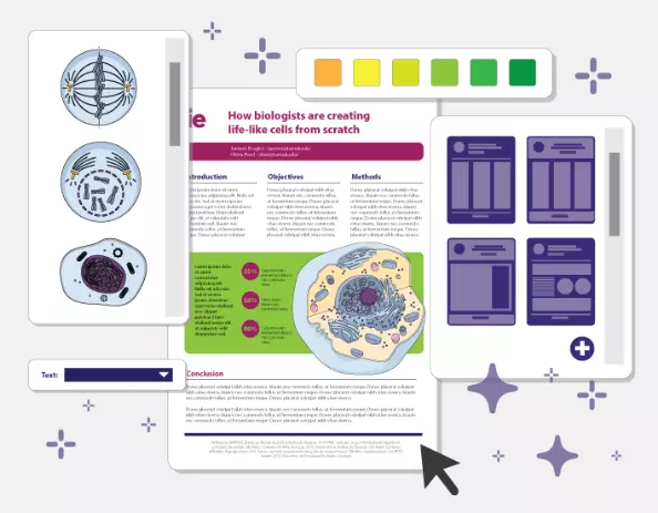
Mind the Graph: your next favorite presentation tool
Are you tired of boring presentations created with low-quality Google images? Get to know Mind the Graph and its amazing design features that will help you create beautiful presentations with the best fonts and even better illustrations. Sign up for free and start exploring their gallery of more than 300 templates to inspire your next creations.


Subscribe to our newsletter
Exclusive high quality content about effective visual
communication in science.