Infographics must employ an organization that literally “talks” with the story. Keep your objective in mind while choosing how to useful organize the infographic. Essentially, an infographic is as useful as it organizes the information in a pleasant and visually appealing way.
It’s important to keep in mind a certain hierarchy while organizing the infographic. What is more important should be highlighted and, therefore, receive more attention.
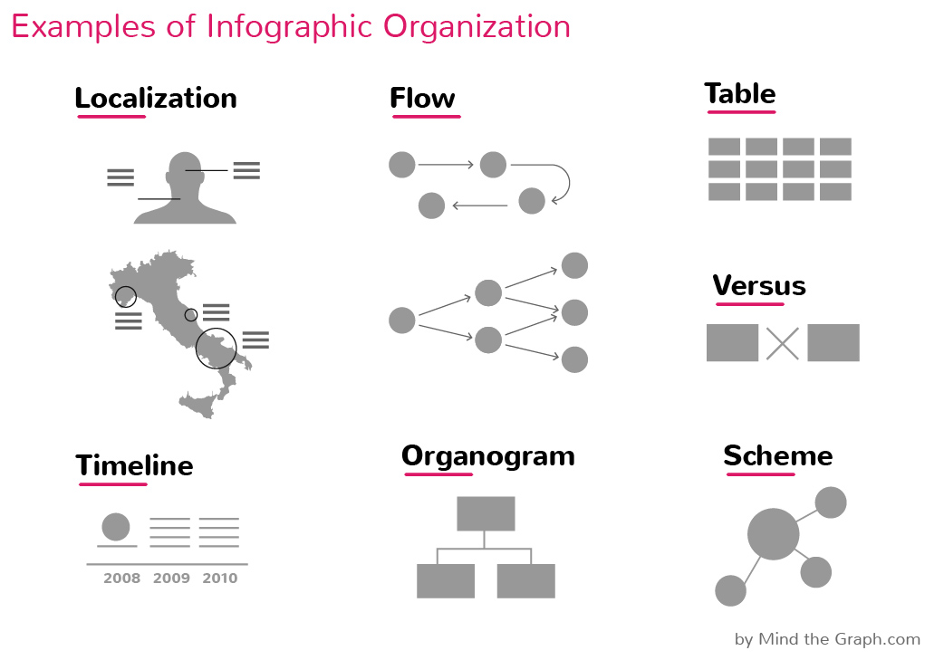
The most common organization frameworks are: tables, schemes, fluxogramas, organogramas and timelines. Each one is more or less appropriated, depending on the case. Your intention is to create a simple and fluid reading experience.
Depending on the nature of your information, you can decide a more “narrative” or “exploratory” organization. Read below the characteristics of each one and when to use different types of data organization.
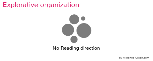
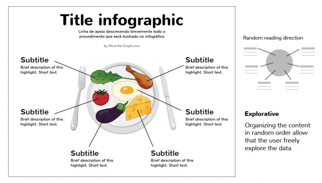
Explorative: when there is no need of a particular reading sequence for the infographic. The data is organized, but alternative perspectives and conclusions can be drawn from the data. The reader is welcome to explore and compare the data in charts or tables, bringing his own perspective. Explorative infographics are often associated with data visualization
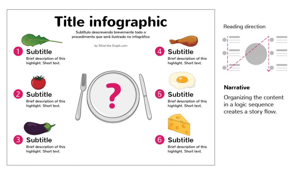
Narrative: when you organize the information in a oriented reading sequence. You literally guide the reader through the infographic and presents a statement/conclusion that includes your perspective about the subject.

Tip: the narrative becomes utterly evident when indicated with a sequence of numbers or arrows, for instance.
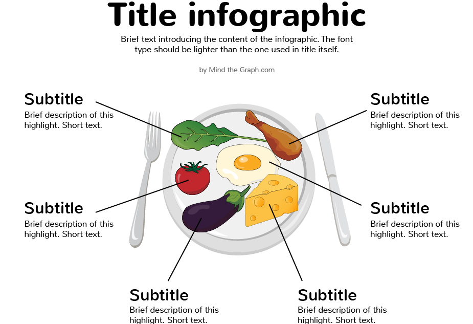
Recapitulating, you must have reliable data to create an infographic. The information source and the data itself are the two main points of credibility to your infographic. Afterwards you’l decide whether to present is text, visual metaphor or a chart. We will discuss data visualization in a specific topic of this post series, [coming soon], but see below an interesting example of the same infographic presented in different organizations. You can also call it layout, if you want.
See how it works in the example
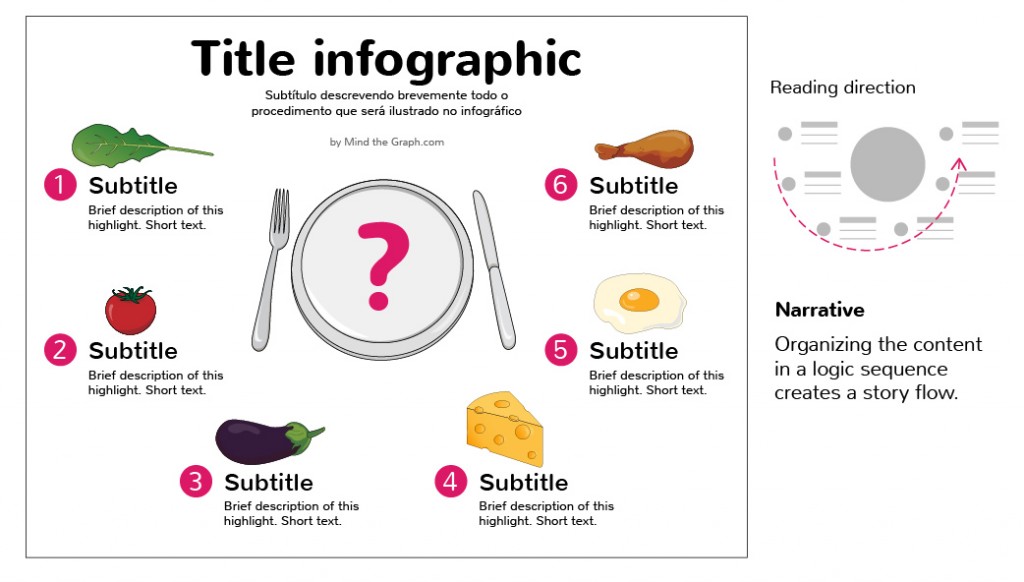
Now it’s your turn. Which one of them would you rate as explorative or narrative?
Important: you don’t need any specific design software to create the organization of your infographic. Pen and paper does the job. In fact, we recommend that you create rapid drafts and explore different organizations before sitting in front of the computer.


Subscribe to our newsletter
Exclusive high quality content about effective visual
communication in science.