Transitions and other transitional words and phrases play a vital role in enhancing the flow and clarity of scientific visualizations. In the realm of research and data presentation, these tools serve as seamless connectors between different concepts, allowing for a smooth and logical progression of ideas. As scientists and researchers must communicate complex information effectively, understanding the power of transitions, transition words, and transitional phrases can significantly elevate the quality and impact of their visual content. This discussion will delve into the importance of these linguistic devices in scientific communication, highlighting their ability to improve comprehension and engagement within the scientific community.
Introduction to Transitions in Visualizations
The Role of Transitions in Scientific Data Representation
Transitions are key in scientific visualizations for guiding the viewer through a series of data points or conceptual illustrations. They act as bridges, facilitating a clear understanding of how one set of data relates to another. In scientific data representation, transitions help in highlighting changes, comparing results, or demonstrating a sequence of events. By effectively employing transitions, researchers can draw attention to the most pertinent aspects of their data, allowing for a narrative that unfolds logically and intuitively. This is especially critical when dealing with complex datasets where the risk of misinterpretation is high. Ultimately, well-executed transitions ensure that the viewer’s attention is focused on the intended progression, making the visualization not just informative, but also engaging.
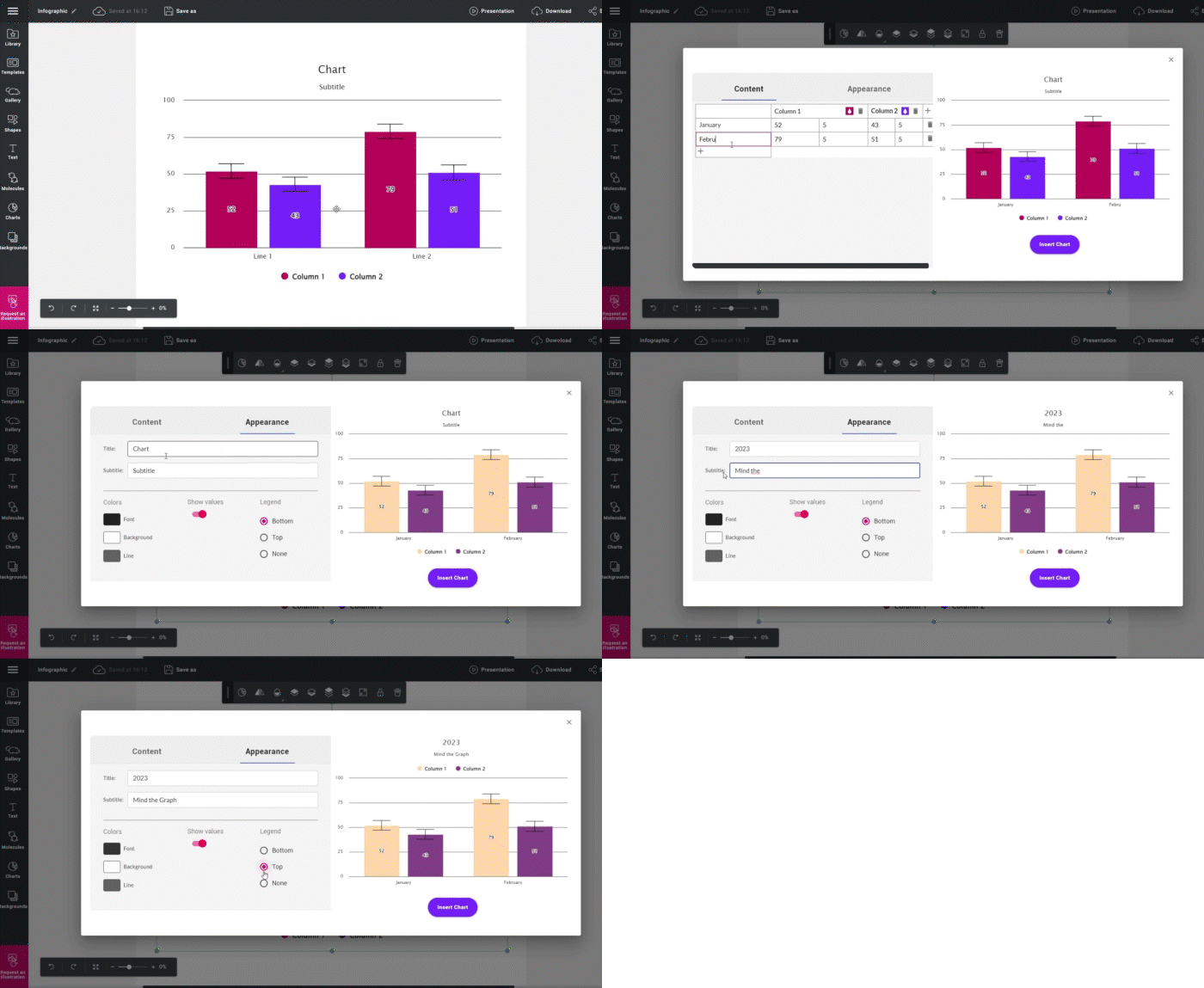
Smart Tip: Use Mind the Graph to represent your data.
Understanding the Basics of Transitional Phrases
Transitional phrases are linguistic tools that connect sentences and paragraphs in a way that makes the text flow logically and smoothly. In the context of scientific visualizations, these phrases are used to introduce a new section, indicate a change in direction, or highlight a relationship between two ideas. Common transitional phrases include ‘however’, ‘furthermore’, ‘in contrast’, and ‘as a result’. When used effectively, they prepare the reader for what’s coming next, making complex information more digestible. It’s important to choose the right transitional phrase to match the sentence and intended emphasis or relationship between ideas, as the wrong choice can lead to confusion rather than clarity. Mastery of transitional phrases can transform a series of disconnected statements into a coherent and persuasive narrative, crucial for successful scientific communication.
The Power of Transitions
Enhancing Data Interpretation through Transitions
Transitions serve a crucial role in the interpretation of data by providing the audience with a clear path through the information presented. They help to establish a logical flow, making previously complex data sets easier to understand and interpret. For instance, in a graph showing a trend over time, transitions can be used to guide the viewer’s eye from one data point to the next, emphasizing the direction and magnitude of changes. Without transitions, viewers might struggle to piece together how different parts of the data are related, which can lead to misinterpretation or oversight of key findings. By carefully planning transitions in visualizations, scientists ensure that their audience gains a deeper and more accurate understanding of the data, thereby enhancing the impact of their research.
Case Studies: Successful Use of Transitions
The effective use of transitions in scientific visualization is best illustrated through case studies. For example, a study on climate change might use animated maps to illustrate the transition between different projections, clearly demonstrating the potential impact over time. Another case could involve a health-related study where transitions show the spread of a disease across a geographical area, with each step in the transition highlighting a new area of infection and its intensity. These transitions not only help in conveying the data more vividly but also in creating a compelling story that resonates with the audience. In both cases, the use of transitions enables viewers to grasp the progression of complex phenomena in a structured and memorable way, which is imperative for driving home the message of the research findings.
Mastering Transitional Phrases
The Impact of Transitional Phrases on Data Coherence

Transitional phrases significantly enhance the coherence of data presentation by providing clear signposts for the audience’s journey through the information. They are instrumental in building a narrative that can be easily followed, ensuring that each piece of data presented is clearly connected to what comes before and after it. For instance, phrases like “leads to” or “corresponds with” can effectively indicate causality or correlation between data sets. Similarly, words such “on the other hand” or “in contrast” can help highlight differences or opposing trends within the data. Transitional phrases act like a thread that sews the pieces of data together into a cohesive whole, preventing the audience from getting lost in a sea of numbers and figures. Ultimately, mastering the use of transitional phrases is fundamental for researchers who aim to convey their findings with precision and clarity.
Examples of Transitional Phrases in Scientific Visualizations

In scientific visualizations, transitional phrases play a significant role in explaining the data and guiding the viewer. For instance, when presenting a sequence of events in a process, phrases like “initially,” “subsequently,” and “finally” can order and summarize the steps effectively. To show cause and effect, phrases such as “as a result,” “therefore,” and “consequently” are often used. When two pieces of data have a correlational relationship, phrases like “in parallel,” “similarly,” or “along with the same way” suggest alignment without implying direct causation. For contrasting data, “in contrast,” “on the other hand,” and “whereas” clearly signal to the audience that a difference is being highlighted. These phrases, when used appropriately within scientific visualizations, help to ensure that the intended message is conveyed clearly and that the transitions between different parts of the visualization are understood by the audience.
Adding Information:
- Moreover, recent studies have shown a correlation between sleep deprivation and decreased cognitive function.
- Additionally, the experiment was repeated three times to ensure the accuracy of the results.
Showing Cause and Effect:
- Therefore, it can be concluded that the new drug has a positive effect on reducing cholesterol levels.
- Consequently, further research is needed to determine the long-term effects of climate change on marine ecosystems.
Contrasting Ideas:
- However, the results of the study contradicted previous findings in this area.
- On the other hand, some argue that the benefits of genetically modified crops outweigh the risks.
Illustrating Examples:
- For example, several species of birds migrate to warmer regions during the winter months.
- Such as, the prevalence of obesity has increased significantly over the past decade.
Summarizing or Concluding:
- In conclusion, the research suggests that regular exercise can improve overall health.
- To sum up, the study highlights the importance of early intervention in cases of childhood development disorders.
The Synergy of Transitions and Transitional Phrases
Improving Visual Narratives with Combined Techniques
The combination of transitions in visualizations and transitional phrases in accompanying text creates a powerful synergy that can significantly improve visual narratives. When both techniques are aligned, they enhance each other’s effectiveness in guiding the audience through the narrative. For instance, a graph that shows the gradual increase in temperature over time can be effectively complemented with transitional phrases like the word “gradually” or “steadily increasing.” This dual strategy ensures that the audience not only sees the visual transition but also reads a textual cue that reinforces the message. This cohesive approach is particularly valuable when dealing with complex or multilayered data, where the risk of losing the audience’s attention or confusing them is high. Utilizing both transitions and transitional phrases strategically allows researchers to craft a more compelling and digestible story out of their data.
The example presented above is a template available for custom on Mind the Graph.
Real-world Applications and Observations
In real-world scenarios, the effective use of transitions and transitional phrases can be seen across various fields of scientific inquiry. For example, in environmental studies, transitions in visual data might show the progression of deforestation over time, with transitional phrases in the narrative explaining the factors contributing to these changes. In medicine, a timeline of patient recovery might use visual transitions to depict improvements in health, while the accompanying text provides context with phrases and transition words like “following treatment” or “as a result of intervention.” These techniques are also applied in fields such as astronomy, where visuals transition between images of celestial bodies at different times, and the text guides the viewer with phrases such as “over the millennia” or “transitioning to the present day.” Observing these applications highlights how transitions and transitional phrases are essential tools for researchers and scientists to communicate their findings effectively.
Conclusion: Transitions and Transitional Phrases – A Powerful Tool
Charting the Future of Scientific Visualizations

The future of scientific visualizations is closely intertwined with the continued innovation in the use of transitions and transitional phrases. As data becomes more complex and the need for clear communication grows, these tools will become even more integral to the success of scientific storytelling. Advances in technology will likely bring new types of transitions, perhaps interactive or three-dimensional, which will offer novel ways to present data. Similarly, the language used to describe and connect data points will evolve, requiring researchers to adapt their use of transitional phrases to new formats and audiences. The commitment to improving these aspects of scientific writing and visualizations will be crucial for researchers who aim to share their discoveries with peers and the public. Effective use of transitions and transitional phrases will remain a key skill in the ever-expanding toolkit of scientists and communicators alike.
Final Thoughts and Key Takeaways
In conclusion, the strategic use of transitions and transitional phrases is essential in scientific visualization. These elements not only enhance the clarity and flow of visual data but are also critical for audience comprehension and engagement. Key takeaways include the need to use transitions to guide the viewer through the data, the importance of choosing the right transitional words and phrases to maintain coherence, and the powerful combination of visual and textual transitions in conveying complex information. As the volume and complexity of data grow, the ability to effectively communicate research findings becomes more vital. Scientists and researchers should consider transitions and transitional phrases as indispensable tools in their communication arsenal, ensuring that their visualizations achieve the desired impact. Moving forward, the mastery of these elements will continue to set apart compelling scientific storytelling from the merely adequate.
Visually Appealing Figures For Your Research
Mind the Graph: Transforming scientific figures with ease and impact. Create visually stunning figures that captivate audiences, communicate complex concepts, and elevate the impact of your research. Experience the power of visual communication with Mind the Graph and revolutionize your scientific presentations. Sign up for free!

Subscribe to our newsletter
Exclusive high quality content about effective visual
communication in science.

