Pearson correlation is a fundamental statistical method used to understand the linear relationships between two continuous variables. Quantifying the strength and direction of these relationships, the Pearson correlation coefficient offers critical insights widely applicable across various fields, including research, data science, and everyday decision-making. This article will explain the fundamentals of Pearson correlation, including its definition, calculation methods, and practical applications. We will explore how this statistical tool can illuminate patterns within data, the importance of understanding its limitations, and the best practices for accurate interpretation.
What is Pearson Correlation?
The Pearson correlation coefficient, or Pearson’s r, quantifies the strength and direction of a linear relationship between two continuous variables. Ranging from -1 to 1, this coefficient indicates how closely the data points in a scatterplot align with a straight line.
- A value of 1 implies a perfect positive linear relationship, meaning that as one variable increases, the other consistently increases as well.
- A value of -1 indicates a perfect negative linear relationship, where one variable increases as the other decreases.
- A value of 0 suggests no linear correlation, meaning the variables do not have a linear relationship.
Pearson correlation is widely used in science, economics, and social sciences to determine whether two variables move together and to what extent. It helps assess how strongly variables are related, making it a crucial tool for data analysis and interpretation.
How to Calculate the Pearson Correlation Coefficient
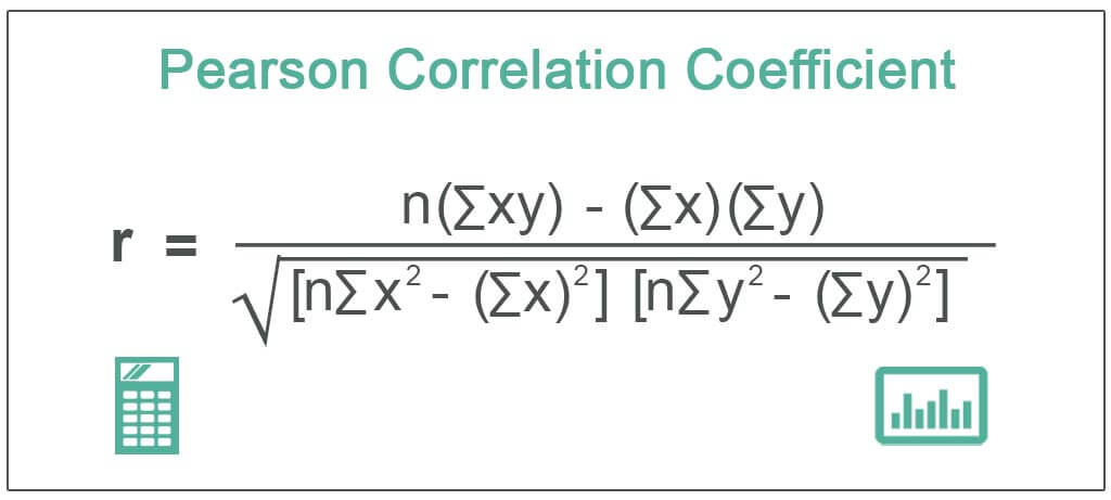
The Pearson correlation coefficient (r) is calculated using the following formula:

Where:
- x and y are the two variables being compared.
- n is the number of data points.
- ∑xy is the sum of the product of paired scores (x and y).
- ∑x2 and ∑y2 are the sums of squares for each variable.
Step-by-Step Calculation:
- Collect Data: Gather paired values for variables x and y.
Example:
x=[1,2,3]
y=[4,5,6]
- Calculate the Sum for x and y:
∑x is the sum of the values in x.
∑y is the sum of the values in y.
For the example:
∑x=1+2+3=6
∑y=4+5+6=15
- Multiply x and y for Each Pair:
Multiply each pair of x and y values, and find ∑xy.
xy=[1×4,2×5,3×6]=[4,10,18]
∑xy=4+10+18=32
- Square Each x and y Value:
Find the square of each x and y value, then sum them to get ∑x2 and ∑y2.
x2=[12,22,32]=[1,4,9]
∑x2=1+4+9=14
y2=[42,52,62]=[16,25,36]
∑y2=16+25+36=77
- Plug Values into the Pearson Formula: Now, substitute the values into the Pearson correlation formula:
r = (n∑xy – ∑x∑y) / √[(n∑x² – (∑x)²) * (n∑y² – (∑y)²)]
r = (3 × 32 – 6 × 15) / √[(3 × 14 – (6)²) × (3 × 77 – (15)²)]
r = (96 – 90) / √[(42 – 36) × (231 – 225)]
r = 6 / √[6 × 6]
r = 6 / 6 = 1
In this example, the Pearson correlation coefficient is 1, indicating a perfect positive linear relationship between the variables x and y.
This step-by-step approach can be applied to any dataset to manually calculate Pearson correlation. However, software tools like Excel, Python, or statistical packages often automate this process for larger datasets.
Why Pearson Correlation is Important in Statistical Analysis
In Research
The Pearson correlation is a key statistical tool in research for identifying and quantifying the strength and direction of linear relationships between two continuous variables. It helps researchers understand whether and how strongly two variables are related, which can provide insights into patterns and trends within datasets.
Pearson correlation helps researchers determine whether variables move together in a consistent way, either positively or negatively. For example, in a dataset measuring study time and exam scores, a strong positive Pearson correlation would suggest that increased study time is associated with higher exam scores. Conversely, a negative correlation could indicate that as one variable increases, the other decreases.
Examples of Use in Various Research Fields:
Psychology: Pearson correlation is often used to explore relationships between variables like stress levels and cognitive performance. Researchers can assess how an increase in stress may impact memory or problem-solving abilities.
Economics: Economists use Pearson correlation to study the relationship between variables such as income and consumption, or inflation and unemployment, helping them understand how economic factors influence each other.
Medicine: In medical research, Pearson correlation can identify relationships between different health metrics. For example, researchers might investigate the correlation between blood pressure levels and heart disease risk, aiding in early detection and preventive care strategies.
Environmental Science: Pearson correlation is useful in exploring relationships between environmental variables, such as temperature and crop yield, allowing scientists to model the impacts of climate change on agriculture.
Overall, Pearson correlation is an essential tool across diverse research fields for uncovering meaningful relationships and guiding future studies, interventions, or policy decisions.
In Everyday Life
Understanding Pearson correlation can be incredibly useful in daily decision-making, as it helps to identify patterns and relationships between different variables that impact our routines and choices.
Practical Applications and Examples:
Fitness and Health: Pearson correlation can be applied to assess how different factors, such as workout frequency and weight loss, are related. For example, tracking exercise habits and body weight over time may reveal a positive correlation between regular physical activity and weight reduction.
Personal Finance: In budgeting, Pearson correlation can help analyze the relationship between spending habits and savings. If someone tracks their monthly expenses and savings rates, they might find a negative correlation, indicating that as spending increases, savings decrease.
Weather and Mood: Another everyday use of correlation could be in understanding the impact of weather on mood. For instance, a positive correlation may exist between sunny days and improved mood, whereas rainy days might correlate with lower energy levels or sadness.
Time Management: By comparing hours spent on specific tasks (e.g., study time) and productivity or performance outcomes (e.g., grades or work efficiency), Pearson correlation can help individuals understand how time allocation affects results.
Benefits of Understanding Correlations in Common Scenarios:
Improved Decision-Making: Knowing how variables are connected allows individuals to make informed decisions. For example, understanding the correlation between diet and health can lead to better eating habits that promote well-being.
Optimizing Outcomes: People can use correlations to optimize their routines, such as discovering how sleep duration correlates with productivity and adjusting sleep schedules accordingly to maximize efficiency.
Identifying Patterns: Recognizing patterns in daily activities (like the correlation between screen time and eye strain) can help individuals modify behaviors to reduce negative effects and improve overall quality of life.
Applying the concept of Pearson correlation in everyday life allows people to gain valuable insights into how different aspects of their routines interact, enabling them to make proactive choices that enhance health, finances, and well-being..
Interpreting Pearson Correlation
Values and Significance
The Pearson correlation coefficient (r) ranges from -1 to 1, and each value provides insight into the nature and strength of the relationship between two variables. Understanding these values helps in interpreting the direction and degree of correlation.
Coefficient Values:
1: A value of +1 indicates a perfect positive linear relationship between two variables, meaning that as one variable increases, the other increases in perfect proportion.
-1: A value of -1 indicates a perfect negative linear relationship, where as one variable increases, the other decreases in perfect proportion.
0: A value of 0 suggests no linear relationship between the variables, meaning changes in one variable do not predict changes in the other.
Positive, Negative, and Zero Correlations:
Positive Correlation: When r is positive (e.g., 0.5), it implies that both variables tend to move in the same direction. For example, as the temperature rises, ice cream sales may increase, showing a positive correlation.
Negative Correlation: When r is negative (e.g., -0.7), it suggests that the variables move in opposite directions. An example could be the relationship between exercise frequency and body fat percentage: as exercise increases, body fat tends to decrease.
Zero Correlation: An r of 0 means there is no discernible linear relationship between the variables. For instance, there might be no linear correlation between shoe size and intelligence.
In general:
0.7 to 1 or -0.7 to -1 indicates a strong correlation.
0.3 to 0.7 or -0.3 to -0.7 reflects a moderate correlation.
0 to 0.3 or -0.3 to 0 signifies a weak correlation.
Understanding these values allows researchers and individuals to determine how closely related two variables are and whether the relationship is significant enough to warrant further attention or action.
Limitations
While the Pearson correlation is a powerful tool for assessing linear relationships between variables, it does have limitations and may not be appropriate in all scenarios.
Situations Where Pearson Correlation May Not Be Appropriate:
Non-Linear Relationships: Pearson correlation only measures linear relationships, so it may not accurately reflect the strength of association in cases where the relationship between variables is curved or non-linear. For example, if variables have a quadratic or exponential relationship, Pearson correlation might underestimate or fail to capture the true relationship.
Outliers: The presence of outliers (extreme values) can significantly distort Pearson correlation results, giving a misleading representation of the overall relationship between variables. A single outlier can artificially inflate or deflate the correlation value.
Non-Continuous Variables: Pearson correlation assumes that both variables are continuous and normally distributed. It may not be appropriate for categorical or ordinal data, where relationships are not necessarily linear or numerical in nature.
Heteroscedasticity: When the variability of one variable differs across the range of another (i.e., when the spread of data points is not constant), Pearson correlation might give an inaccurate measure of the relationship. This condition is known as heteroscedasticity, and it can distort the coefficient.
Limitation to Linear Relationships Only: Pearson correlation specifically measures the strength and direction of linear relationships. If the variables are related in a non-linear manner, Pearson correlation will not detect this. For example, if one variable increases at an increasing rate relative to another (as in an exponential or logarithmic relationship), Pearson correlation may show a weak or zero correlation, despite the existence of a strong relationship.
To address these limitations, researchers may use other methods, such as Spearman’s rank correlation for ordinal data or non-linear regression models to better capture complex relationships. In essence, while Pearson correlation is valuable for linear relationships, it must be applied with caution, ensuring that the data meet the assumptions required for accurate interpretation.
How to Use Pearson Correlation
Tools and Software
Calculating the Pearson correlation can be done manually, but it’s much more efficient and practical to use statistical tools and software. These tools can quickly compute the Pearson correlation coefficient, handle large datasets, and offer additional statistical features for comprehensive analysis. There are several popular software and tools available for calculating Pearson correlation:
Microsoft Excel: A widely used tool with built-in functions to calculate Pearson correlation, making it accessible for basic statistical tasks.
SPSS (Statistical Package for the Social Sciences): This powerful software is designed for statistical analysis and is commonly used in social sciences and medical research.
R Programming Language: A free and open-source programming language specifically designed for data analysis and statistics. R offers extensive flexibility and customizability.
Python (with libraries like Pandas and NumPy): Python is another powerful, open-source language for data analysis, with user-friendly libraries that simplify calculating Pearson correlation.
GraphPad Prism: Popular in the biological sciences, this software offers an intuitive interface for statistical analysis, including Pearson correlation.
Basic Guide to Using These Tools for Analysis:
Microsoft Excel:
- Input your data into two columns, one for each variable.
- Use the built-in function =CORREL(array1, array2) to compute Pearson correlation between the two datasets.
SPSS:
- Import your data into SPSS.
- Go to Analyze > Correlate > Bivariate, and select the variables for analysis.
- Choose “Pearson” under the correlation coefficient options and click “OK.”
R Programming:
- Input your data into R as vectors or data frames.
- Use the function cor(x, y, method = “pearson”) to calculate the Pearson correlation.
Python (Pandas/NumPy):
- Load your data using Pandas.
- Use df[‘variable1’].corr(df[‘variable2’]) to compute the Pearson correlation between two columns.
GraphPad Prism:
- Input your data into the software.
- Select the “Correlation” analysis option, choose Pearson correlation, and the software will generate the correlation coefficient along with a visual scatterplot.
These tools not only calculate the Pearson correlation coefficient but also provide graphical outputs, p-values, and other statistical measures that help interpret the data. Understanding how to use these tools enables efficient and accurate correlation analysis, essential for research and data-driven decision-making.
Here you can find Infographic and Visual Design Statistics
Practical Tips to Use Pearson Correlation
Data Preparation and Checks Before Calculating Correlation:
Ensure Data Quality: Verify that your data is accurate and complete. Check for and address any missing values, as they can skew the results. Incomplete data may lead to incorrect correlation coefficients or misleading interpretations.
Check for Linearity: Pearson correlation measures linear relationships. Before calculation, plot your data using a scatterplot to visually assess if the relationship between the variables is linear. If the data shows a non-linear pattern, consider alternative methods, such as Spearman’s rank correlation or non-linear regression.
Verify Normality: Pearson correlation assumes that the data for each variable is approximately normally distributed. Although it is somewhat robust to deviations from normality, significant deviations can affect the reliability of the results. Use histograms or normality tests to check the distribution of your data.
Standardize Data: If the variables are measured in different units or scales, consider standardizing them. This step ensures that the comparison is not biased by the scale of measurement, although Pearson correlation itself is scale-invariant.
Common Mistakes to Avoid When Interpreting Results:
Overestimating Strength: A high Pearson correlation coefficient does not imply causation. Correlation only measures the strength of a linear relationship, not whether one variable causes changes in another. Avoid jumping to conclusions about causation based solely on correlation.
Ignoring Outliers: Outliers can disproportionately influence the Pearson correlation coefficient, leading to misleading results. Identify and assess the impact of outliers on your analysis. Sometimes, removing or adjusting outliers can provide a clearer picture of the relationship.
Misinterpreting Zero Correlation: A Pearson correlation of zero indicates no linear relationship, but it does not mean there is no relationship at all. The variables might still be related in a non-linear fashion, so consider other statistical methods if you suspect a non-linear association.
Confusing Correlation with Causation: Remember that correlation does not imply causation. Two variables might be correlated due to the influence of a third, unobserved variable. Always consider the broader context and use additional methods to explore potential causal relationships.
Neglecting the Size of the Sample: Small sample sizes can lead to unstable and unreliable correlation estimates. Ensure your sample size is sufficient to provide a reliable measure of the correlation. Larger samples generally provide more accurate and stable correlation coefficients.
Key Takeaways and Considerations
Pearson correlation is a fundamental statistical tool used to measure the strength and direction of linear relationships between two continuous variables. It provides valuable insights across various fields, from research to everyday life, helping to identify and quantify relationships in data. Understanding how to correctly calculate and interpret Pearson correlation allows researchers and individuals to make informed decisions based on the strength of associations between variables.
However, recognizing its limitations, particularly its focus on linear relationships and sensitivity to outliers, is crucial. Proper data preparation and avoiding common pitfalls—such as confusing correlation with causation—are essential for accurate analysis. Using Pearson correlation appropriately and considering its constraints allows you to effectively leverage this tool to gain meaningful insights and make better decisions.
Browse Through 75.000+ Scientifically Accurate Illustrations In 80+ Popular Fields
Mind the Graph is a powerful tool designed to assist scientists in visually communicating complex research findings. With access to over 75,000 scientifically accurate illustrations across 80+ popular fields, researchers can easily find visual elements that enhance their presentations, papers, and reports. The platform’s wide range of illustrations ensures that scientists can create clear, engaging visuals tailored to their specific area of study, whether in biology, chemistry, medicine, or other disciplines. This vast library not only saves time but also allows for more effective communication of data, making scientific information accessible and understandable to both experts and the general public.


Subscribe to our newsletter
Exclusive high quality content about effective visual
communication in science.

