2分で読める
11/05/2025
Mind The Graph Scientific Blogは、科学者が科学を分かりやすく伝える方法を学ぶことを目的としています。
AI has quietly become a co-author in modern research. From grammar checks to literature reviews, tools powered by artificial intelligence are helping academics write faster and smarter. But there’s a growing challenge — most researchers don’t disclose their use of AI, even when journals require it. In fact, recent data shows that over 75% of authors using AI fail to mention it in their submissions. With journal policies tightening and transparency becoming a pillar of academic integrity, understanding how and when to disclose AI use has become essential. To unpack this important topic, Mind the Graph along with Paperpal is hosting a free webinar as part of The AI Exchange […]
Over the past few years, AI tools for researchers have become crucial, simplifying everything from […]
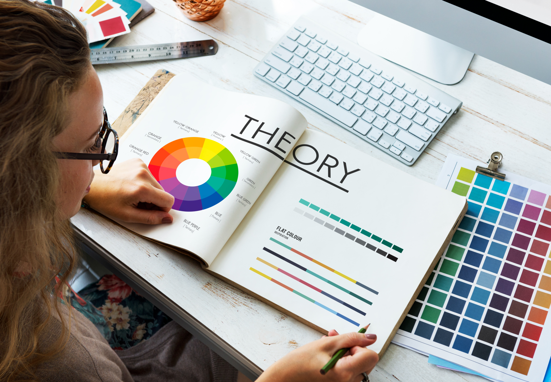
Choosing the right color palette is one of the most important steps in creating clear, […]
AI tools have revolutionized the way researchers work, making academic writing and scientific communication more […]
In a world where attention spans are shrinking, visual learning is no longer a “nice-to-have” […]
Great academics know that powerful visuals can transform research—but not all tools give you that […]
A scientific poster is an important and widely used format for sharing research in academic […]
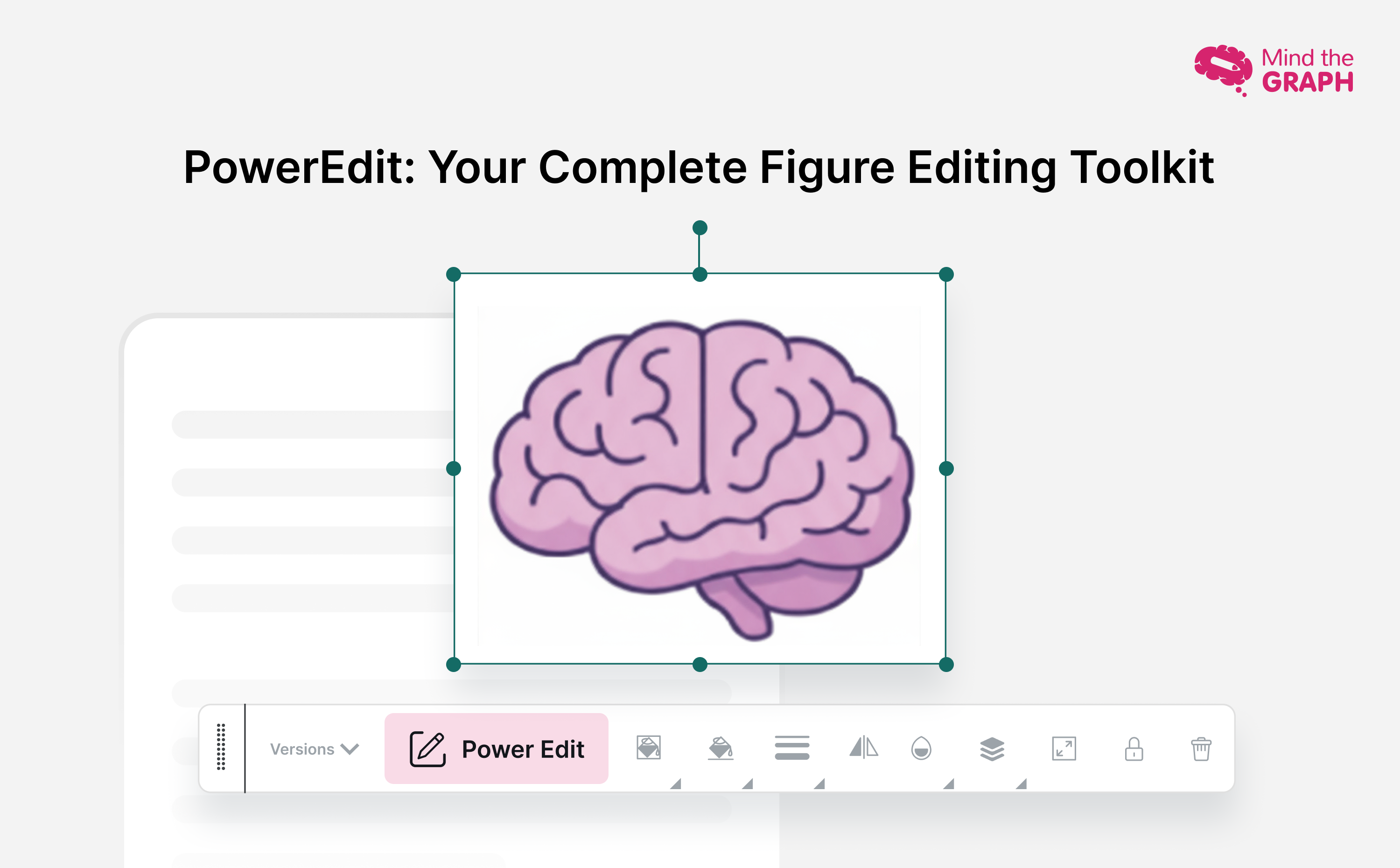
Creating compelling scientific illustrations shouldn’t require a PhD in graphic design or drain your research […]
Research design is the backbone of any successful study—it’s the structured plan that guides how […]
Generative AI tools are transforming how researchers and students write, yet many still face uncertainty […]
As social media grows noisier, infographics in social media have become one of the most […]
色は生命と科学に不可欠な要素である。それはあなたの注意を引くことができ、[...]を呼び起こす
サイエンティフィック・イラストレーションは、学問分野や地理的なギャップを埋める普遍的な言語とみなされている。[...]