2分で読める
03/19/2026
Mind The Graph Scientific Blogは、科学者が科学を分かりやすく伝える方法を学ぶことを目的としています。
Still juggling multiple papers, citations, and drafts while working on your research manuscript? This is your chance to see a smarter, faster way to bring everything together and improve your document. Join our free webinar, Your Best Manuscript Yet: Unlocking Paperpal’s Most Powerful Features, and learn how to move from scattered research to a structured, submission-ready manuscript, all in one place. Join Us for the Live Webinar: Your Best Manuscript Yet: Unlocking Paperpal’s Most Powerful Features Date: Thursday, March 26, 2026Time: 4:00 PM IST | 10:30 AM GMT | 6:30 AM EDTDuration: 1 hourLanguage: English Led by Dyanne Coelho, Product Manager at Paperpal, this session will show you how to simplify your research and writing workflows and save hours on your next manuscript. In this session, you’ll learn how to: Whether you’re preparing your essay, thesis, or manuscript for publication, this session will help you save time, reduce back-and-forth, and improve the quality of your work with practical workflows you can start using right away. Don’t miss this opportunity to transform […]
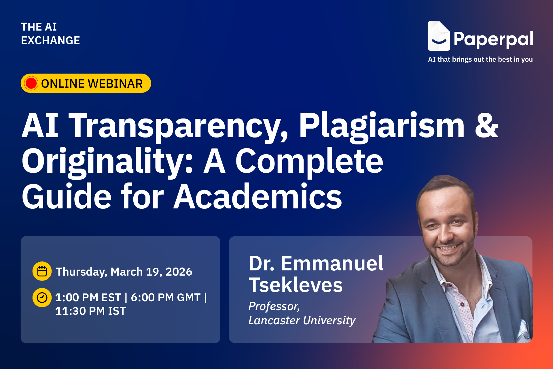
As AI becomes embedded in academic workflows, the real question is no longer whether to use it, but how to use it responsibly without risking plagiarism, rejection, or misconduct. Join our free webinar on ‘AI Transparency, Plagiarism & Originality: A Complete Guide for Academics,’ led by Dr. Emmanuel Tsekleves, Professor at Lancaster University, and learn where to draw the line when using AI in academic writing.
日付 Thursday, March 19, 2026
Time: 1:00 PM EST | 6:00 PM GMT | 11:30 PM IST
Duration: 1 hour
Language: English
During this engaging session, you’ll discover how to improve the clarity and impact of your research visuals. Here’s what you’ll learn:
Bring your questions to the live Q&A and gain actionable guidance you can apply immediately.
Dr. Emmanuel Tsekleves
Professor, Lancaster University

Emmanuel Tsekleves is a Professor at Lancaster University and a former Director of the Future Cities Research Institute. With 130+ published research articles, he is a leading voice in research excellence and academic integrity. As an advocate for responsible AI use in academia, he guides researchers worldwide on ethical AI integration in research workflows. Prof. Emmanuel’s advice on academic careers has inspired 220,000+ researchers across multiple platforms. He serves on the Executive Board of the Design Research Society, has supervised 14 completed PhDs, and has extensive practical experience in research supervision and academic writing standards.
Don’t miss this opportunity to learn how to communicate your research more effectively through powerful scientific visuals — Register for free today!
Mind the Graph is an easy-to-use visualization platform for researchers and scientists that enables fast creation of precise publication-ready graphical abstracts, infographics, posters, and slides. With 75,000+ scientifically accurate illustrations made by experts and hundreds of templates across 80+ major research fields, you can produce polished visuals in minutes — no design skills required.
If you’re working on a research article, thesis chapter, grant proposal, or even a class essay, you already know how essential originality is. Journals, universities, and conference committees are more vigilant than ever about plagiarism, and even accidental similarities can slow down publication or raise uncomfortable questions.
Plagiarism checkers are popular, but some focus on web‑based matches; others tap into scholarly databases, while a few bundle plagiarism detection with grammar and writing support. And not all of them are equally reliable when it comes to academic content.
In this blog, we break down the top 5 plagiarism checkers for academics, from accuracy and database coverage to ease of use and pricing. This guide will help you understand what each tool offers and which one might be the best fit for your workflow.
免責事項
This article is based on independent research and is intended to provide an unbiased comparison of various AI writing tools, including our own. While we strive to present accurate and up-to-date information, features, and pricing, we recommend checking directly with the respective companies for the latest details, as offerings may change over time. Additionally, any opinions expressed here reflect the author’s perspective and may not represent the official stance of the companies/tools discussed.
Top 6 Plagiarism Checkers for Research: Quick Comparison
| Tool | Best For | Free Plan Availability |
| ペーパーパル | Researchers, academics, PhD scholars preparing manuscripts for journal submissions | 7,000 words/month |
| Scribbr | Students writing theses, dissertations, and those needing one‑time, detailed checks | Preview scans without any word limit |
| グラマリー | Undergraduates, casual academic writers | 10,000 characters per check (~1,500–2,000 words) |
| クエテキスト | Budget‑conscious students, early‑draft writers needing simple scans | 500 words per check |
| Copyleaks | Researchers handling multilingual content, educators checking AI‑generated text | 10-25 credits (~2,500–6,250 words) |
Paperpal checks your document against a massive research-focused database, scanning 99–100 billion web pages and 200 million+ open-access articles to catch both direct matches and subtle paraphrasing. Its similarity report highlights overlaps with color-coded markers and side-by-side source comparisons, making it easy to identify and revise problematic sections.
What makes ペーパーパル appealing for academic writers is its generous free limit of 7,000 words per month. That’s often enough to fully check a class essay, thesis chapter, conference paper draft, or even a short journal manuscript, without committing to a paid plan.
主な特徴
Scribbr compares your document against a huge academic + web database, including 99 billion webpages and 8 million publications. Scribbr offers a free preview scan that gives you a quick sense of whether your text might contain similarities, and if you need deeper insights, you can upgrade to a paid detailed report, starting at $19.95 for up to 7,500 words.
主な特徴
Grammarly is a popular choice for students and everyday academic writers because it combines grammar, style, and plagiarism checking in one simple tool. Its plagiarism checker scans your work against billions of webpages plus the ProQuest academic database,
The free version offers a basic scan of up to 10,000 characters (~1,500–2,000 words), while full plagiarism detection is part of Grammarly Premium, priced at $15/month.
主な特徴
Quetext’s plagiarism checker is built for students, teachers, and writers who need quick similarity scans without a complicated workflow. Its free version allows a small test scan of up to 500 words to give you a sense of how much of your text overlaps with online sources.
It uses its proprietary DeepSearch™ technology to go beyond basic copy‑paste detection and highlight both exact matches and near‑similar phrasing, making it helpful for early‑draft checks. Quetext is especially popular among budget‑conscious because of its simple interface and affordable plans, with Premium at $9.99/month with 100,000 words.
主な特徴
Copyleaks is known for its ability to detect similarities across multiple languages and formats, making it a strong option for users who need more than just standard web‑based checks. It’s designed to pick up reworded text, cross‑language similarities, code overlaps, image‑based plagiarism, and hybrid human-AI text with over 99% claimed accuracy; making it far more comprehensive than standard checkers.
Copyleaks offers a limited free trial with 2,500 free words, giving users a chance to test its capabilities before switching to a paid plan, which starts at $13.99/month with 25,000 words.
主な特徴
Each plagiarism checker brings something useful to the table; Grammarly for quick classroom‑level scans, Scribbr for detailed one‑off reports, Quetext for straightforward early‑draft checks, and Copyleaks for strong multilingual and AI‑focused detection.
But if you’re looking for a tool that truly supports academic writing from start to submission, ペーパーパル stands out. With its research‑focused database, clear similarity insights, and 7,000 free words/month for plagiarism checks, it offers one of the most balanced, reliable experiences for students and researchers aiming for publication‑ready work.
Brilliant research can lose impact for a surprisingly simple reason: poor visual communication.
Reviewers don’t have time to decode confusing diagrams. Readers won’t struggle through tiny labels and inconsistent layouts. And when your figures don’t communicate clearly, your science loses impact, no matter how strong it is.
Editors and reviewers frequently flag issues such as overcrowded figures, inconsistent formatting, and unclear diagrams during peer review. In fact, guidelines from major publishers like Elsevier and Springer consistently emphasize figure clarity, resolution, and readability as critical submission requirements.
The reality is this: researchers are trained to generate data not necessarily to design visuals. Yet figures are often the first (and sometimes only) part of a paper that readers examine.
The good news? Most research visualization mistakes are easy to fix once you know what to look for. In this article, we are going to break down the most common designing mistakes researchers make and how to correct them quickly.
Multiple panels, tiny labels, dense annotations, long legends, when a figure carries too much information, it becomes difficult to read.
According to research on cognitive load theory (Sweller, 1988), when visuals are cluttered or poorly structured, they increase mental effort, making it harder for readers to interpret information accurately. In academic publishing, this translates to reviewer fatigue and misinterpretation.
The Fix: One Clear Message Per Figure
Each figure should communicate one main idea.
If you’re combining workflow, results, and conclusions in a single visual, consider splitting them. Use whitespace, increase readability, and remove non-essential elements.
Structured templates and scientifically accurate illustrations like those available in Mind the Graph can help you organize complex information without overcrowding your design.
Clear figures don’t oversimplify your research. They amplify it.
Another common mistake researchers make is designing figures where everything looks equally important. Same font size, same color weight, same spacing and no focal point.
When there’s no visual hierarchy, readers don’t know where to look first. Their eyes wander. The main finding gets lost inside supporting details.
Research in information design and visual perception shows that people scan visuals in patterns. If you don’t guide attention intentionally, the brain works harder to prioritize information on its own.
The Fix: Guide the Reader’s Eye
Every figure should have a clear entry point.
Use:
Ask yourself: If someone sees this for five seconds, what stands out first?
Many researchers rely on generic icons, copied images, or simplified graphics pulled from the internet. Sometimes the proportions are wrong. Sometimes biology isn’t accurate. Sometimes the style just doesn’t match the rest of the paper.
It may seem minor, but inaccurate or inconsistent visuals can reduce credibility. In scientific communication, visual precision matters.
The Fix: Use Scientifically Accurate Illustrations
Your figures should reflect the same rigor as your data. Use visuals that are scientifically correct, stylistically consistent, and appropriate for academic publishing. Instead of stretching PowerPoint shapes or repurposing random images, work with illustration libraries built specifically for research.
Mind the Graph offer thousands of peer-reviewed, scientifically accurate illustrations across disciplines, making it easier to create visuals that are both clear and credible.
Different font sizes in every figure, changing color palettes, one diagram in flat design, another in 3D, misaligned panels or uneven spacing; individually, these may seem small. Together, they make your manuscript feel unpolished.
Consistency builds trust. When your figures follow a coherent visual style, they look intentional and professional.
The Fix: Create a Simple Visual System
Decide on:
You don’t need to be a designer. You just need consistency.
You’ve finalized your figure and it looks great on your screen. Then comes submission and suddenly there’s a problem.
Wrong resolution. Incorrect dimensions. RGB instead of CMYK. Text too small. File size too large. Most journals have strict technical requirements for figures, and ignoring them can delay review or lead to immediate revision requests. According to major publishers like Elsevier and Wiley, figure quality and formatting are among the most common technical issues flagged during submission.
The Fix: Design With Submission in Mind
Before finalizing any figure, check:
Designing with these constraints early saves time later. A figure that meets technical standards from the start reduces friction during submission and keeps the focus where it belongs: on your research.
It’s easy to assume your audience knows what you know. So abbreviations go unexplained, complex pathways skip intermediate steps; labels feel “obvious” and legends are minimal.
But not every reviewer is a narrow specialist. And not every reader shares your exact research background. When figures rely too heavily on assumed knowledge, they limit accessibility and potentially reduce citations across disciplines.
The Fix: Design for Clarity, Not Assumption
Ask yourself: Would someone adjacent to my field understand this?
Clear labeling, simple visual grouping, and short explanatory cues make a big difference.The goal isn’t to oversimplify your science. It’s to make it understandable without forcing the reader to decode it.
Figures often become a “final step” task. You finish the experiments, write the manuscript, analyze the data, and then, right before submission, you quickly assemble the visuals.
The result? Rushed layouts, inconsistent formatting, and design decisions made under deadline pressure.
When figures are treated as an afterthought, they rarely reach their full communicative potential.
The Fix: Integrate Visual Thinking Early
Start sketching figures while analyzing results, not after writing the discussion. Early visual planning helps you identify the core message sooner, remove unnecessary complexity, and structure your narrative more clearly.
When figures evolve alongside your research, they become sharper and more intentional.
In research, clarity is influence. You can run rigorous experiments, generate meaningful data, and write a solid manuscript but if your figures are confusing, your message weakens. Reviewers hesitate, and readers move on.
The good part? Most of these visual design mistakes are easy to fix. They don’t require artistic talent; they require intention.
When you treat figures as part of your scientific argument, not as decoration or a last-minute task, you elevate the entire paper. Clear visuals reduce cognitive load, improve understanding, and make your findings easier to remember and cite.
If designing figures still feels overwhelming, you’re not alone. Most researchers were never trained in visual communication. That’s exactly why Mind the Graph exist—to make scientific illustration simpler, faster, and aligned with academic standards.
Mind the Graph is an easy-to-use visualization platform for researchers and scientists that enables fast creation of precise publication-ready graphical abstracts, infographics, posters, and slides. With 75,000+ scientifically accurate illustrations made by experts and hundreds of templates across 80+ major research fields, you can produce polished visuals in minutes — no design skills required.
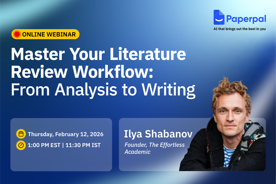
Ready to end the struggle of wading through endless PDFs, making sense of scattered notes, and dealing with slow progress on literature reviews? Join us for a free webinar led by academic expert Ilya Shabanov, who will share a faster, more structured way to read, analyze, and synthesize research using AI responsibly. You’ll also learn how Paperpal’s new Multi-PDF Chat feature, along with its research and writing tools, helps you craft clear, powerful literature reviews without compromising academic rigor.
日付 Thursday, February 12, 2026
Time: 1:00 PM EST | 11:30 PM IST
Duration: 1 hour
Language: English
Over this engaging session, you will learn how to:
This session is ideal for anyone looking to streamline literature reviews with responsible AI workflows. You’ll also have the opportunity to get your questions answered live and receive a certification of attendance.
Ilya Shabanov
Founder, The Effortless Academic

Ilya Shabanov is the creator of The Effortless Academic, a platform dedicated to helping academics excel with digital knowledge management, note-taking, and the use of various online tools available to research today (but known by few).
He is not a traditional academic and has spent over 10 years freelancing and co-founding the brain-training company NeuroNation, before switching to academia and starting a PhD in computational ecology. Drawing on his experience with knowledge management as a CEO and an entrepreneurial career, he founded The Effortless Academic as a way to share practical insights, tutorials, and courses designed to make scholarship more effective and less stressful for academics at all stages of their careers.
Don’t miss this chance to level up your literature reading and review process — Register for free today!
Mind the Graph is an easy-to-use visualization platform for researchers and scientists that enables fast creation of precise publication-ready graphical abstracts, infographics, posters, and slides. With 75,000+ scientifically accurate illustrations made by experts and hundreds of templates across 80+ major research fields, you can produce polished visuals in minutes — no design skills required.
Hyper-realistic AI generated content, fabricated text and images now comprise a considerable chunk of flagged academic submissions. So, the buzz and search for the best AI detectors is hardly surprising. The implications of fabricated studies with synthetic data, hallucinated citations, and cooked up images and visuals are dangerous and far-reaching.
As challenges from new tech arise, so do tailored remedies to restore balance. AI tools have the power to detect plagiarism, image manipulation, fabricated data, and other ethical concerns, including paper mills. Plagiarism checkers and AI checkers are therefore essential for maintaining scholarly standards, especially as submission volumes continue to grow. To avoid the proliferation of deceptive content in scholarly work, educators, researchers, and journal editors will want to use only the most reliable and best AI checkers available. At the same time, users have so many questions: How does an AI detector work? How accurate are AI detectors? And of course, which are the best AI content detectors out there?
The plethora of AI detection tools is sure to give anyone a case of analysis paralysis! Here is a handy table that can help compare the 7 best AI detectors at a glance (Table 1).
Table 1: Best AI Checkers Compared
| Tool | Primary purpose | Target audience | Key features | Claimed accuracy* | Pricing |
| ペーパーパル | Best AI detector for academic integrity | Students, researchers, & publishers | Trained on scholarly text; 3-band probability scale; sentence-level insights | 95%+ (Specific to academic text) | Get started for free (5 scans/day of AI detection. Up to 1,200 words per scan) Free for 7,500 words weekly Prime: $25/month (unlocks access to AI detection, plagiarism, writing, grammar, research and citation, submission readiness checks, and more). |
| GPTZero | Educational & general text detection | Educators, schools, & casual users | “Human-in-the-loop” writing reports, Chrome extension, LMS integration | 99% (on raw AI text) | 無料 (up to 10k words/month) Essential: ($10/month) for 150k words Premium: ($16/month) adds plagiarism scanning |
| ZeroGPT | Lightweight, fast text analysis | Bloggers, Freelance writers, & SEO | DeepAnalyze tech, multilingual support | 98%+ (claimed) | 無料 (up to 15k characters) プロ: $7.99/month for 100k characters per scan and batch processing |
| Copyleaks | Corporate compliance | Enterprise, Law firms, etc. | Detects AI in 30+ languages, advanced data security. | 99.1% | 無料 (trial) Personal plan: $13.99/month for 25,000 words per month |
| Originality. AI | Web content & SEO safety | Content agencies, Web publishers | Real-time fact-checker | 99% (with <1% false positives) | Pricing: Pay-as-you-go ($30 for 3,000 credits), 購読申し込み: $12.95/month for monthly credit allowances |
| Truthscan | Multimodal fraud prevention | Government, large enterprises | Detects AI in images, video, and voice | 99%+ (Forensic level) | Free trial (limited characters) プロ: $49/month |
| SynthID | Watermarking | Developers & media organizations | Detects watermarks at the pixel/token level. | Near 100% (for Google models) | 無料 (for developers/researchers, via waitlist/portal) |
An AI detector is a tool designed to determine whether a piece of content (text, images, video, or voice) was generated by AI or created organically by a human. These tools use sophisticated algorithms to identify certain telltale signs and inconsistencies that are characteristic of synthetic generation.
The main goal of such tools is to ensure authenticity and uphold integrity. In academic research, reliable AI detectors can verify manuscripts, theses, and data visuals for originality before peer review or publication, helping editors flag fabricated content while minimizing false positives.
Text detectors analyze writing style through mathematical metrics to see if it mirrors the predictable nature of LLMs. One is a measure of how predictable the wording is. AI models are designed to “predict” the next most likely word, often resulting in text that has high predictability. The second measure is “burstiness” or variation in sentence length and structure. Natural human writing is “bursty,” with a mix of long, complex sentences and short ones (think one- or two-word sentences!). AI-generated text tends to have sentences of uniform length with consistent flow. In fact, if you read AI-generated text aloud, it seems to drone on flatly.
How AI image detectors work is that they identify statistical patterns and visual inconsistencies that distinguish artificial content from human-created work. Image detectors use sophisticated algorithms to find “telltale signs” of synthetic generation that are often invisible to the human eye, e.g., pixel anomalies in visuals and lack of “noise.” Such tool are also good at “clone detection” to identify whether parts of an image have been duplicated from other online sources.
AI text checkers are highly accurate (95%–99% accuracy) at detecting pure AI text or “lazy” AI use (in other words, copy-pasted AI text). With human edited or hybrid text, however, detection accuracy drops to 80%–90%. When text is written by non-native English speakers, again, the reliability is lower. This is because non-native writing often follows simple, “predictable” patterns, i.e., with low perplexity and burstiness, appearing to AI detectors as machine logic.
AI detectors flag text that follows a highly logical, structured pattern—qualities often found in certain types of human writing. In 2023, when researchers ran the U.S. Constitution through popular detectors like GPTZero and ZeroGPT, it was flagged as 92% to 97% AI-generated! Excerpts from the Bible have frequently returned high AI scores, often exceeding 88%. What’s more, many professional content writers have found their work written well before ChatGPT came to the scene flagged as AI! The reasons for these include an overlap in training data, formal structure (with naturally lower perplexity and burstiness).
The best AI checkers like Paperpal use perplexity and burstiness metrics, hitting high (99%+) accuracy on benchmarks like “human-ChatGPT comparison corpus” or HC3. However, they cannot identify intellectual ownership or original ideas; they only assess the final output. Finally, because AI generators are constantly evolving, AI detectors must be frequently retrained to stay effective against newer models. Nevertheless, it is worth noting that Paperpal’s cross-verifying models are retrained every 90 days to ensure accuracy, reducing false positives by over 40%.
You Might Like Reading: Why Paperpal Built Its Academic AI Detector (And Why Binary Scores Don’t Tell the Full Story)
With AI content detection, things are not really black and white. In 2026, the market for AI detection has shifted from simple “human vs. machine” scores to sophisticated and specialized tools. Here are the 7 most accurate detectors for content and images, categorized by their specific strengths.
Unlike general AI detectors, Paperpal AI Deetector doesn’t provide a blanket document score. Instead, it gives a contextual view of how AI may have influenced a piece of text, with sentence-level scoring to distinguish between AI written, AI-human blend, and human written text. Since Paperpal understands academic writing patterns, it doesn’t flag structured text, as often found in academic writing and tops the best AI detectors for academic content.
GPTZero.me is highly sensitive to ChatGPT and Claude outputs, making it a reliable text specialist. Its perplexity-based scans flag pure GPT outputs with a high accuracy of 98%, but it falters when it comes to hybrid text (82% accuracy).
ZeroGPT is a simple, no-frills AI detector for instant scans, detecting 90% unedited AI text with zero signup, making it good for quick, preliminary checks. It is known for its aggressive DeepAnalyze algorithm.
Copyleaks is highly accurate for non-English text (30+ languages) and source code. It even integrates directly into platforms such as Canvas and learning management systems (LMSs) such as Moodle.
Originality.AI includes a “Fact Checker” and “Readability” score alongside AI detection, allowing it to check for fabricated claims. It also detects content from latest models such as GPT-4o and Gemini Pro.
This multimodal detector is designed to spot “deep” synthetic content. It is one of the few platforms that detects AI in images, voice, and video in addition to text. A veritable deepfake catcher, Truthscan is one of the best AI detection tools for fraud prevention and media verification.
SynthID (by Google DeepMind) looks for invisible digital watermarks embedded at the pixel or token level by Google’s own models (Gemini, Imagen, Veo). It is now available via a dedicated portal.
Not all AI detectors are built the same and choosing the right one depends on what you’re checking. Whether it’s a research manuscript, a conference poster, or a set of figures, the type of content you’re working with determines which AI detection tool will serve you best.
For text-heavy academic work, you need an AI detector that understands the nuances of scholarly writing and doesn’t penalize legitimate editing. Paperpal emerges as the premier choice among the most cost-effective and reliable AI detectors for academic writing as it is tailored for academic rigor with its three-tier scoring (human, blended, AI), which minimizes false positives on edited drafts.
For visuals, you need tools that can flag AI-generated images slipping into figures and presentations. AI checkers like SynthID can help here.
AI detection tools are great at detecting raw, unedited LLM outputs. However, these cannot be used as the sole evidence to rate a scholar’s work. A human review must complement this check so that legitimately edited or paraphrased content isn’t unfairly flagged.
Most journals now require that the use of LLMs be acknowledged. It is important to disclose AI use to uphold the integrity of the scientific record. Transparency allows readers to understand which parts of a study were synthesized by AI and which were the result of human analysis. By using reliable AI detectors such as Paperpal, authors can ensure their work remains compliant with these evolving standards.
While GPTZero and Originality.ai are popular for general use, Paperpal has emerged as a top choice among best AI writing detectors for students and publishers. Unlike generic tools, Paperpal is specifically trained on millions of scholarly manuscripts, making it better at distinguishing between academic formality and machine-generated patterns.
Yes, frequently. Even the best AI content detectors report false positive rates, with higher spikes for content by non-native English speakers. While most checkers flag “ChatGPT-style” predictability, Paperpal works differently by using a three-band probability scale and sentence-level insights, helping you defend your original work rather than just providing a binary “human or AI” score.
AI image detectors identify visuals created by models like Midjourney or DALL-E. They work by conducting forensic analysis at the pixel level, looking for “digital fingerprints” such as unnatural noise patterns, lighting inconsistencies, or regularities that don’t occur in organic photography.
While plagiarism checkers compare your text against a database of existing work (to see if you copied someone else’s words), AI detectors analyze your writing style (predictability and rhythm) to predict if the words were generated by a machine, even if the content is technically “unique.”
At present, no detector is 100% accurate, including the best AI checkers. AI detectors should therefore be used as a starting point rather than the sole basis for disciplinary action. At best, AI scores can be treated as “smoke signals” that could encourage a student to disclose the extent of their AI use and/or review their drafts.
Several tools offer limited free scans; however, for those in research or academia, Paperpal provides one of the most accurate AI detectors that are free, allowing for 5 daily checks with a generous word limit, specifically tailored to handle complex, technical writing.
Simple spelling and punctuation fixes usually will not trigger a flag. However, using generative AI features (like “Rewrite this paragraph: or “Change tone to professional”) could increase the risk of a false positive.
Mind the Graph is an easy-to-use visualization platform for researchers and scientists that enables fast creation of precise publication-ready graphical abstracts, infographics, posters, and slides. With 75,000+ scientifically accurate illustrations made by experts and hundreds of templates across 80+ major research fields, you can produce polished visuals in minutes — no design skills required.
Thousands of new papers appear daily across disciplines, each competing for a few seconds of attention from editors, reviewers, and readers. Traditional abstracts, no matter how well written, are often skimmed or skipped entirely.
A single, well-designed image is now becoming the first read of a research paper and journals are preferring papers with graphical abstracts. A 2016 study found that 47% of social science journals had already published at least one article with a graphical abstract.
A visual abstract is a concise, visual summary of a research paper that highlights its core message at a glance. It uses a combination of icons, illustrations, short labels, and structured layouts to communicate the study’s objective.
The practice of journals encouraging, and in some cases mandating visual abstracts is expected to grow in the coming years. As more publishers adopt visual summaries as part of the submission process, it becomes important for researchers to get comfortable with simple and effective design approaches.
Looking to make your research more visible and accessible? With Mind the Graph, researchers can create clear, publication-ready visual abstracts using scientifically accurate illustrations without any design experience.
Mind the Graph is an easy-to-use visualization platform for researchers and scientists that enables fast creation of precise publication-ready graphical abstracts, infographics, posters, and slides. With 75,000+ scientifically accurate illustrations made by experts and hundreds of templates across 80+ major research fields, you can produce polished visuals in minutes — no design skills required.
As AI becomes increasingly embedded in research and scholarly workflows, trust, transparency, and strong governance are more critical than ever. Cactus Communications (CACTUS), a leading technology company delivering AI-powered and expert-led solutions for the scholarly publishing ecosystem, has achieved ISO/IEC 42001:2023 certification for its Artificial Intelligence (AI) Management System, placing it among the early global adopters of this international standard. The certification confirms that CACTUS has established, implemented, and continues to maintain a robust AI governance framework aligned with global best practices.
ISO/IEC 42001:2023 sets an international benchmark for the responsible design, deployment, and management of AI systems. The standard emphasizes essential principles such as fairness, reliability, risk management, system oversight, and lifecycle governance, areas that are becoming increasingly vital as AI adoption accelerates across enterprises, institutions, and academia.
The certification applies across all CACTUS brands and solutions, including ペーパーパル, the AI writing and research assistant trusted by more than three million researchers worldwide. It validates that CACTUS operates a comprehensive, organization-wide AI governance framework aligned with international best practices and evolving regulatory expectations.
CACTUS’ AI Management System spans both expert services and AI-enabled product development, covering governance, legal, risk and compliance, responsible AI, engineering, product, and design functions. All processes operate in line with the controls defined under the ISO/IEC 42001:2023 Statement of Applicability, ensuring consistent oversight across the entire AI lifecycle from design and development to deployment and ongoing monitoring.
For researchers, institutions, and enterprise partners, this certification provides meaningful reassurance. It demonstrates that Paperpal’s AI is developed with strong safeguards for transparency, accountability, and risk management, while enabling continuous improvement as AI technologies and expectations continue to evolve.
Akhilesh Ayer, CEO, Cactus Communications, said, “Achieving ISO/IEC 42001:2023 reflects our commitment to building AI systems that stakeholders across academia, publishing, and research can trust. It reinforces our focus on delivering secure, accountable, and responsibly developed AI that users can rely on with confidence.”
“ISO/IEC 42001:2023 validates the discipline and safeguards that underpin our AI solutions—from how we govern data to how we evaluate, test, and monitor our models. As AI becomes increasingly central to research workflows, this certification assures our users and partners that our AI tools are built on strong foundations of safety, reliability, and responsible innovation,” Ayer added.
As AI continues to shape how research is written, reviewed, and shared, Paperpal’s ISO/IEC 42001:2023 certification further strengthens its position as one of the most rigorously governed AI writing tools available—built on a foundation of responsible innovation, safety, and trust.
Whether you’re preparing a manuscript, designing a conference poster, or sharing results on social platforms, the clarity and impact of your visuals influence how your work is perceived.
For many early-career researchers and PhD students, the challenge lies in converting complex data into clean, engaging graphics, especially without dedicated design skills or extra time. That’s where Mind the Graph steps in: a platform designed from the ground up for scientists, to turn your visual communication from “nice to have” into a strategic advantage.
Articles with well-designed graphical abstracts or infographics often receive higher citations and stronger engagement. For a researcher or PhD student, this means a better chance their work gets noticed, remembered, and shared. However, templating, layout decisions, and scientific illustration sourcing often demand time and skill that you might prefer to spend on the science itself. Mind the Graph addresses that gap.
If you’re a researcher or PhD student serious about sharing your work effectively, Mind the Graph offers a powerful yet approachable solution. Sign up to Mind the Graph and explore the library, pick a template for your next project, customise it, and download it. Your science deserves to look as good as it is!
Mind the Graph is an easy-to-use visualization platform for researchers and scientists that enables fast creation of precise publication-ready graphical abstracts, infographics, posters, and slides. With 75,000+ scientifically accurate illustrations made by experts and hundreds of templates across 80+ major research fields, you can produce polished visuals in minutes — no design skills required.
Report writing involves creating documents to communicate with readers about specific topics and to present facts, findings, and recommendations for research. Report writing is commonly used in academic, research, and technical settings. A well-structured report is important to ensure clarity and accuracy and effective communication of the findings.
In academia, report writing is essential for documenting details about research experiments, data analysis, and providing recommendations. Effective report writing requires clear, professional language and accurate information. Reports may need to be written in specific formats based on the guidelines provided and also need to be customized keeping the target audience in mind. For example, a budgetary report may provide the annual expenditures of the marketing department of a company and offer recommendations on how the expenditure can be reduced.1
This article provides details and steps about report writing and also shares tips on how to create well-structured reports.
Report writing is the process of presenting detailed information about a subject in a clear and accurate way using plain language. Report writing helps in communicating facts, ideas, research methods, recommendations, etc. with readers. Reports are useful across all industries such as academics, science, government, and business.
Report writing follows a specific structure, mostly including sections such as the Introduction, Methodology, Results, Discussion, and sometimes a separate Conclusion (IMRaD) to give readers a complete understanding of the subject. Reports can be of different lengths depending on the type of report, requirement, and target audience.
A good report has the following characteristics:
The following table describes the differences between reports and essays.2,3
| Characteristic | Report | Essay |
| Table of contents | Present | Absent |
| Sections/structure | Divided into headed and numbered sections, following the IMRaD structure | No sections, only paragraphs |
| メソドロジー | Presents data that you have collected yourself through surveys and experiments. Includes description of the methodology. | Usually analyzes or evaluates theories and past research. Does not refer to the methods used. |
| Visual aids | Contains tables, charts, and diagrams | Does not include these elements |
| Recommendations | May be present | Not present |
| Overall tone | Objective, formal, informative, fact-based | Analytical, critical, argumentative, idea-based |
The following table lists a few different types of report writing and also provides examples from the educational setting.2
| Type of report writing | 目的 | Example in education |
| 情報提供 | Present facts objectively without analysis or opinion. Provide a summary of information and data on a particular topic. | Report on school library usage trends over the past academic year |
| 分析的 | Analyze data and provide interpretation or recommendations | Report analyzing the impact of blended learning on student performance |
| 研究内容 | Document the process, data, and findings of a research study | Research report on student attention spans during online vs. offline classes |
| Progress | Update stakeholders on the current status of a project | Monthly report tracking the rollout of digital whiteboards in classrooms |
| Technical | Explain technical details, systems, or procedures | Guide explaining how to use a Learning Management System like Moodle |
| Field | Describe observations made in the field | Trainee teacher’s report on student behavior during classroom observation |
| Proposal | Propose a plan or solution with reasons and benefits | Proposal suggesting a new elective course on financial literacy for high schoolers |
Report writing is an organized and structured process. Here are some of the main steps you could use to write your report.2
1. Identify the objective of the report and the target audience
Before writing a report, you need to know the target audience for whom you are writing your report. The audience could be the general public, academicians, government, or any other specific group. The report should be written keeping your audience’s level of expertise and requirements in mind and including information that would be useful for them.
2. Conduct research to gather data
Use appropriate sources to collect data for your research. Ensure that the sources are credible and authentic and provide accurate data. These sources should be cited correctly in both the text at the corresponding instances and also in the reference list at the end of the report.
3. Create a structure to organize your report
Although most reports have a common structure, make sure to plan and customize your sections and headings based on the information you have and which you need to present to the audience. You could use the typical sections such as Title page, Table of contents, Introduction, Methodology, Findings, Discussion, Conclusion, and References.
4. Write your report
Write each section of your report and ensure that you include all relevant information. For example, the Introduction should have the objective and background information to set the context to help readers understand your report clearly. In the Results section, use visual aids such as graphs, tables, etc., which help in clearly representing data. In the conclusion, summarize your research, note any implications and potential for further research, and also offer recommendations.
5. Proofread your report
Ensure that the language used is formal and free of any grammatical and typographical errors. ペーパーパル is an excellent tool to ensure consistent formatting and correct referencing. In addition, you could run Paperpal’s Plagiarism Check to ensure originality in your writing.
Report writing has a few essential elements and a structure typically common to most reports. The common report writing elements are listed below, along with few examples:2
1. タイトルページ: Title, author name, institution, date
Baral, P., Larsen, M., & Archer, M. (2019). Does money grow on trees? Restoration financing in Southeast Asia. Atlantic Council. https://www.atlanticcouncil.org/in-depth-research-reports/report/does-money-grow-on-trees-restoring-financing-in-southeast-asia/
2. Table of contents: Provides an overview of the report’s contents and lists entries using section headings and page numbers for easy retrieval.
3. Executive summary (or Abstract): This is a concise overview of the entire report, summarizing only the key aspects.
Example: In 2024, the annual sales report for ABC Ltd. showed a 30% increase in overall sales compared to the previous year. Since majority of the customers were women aged 25 to 40 years, marketing efforts are recommended to be focused on this demographic in the next year.
4. はじめに: Provides the context and background of the research.
例: The inclusion of experiential and competency-based learning has benefited electronics engineering education. Industry partnerships provide an excellent alternative for students wanting to engage in solving real-world challenges. Industry-academia participation has grown in recent years due to the need for skilled engineers with practical training and specialized expertise.
However, very few studies have considered using educational research methods for performance evaluation of competency-based higher engineering education. To remedy the current need for evaluating competencies in STEM fields and providing sustainable development goals in engineering education, in this study, a comparison was drawn between study groups without and with industry partners.
5. メソドロジー: Outlines the methods used for data collection, such as surveys, interviews, or experiments.
例: The study randomly allocated the 350 resultant patients to the treatment or control groups, which included life skills development and career training in an in-house workshop setting. The 350 participants were assessed upon admission and again after they reached the 90-day employment requirement. The psychological functioning and self-esteem assessments revealed considerable evidence of the impact of treatment on both measures, including results that contradicted our original premise.
6. Results/Discussion/Analysis: Presents, discusses, and analyzes the key findings and data
例: A total of 5365 snakebites were reported to the CPCS from 1 September 1997 through 30 September 2017. All bites were reported from rattlesnakes. The majority of snakebite reports were called from health care facilities (4607, 85.9%) versus private residences (671, 12.6%), with the distribution of number of cases per county and incidence (number of cases per 1 million residents) shown in Figures 1 and 2. […] Males were significantly more likely than females to be injured (76.6%, 95% CI ¼ 75.6–77.9%, p < .01) […]
7. 結論: Summarizes the main points, reiterates the report’s purpose, and suggests implications of the study.
例: In conclusion, our study has shown that increased usage of social media is significantly associated with higher levels of anxiety and depression among adolescents. These findings highlight the importance of understanding the complex relationship between social media and mental health to develop effective interventions and support systems for this vulnerable population.
8. Recommendations: Offers feasible suggestions for improvements in future research.
例: E-learning platform developers should focus on e-learning platforms that are interactive and cater to different learning styles. They can also invest in features that promote learner autonomy and self-directed learning.
Future researchers can further explore the long-term effects of e-learning on language acquisition to provide insights into whether e-learning can support sustained language development.
9. 参考文献: Cites all sources referred to in the research.
10. 付録: Includes any supporting or additional information.
Report writing should use clear and concise language. The sentences are usually structured and use a formal tone and the paragraphs are typically shorter than those in an essay.
Here are a few points to keep in mind:4
Tips for Creating Strong Reports
Listed below are a few tips to help you in strong report writing:
To summarize, report writing involves writing a structured and organized document with clear sections and headings using formal and transparent language. The purpose of report writing is to clearly communicate required details about a topic to a target audience and include recommendations for future research.
A report that uses credible sources, which are all correctly cited in the paper helps prove to readers that the report is authoritative and trustworthy. A well-structured report that uses data effectively and also uses formal language also helps readers gain trust.
Consult any guidelines you have been provided with to see if any specific referencing format is required. Ensure that you are citing the sources at the appropriate place in the text and also in the reference list.
Although report writing is relatively simple because of the well-defined structure that needs to be adhered to, even experienced report writers may inadvertently make mistakes. Some common errors that could be avoided in report writing include the following:6
1. Unclear or vague objectives
In report writing, it is essential to ensure that the objective is clearly stated to help set the context for the readers.
2. Insufficient research
Absence of the necessary amount of correct data because of inadequate research can affect the credibility of the research as the arguments may not be convincing enough for the readers.
3. Poor organization and structure
An unstructured report can be difficult to comprehend for readers. Clear headings and paragraphs are useful in enhancing clarity. In a report, the information should be coherent with a logical flow.
4. Unclear communication of findings
Although reports include findings of the study, these data may not be discussed in much detail. The significance of the findings and how they connect with the objectives should be clearly explained.
5. Avoiding proofreading the final report
However well a researcher writes a report, some grammatical and typographical errors may creep in. Proofreading the entire report before final submission can help eliminate such errors.
6. Ignoring the target audience
Report writing is sometimes exclusively written for a specific audience and should consequently be adapted considering their level of expertise. A report full of technical jargon for a relatively less-experienced audience may not have the intended effect. Therefore, language and level of detail should be adapted and customized based on the target audience.
Thus, report writing is an essential means for researchers or authors to communicate the details of their work with their target audience and therefore should be written carefully in a logical structure.
We hope that this article has helped you understand how reports can be an effective tool for communicating details about a specific subject and also to help readers understand the implications and scope for further research, in addition to providing recommendations for improving the research.
Mind the Graph is an easy-to-use visualization platform for researchers and scientists that enables fast creation of precise publication-ready graphical abstracts, infographics, posters, and slides. With 75,000+ scientifically accurate illustrations made by experts and hundreds of templates across 80+ major research fields, you can produce polished visuals in minutes — no design skills required.
参考文献
1. Report writing: A step-by-step guide for professionals. Indeed. Updated November 27, 2025. Accessed December 11, 2025. https://uk.indeed.com/career-advice/career-development/report-writing
2. What is report writing: Format, types, and examples. Paperpal blog. Published July 16, 2025. Accessed December 12, 2025. https://paperpal.com/blog/academic-writing-guides/what-is-report-writing-format-types-examples
3. Reports and essays: Key differences. University of Portsmouth. Accessed December 17, 2025. https://www.port.ac.uk/sites/default/files/2022-10/Reports%20and%20Essays%20key%20differences.pdf
4. Report writing. Sheffield Hallam University. Accessed December 22, 2025. https://libguides.shu.ac.uk/reportwriting/language
5. Types of reports. LibreTexts. Accessed December 23, 2025. https://biz.libretexts.org/Courses/Chabot_College/Mastering_Business_Communication/06%3A_Business_Reports/6.01%3A_Types_of_Reports
6. Common mistakes in report writing: A guide to avoiding pitfalls. Reportql vis Linkedin. Published November 29, 2023. Accessed December 24, 2025. https://www.linkedin.com/pulse/common-mistakes-report-writing-guide-avoiding-pitfalls-%C3%A7elik-ksssf/
Scientific illustration has become a cornerstone of modern research communication. Clear, well-designed visuals help researchers explain complex concepts, improve comprehension, and present findings more effectively in journals, posters, and conferences. Studies show that academic papers incorporating more diagrams and visual content typically achieve higher impact than those relying on text alone. For researchers, PhD students, and broader academic professionals, choosing the right scientific illustration tool can make the difference between a figure that merely looks good and one that simplifies complex data and clearly supports the research narrative while meeting stringent publication standards.
Whether you are creating a graphical abstract, a conference poster, or high-resolution figures for peer-reviewed journals, several factors matter when selecting the best scientific illustration tool. These include access to accurate scientific visuals and icons, vector-based export formats, ease of use, ready-made templates, customization options, and compatibility with existing research workflows.
In this blog, we compare the five best scientific illustration software tools: Mind the Graph, BioRender, Adobe Illustrator, Affinity Designer, and Inkscape, to help you choose the right solution for your research and visualization needs.
| Feature | Mind the Graph | バイオレンダー | アドビ イラストレーター | Affinity Designer | インクスケープ |
| Ready-to-use scientific templates | ✅ | ✅ | ❌ | ❌ | ❌ |
| Specialized scientific icon library | ✅ | ✅ | ❌ | ❌ | ❌ |
| Graphical abstract support | ✅ | ✅ | ❌ | ❌ | ❌ |
| Scientific poster templates | ✅ | ✅ | ❌ | ❌ | ❌ |
| Drag-and-drop simplicity | ✅ | ✅ | ❌ | ❌ | ❌ |
| Cloud-based platform | ✅ | ✅ | ❌ | ❌ | ❌ |
| Team collaboration options | ✅ | ✅ | ❌ | ❌ | ❌ |
| Beginner-friendly learning curve | ✅ | ✅ | ❌ | ❌ | ❌ |
| Auto-alignment & visual formatting tools | ✅ | ✅ | ❌ | ❌ | ❌ |
| Freemium access for students | ✅ | ✅* | ❌ | ❌ | ✅ |
| Journal-ready export quality (PDF/PNG) | ✅ | ✅ | ✅ | ✅ | ✅ |
| Advanced image editing for custom illustrations | ✅ | ❌ | ✅ | ✅ | ✅ |
*Free plan available with export limitations.
Mind the Graph is an easy-to-use scientific illustration software designed specifically for researchers, PhD students, and academic teams who need clean, accurate, and publication-ready visuals quickly. As an online scientific illustration program, it is fully browser-based and intuitive, making it ideal for academics without any formal design experience.
The platform offers an extensive library of professionally created scientific illustrations spanning 80+ research fields, including biology, medicine, chemistry, life sciences, and environmental sciences. It also offers 300+ ready-made templates for graphical abstracts, scientific posters, presentations, and infographics.
Mind the Graph: Key Features
Pros of Mind the Graph
Cons of Mind the Graph
BioRender is one of the most widely used science illustration software tools in the life sciences. It is especially popular among biology and biomedical researchers, who need polished, publication-ready figures without designing illustrations from scratch.
Although not as flexible as Adobe Illustrator for complex vector editing, BioRender is a great platform to help researchers create key pathway diagrams, experimental workflows, and research figures that maintain consistent visual standards, making it a popular choice among labs and academic teams.
BioRender: Key Features
Pros of BioRender
Cons of BioRender
Adobe Illustrator is a powerful vector graphics tool widely used for creating highly customized scientific figures, especially when researchers need full control over shapes, layers, typography, and precise adjustments for publication. Many academics use Adobe Illustrator for science visualization, using it to create complex diagrams, multi-panel figures, or fine-tuned edits for journal publication. This flexibility makes it popular among researchers looking for reliable scientific poster templates; Adobe Illustrator can help to quickly craft posters and conference visuals based on submission guidelines.
Adobe Illustrator: Key Features
Pros of Adobe Illustrator
Cons of Adobe Illustrator
Affinity Designer is a powerful alternative to Illustrator for researchers who want advanced vector editing without paying for a subscription. Although it isn’t specifically built as scientific illustration software, it is frequently used by academics to produce precise, scalable diagrams for publication, scientific posters, and conference presentations. Its smooth workflow, offline availability, and flexible vector-raster workspace make it a strong option for researchers comfortable with design tools.
Affinity Designer: Key Features
Pros of Affinity Designer
Cons of Affinity Designer
Inkscape is a free, open-source vector editor that is widely used by academic looking for full control over research visuals. It is often chosen by researchers looking for a reliable scientific illustration software free of cost. While it isn’t designed specifically to be a scientific illustration software, it can help with creating scalable diagrams, editing vector artwork, and producing figures suitable for journals and conferences.
Inkscape: Key Features
Pros of Inkscape
Cons of Inkscape
After comparing the leading tools, Mind the Graph stands out as the best scientific illustration software for most researchers because it is built specifically for scientific communication, not general design. It is ideal for researchers, PhD scholars, and academic teams who need quick publication-ready visuals without spending days learning complex design tools.
Mind the Graph goes beyond what other tools offer to better address researcher needs. By eliminating the friction between scientific thinking and visual communication, it empowers researchers to focus on the content of their work, while still producing accurate figures and illustrations that meet the clarity and quality expected by leading journals and conferences.
Choosing the best scientific illustration tool depends on your research workflow, design experience, and the type of visuals you create. Template-driven platforms like Mind the Graph and BioRender are ideal for quick, accurate figures with minimal effort. Advanced vector tools such as Adobe Illustrator, Affinity Designer, and Inkscape are better suited for highly customized or complex illustrations.
Consider whether you need an online platform or offline software, built-in scientific icon libraries, collaboration features, and how much time you can invest in learning design tools. Ultimately, the right choice is the one that helps you create clear, journal-ready visuals efficiently and accurately.
If you want to simplify the process of creating scientific illustrations and enhance the impact of your research visuals, sign up to Mind the Graph and explore its scientific templates and vast illustration library. It’s one of the easiest ways to elevate your posters, graphical abstracts, and publications so you can communicate your findings effectively and regain time to focus on your research.
Mind the Graph is an easy-to-use visualization platform for researchers and scientists that enables fast creation of precise publication-ready graphical abstracts, infographics, posters, and slides. With 75,000+ scientifically accurate illustrations made by experts and hundreds of templates across 80+ major research fields, you can produce polished visuals in minutes — no design skills required.
Data visualization is the graphical representation of data and is used for understanding and communication, including common graphics such as pie charts and plots. Data visualization helps convey complex data relationships in an easy-to-understand manner, making it a critical part of research. For example, if numerical data in a table requires considerable effort to conceptualize a trend, plotting the data visually makes the trend immediately clear to the reader.
The way information is visually presented can influence human perception. Consider the pie chart, a visual representation designed to display how individual components contribute to a whole. It offers a simple way to organize data, allowing users to easily compare the size of each component with the others. Therefore, if a researcher needs to visualize proportions or relative contributions within a single category, a pie chart serves as a straightforward visualization tool.
Let’s explore how to make pie charts, common pie chart uses, pie chart examples, and more!
A simple pie chart definition is “a circular statistical graphic that is divided into radial slices to illustrate numerical proportion.” In this chart type, each categorical value corresponds to a single slice, and the size of that slice—measured by its area, arc length, and central angle—is designed to be proportional to the quantity it represents. Thus the main strength of the pie chart lies in how it helps convey data at a glance by instantly communicating the part-to-whole relationship.
Did you know that the pioneer of data visualization, Florence Nightingale, used an adaptation of the pie chart, the polar area diagram or rose diagram as early as in 1858? She used this diagram to illustrate seasonal sources of patient mortality in military hospitals during the Crimean War, demonstrating that deaths due to disease (represented by a large segment) far outweighed deaths caused by wounds or other factors.
Pie chart uses are limited to visualizing proportions where the primary objective is to show each group’s contribution relative to the total. Pie charts are especially useful when highlighting a particular slice whose proportion is close to a common fraction like 25% or 50%. They are highly effective in scenarios where simplicity and quick comprehension are paramount and where the chart needs to be compact. Note that pie charts are inappropriate for non-proportional data (data exceeding 100%) or when the goal is to compare groups to each other, rather than to the whole.
In modern social science, pie charts or effective alternatives are employed for data where the components must sum to 100%. Relevant pie chart examples include distribution of aggregate income, population demographics, and election results.
To handle complex data, researchers may turn to pie chart subtypes. For instance, treemaps can break down cumulative global CO2 emissions by country, and sunburst diagrams may be used for visualizing hierarchical data, such as an employee directory of a company divided by country and department, where the size of the segment represents the number of employees.
How to Calculate a Pie Chart Formula
To create a pie chart, you need to first know the pie chart formula. The steps to calculate it are as follows:
1. Add up the individual numbers to calculate the total number.
2. Divide 360 (the total number of degrees in the pie chart) by the total number. The resulting value will tell you the angle, in degrees, that each category equates to in terms of a pie chart.
3. Multiply each frequency by this angle value to get the angle for each segment of the pie chart. Remember, the segment angles should add up to 360°.
Put simply, to calculate the angle of each slice of a pie chart, the pie chart formula is as follows:
Segment angle = (360/total frequency) x category frequency
Now that you have understood how to calculate the pie chart formula, the next question is how to draw a pie chart? Suppose an ecologist has been tasked with understanding species distribution of various animal phyla in a forest understory. Here are the steps she will follow:
ステップ1: Collect the data
ステップ2: Tabulate the data:
| Animal phyla | Number of species |
| Arthropoda | 50 |
| Mollusca | 7 |
| Annelida | 10 |
| Nematoda | 5 |
The data above can be represented by a pie chart as following and by using the circle graph formula, i.e. the pie chart formula explained above.
ステップ3: Add up the individual numbers to calculate the total number. In this case: 50 + 7 + 10 + 5 = 72.
ステップ4. Divide 360 (the total number of degrees in the pie chart) by the total number. In this case: 360 ÷ 72 = 5, so each species is equal to 5° in the pie chart.
ステップ5: Multiply each frequency by this angle value to get the angle for each segment of the pie chart:
| Animal phyla | Number of species | Angle |
| Arthropoda | 50 | 50 × 5° = 250° |
| Mollusca | 7 | 7 × 5° = 35° |
| Annelida | 10 | 10 × 5° = 50° |
| Nematoda | 5 | 5 × 5° = 25° |
ステップ6: Draw a circle and use a protractor to measure the degree of each sector (see Figure 1). You can also use online pie chart makers as well.
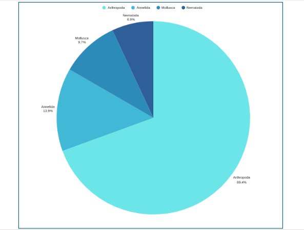
ステップ7: Label the sections and provide annotations and a legend.
Pie Chart Examples
Beyond the basic standard pie chart, there are several variants based on the circular concept, which are often used as alternatives for specific visualization needs.
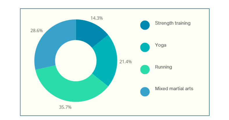
1. Donut chart: This is a variant of the pie chart with a hole in the center. Its primary purpose is to visualize data as a percentage of the whole (Figure 2).
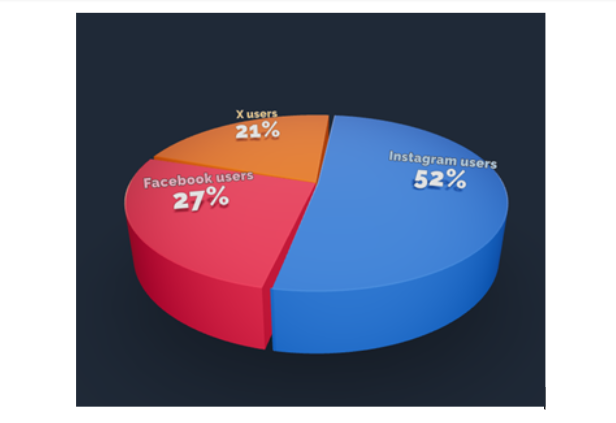
2. 3D Pie chart: This variant gives an aesthetic, three-dimensional look (see Figure 3). However, the use of perspective distorts the proportional encoding of the data, making these plots difficult to interpret accurately.
3. Exploded pie chart: This chart features one or more sectors “pulled out” from the rest of the disk to highlight a specific sector for emphasis.
4. Square chart (waffle chart): This chart uses color-coded squares, typically arranged in a 10 × 10 grid, where each cell represents 1%, instead of a circle, to represent proportions.
5. Polar area diagram (Nightingale diagram/rose diagram): This chart is similar to a pie chart, but the sectors all have equal angles and differ in how far they extend from the center (radius).
6. Treemaps: This is a “square” version of the pie chart that uses a rectangular area divided into sections; the area of the sections is proportional to the corresponding value. Treemaps can handle hierarchies, and visualize many more categories than a traditional pie chart.
When designing pie charts, careful consideration must be given to their specific limitations to ensure accurate and effective communication of data.
Dos when creating a pie chart
Don’ts when creating a pie chart
Pie charts have a specific, narrow use case, which contributes both to their enduring popularity and the intense criticism from data visualization experts.
Pie chart advantages
Pie chart disadvantages
Pie charts are a simple yet powerful tool for visually representing how each component contributes to a whole, making them invaluable for part‑to‑whole comparisons in research papers. They excel in quick, intuitive communication of proportion and are most effective when used with a suitable pie chart maker and an accurate pie chart formula that ensures all segments sum to 100%. However, they are limited to scenarios where data segments represent parts of a single whole; therefore, researchers should use them sparingly, ideally with five or fewer categories, clear labels, and accessible annotations that align with recommended pie chart uses. While alternatives like donut charts, waffle charts, and treemaps can address specialized visualization needs and overcome several pie chart disadvantages, one should steer clear of pie charts when precise group comparisons, complex data structures, or large datasets are involved, where other visuals are more suitable. To maximize effectiveness and truly leverage pie chart advantages, researchers should avoid 3D distortions, unnecessary colors, and non‑proportional data; follow best practices for how to create a pie chart; and always prioritize clarity and accessibility in visual design.
Pie charts show how each part contributes to a whole, ideal for visualizing proportions, while bar charts are better for comparing different categories or values across groups.
A 3D pie chart presents data with a three-dimensional look, but it distorts proportions and should generally be avoided for accurate interpretation of research data.
Pie charts are most effective with five or fewer categories; more slices can make interpretation difficult and cluttered.
Popular pie chart makers include Google Sheets, Microsoft Excel, Flourish Studio, and Tableau.
Mind the Graph is an easy-to-use visualization platform for researchers and scientists that enables fast creation of precise publication-ready graphical abstracts, infographics, posters, and slides. With 75,000+ scientifically accurate illustrations made by experts and hundreds of templates across 80+ major research fields, you can produce polished visuals in minutes — no design skills required.
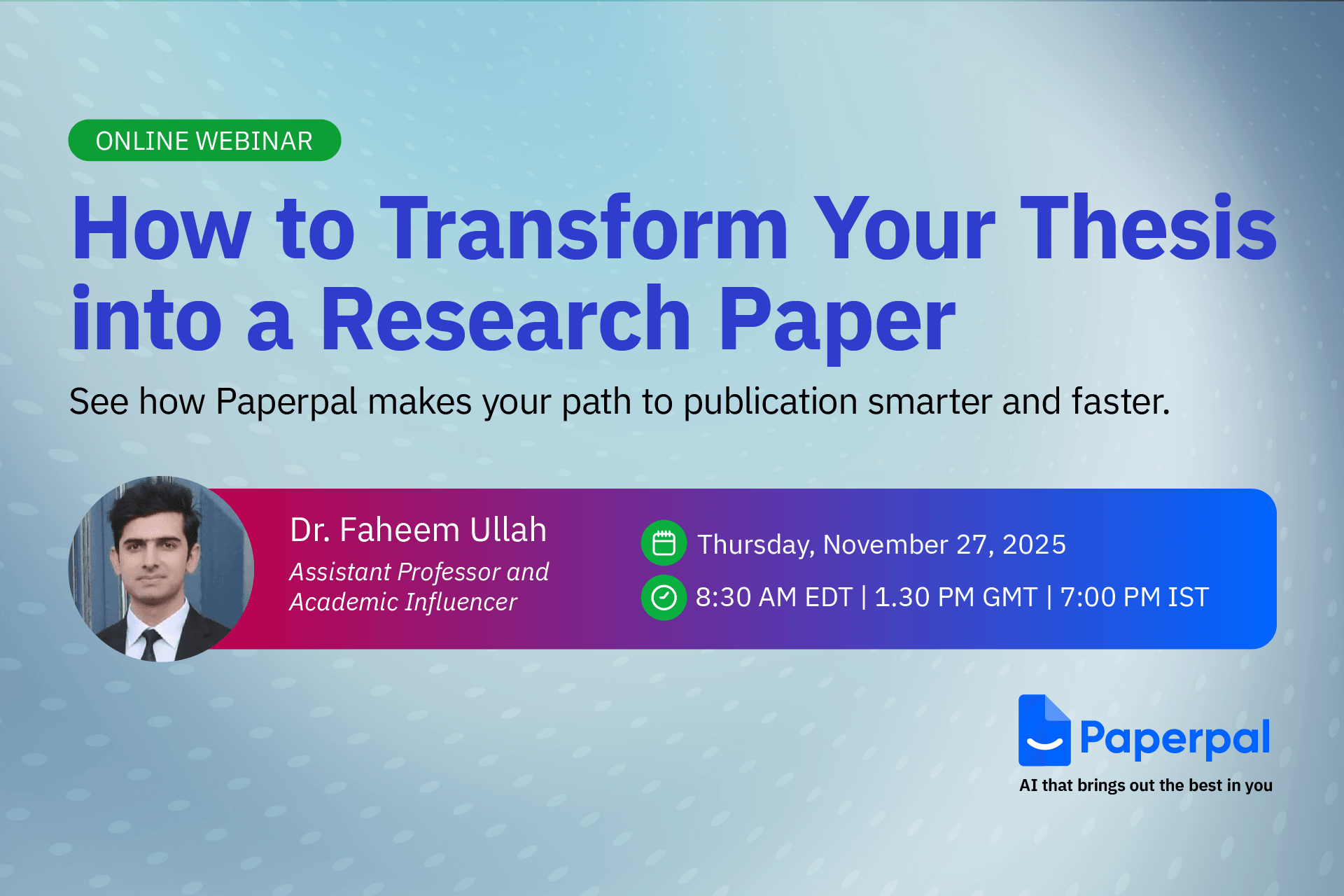
Completing a thesis is a major milestone, but turning it into a publishable research paper is a different challenge altogether. Many researchers struggle with condensing a long, descriptive thesis into a clear, concise manuscript that meets journal standards.
To help you bridge this gap, Mind the Graph along with Paperpal is thrilled to announce the next session in The AI Exchange Series – How to Transform your Thesis into a Research Paper
日付 Thursday, November 27, 2025
Time: 8:30 AM EDT | 1:30 PM GMT | 7:00 PM IST
Language: English
Duration: 1 hour
In this session, we’ll break down the thesis-to-paper conversion process with clear, practical guidance on:
Dr. Faheem Ullah
Assistant Professor and Academic Influencer
Dr. Faheem Ullah is an award-winning academic and consultant specializing in AI and research methodologies. He holds a PhD and Postdoc in Computer Science from the University of Adelaide and has earned multiple distinctions, including two Gold Medals and a Bronze Medal. With over 40 publications in leading journals and conferences and experience supervising more than 40 undergraduate, master’s, and PhD researchers, Dr. Faheem brings deep insight into academic writing and ethical AI use.
A respected voice in the global research community, he has attracted an audience of over 300,000 followers, sharing advice on research skills, publishing, and responsible AI.
Publishing from your thesis can feel overwhelming, but the right guidance makes the process faster and more structured. This webinar will help you identify what’s publishable, avoid common mistakes, and reshape your thesis into a clear, journal-ready manuscript. Whether you’re a master’s or PhD researcher, you’ll walk away with practical steps and more confidence in your path to publication.
Don’t miss this chance to learn how to turn your thesis into a clear, compelling manuscript and take the next big step in your research journey – Register for free today!
Mind the Graph is an easy-to-use visualization platform for researchers and scientists that enables fast creation of precise publication-ready graphical abstracts, infographics, posters, and slides. With 75,000+ scientifically accurate illustrations made by experts and hundreds of templates across 80+ major research fields, you can produce polished visuals in minutes — no design skills required.