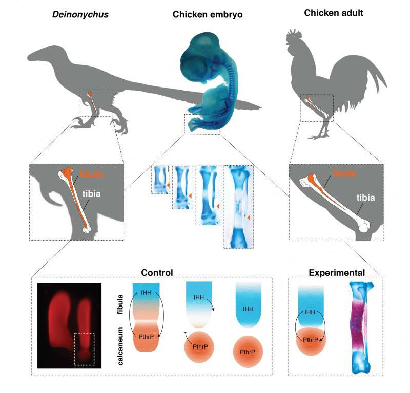
Last week, Botelho et al. published a new research on gene manipulation in chicken. Their paper has a great graphical abstract to illustrate main points of the research. Nevertheless, Mind the Graph wouldn’t let an amazing work like this without an infographic made by us! Check it out and learn how to make an infographic:
Since an infographic is supposed to highlight only a few points of a research, our work didn’t turn out as deep as the research itself. However, understanding the whole idea of the study was essential to start building the infographic.
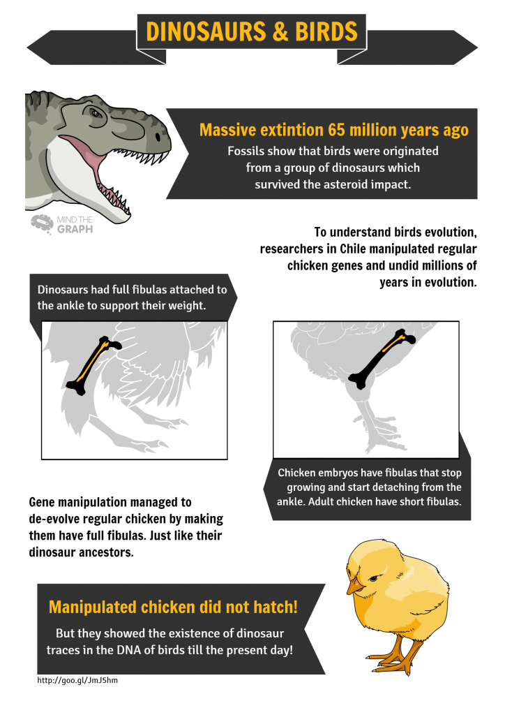
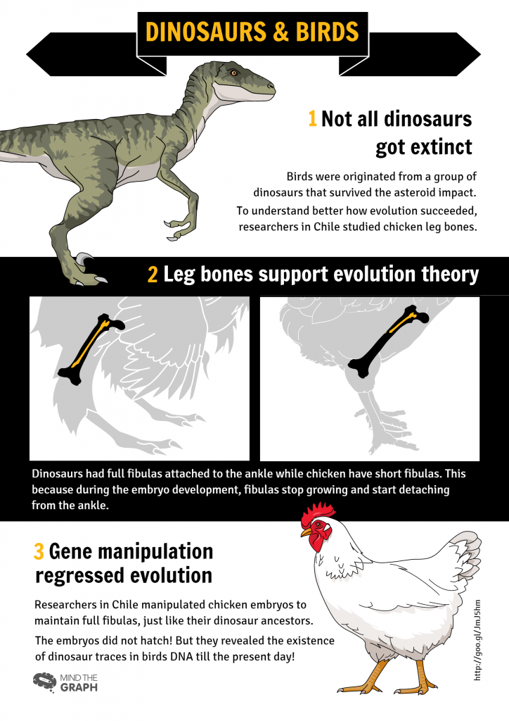
We made two infographics for Botelho et al. research. Can you see how different they are? And why did we choose one instead of the other as the final version?
How to make an infographic: structure
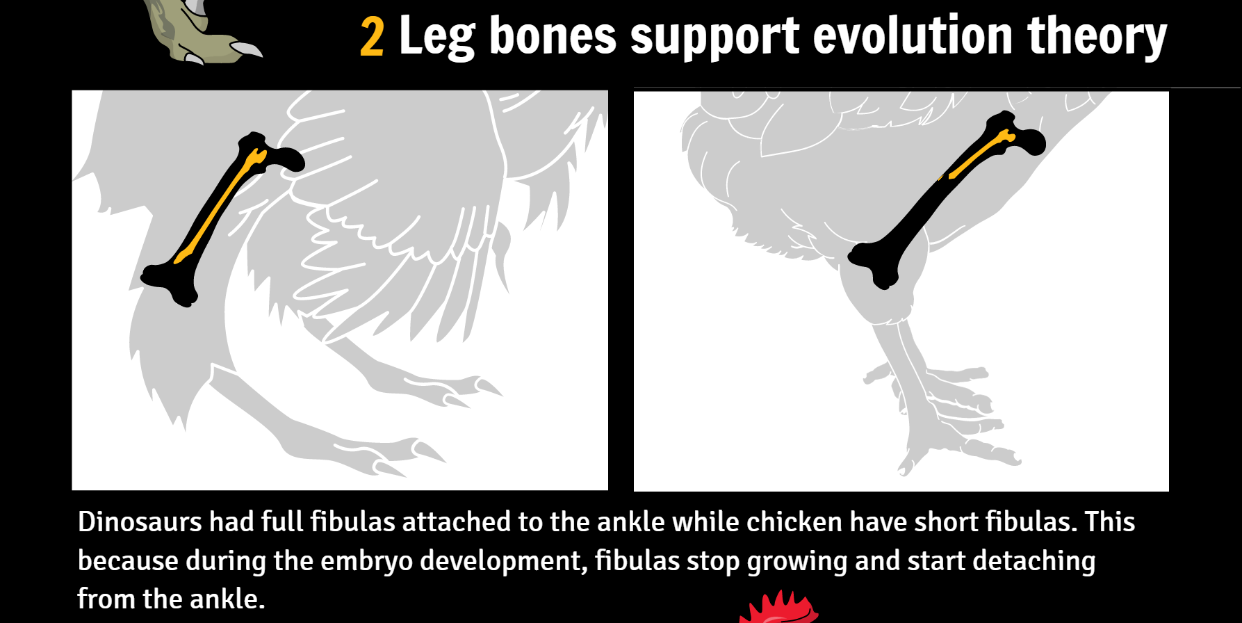
At first sight, both infographics may look very much alike. However, there are a few differences that change completely their information flow. Let’s compare the two of them:
The first infographic has too many reading points that don’t follow any logical flow making the reader confused about what to read next.
Also, almost every set of information is highlighted, making it difficult to understand what information is more relevant
The second infographic has less color variety and the most important information is highlighted by a black box.
In addition, figures are placed better in the infographic with well-defined sets of information leaded by numbers.
To make an infographic it is important to keep in mind:
- What story do you want to tell?
- What is the most important information? How to highlight it?
- What is the best layout for figures and text boxes to interact?
- What is your final message?
 An infographic is self-explanatory. After making a draft, it is always a good idea to ask for feedbacks and inputs. Sometimes, the information flow you had in mind doesn’t make sense for someone else.
Always remember that making an infographic means trying to communicate and it should be effortless for the reader. A person who has no idea of what your work is about and your co-workers should reach the same conclusion after looking at your graphical abstract.
Here at Mind the Graph, we learn everyday what is the best approach to present a research, an idea, new data, etc. How about you try it with us?

Subscribe to our newsletter
Exclusive high quality content about effective visual
communication in science.

