É hora de ver as ilustrações científicas que adicionamos à plataforma Mind the Graph na semana passada. Adicionamos novas ilustrações todas as semanas à nossa biblioteca. Consequentemente, já temos milhares de ilustrações disponíveis para todos os nossos usuários (incluindo usuários gratuitos).
Nossas ilustrações são cientificamente precisas. Além disso, eles têm um padrão, o que significa que você pode combinar diferentes ilustrações e o resultado final será atraente e atraente.
Se você ainda não conhece o Gráfico, mas quer começar a melhorar sua comunicação em ciências, pode começar agora gratuitamente:

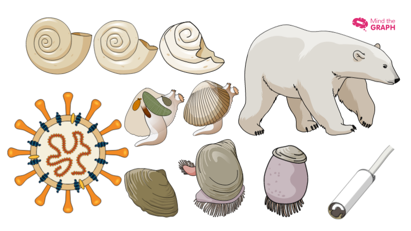
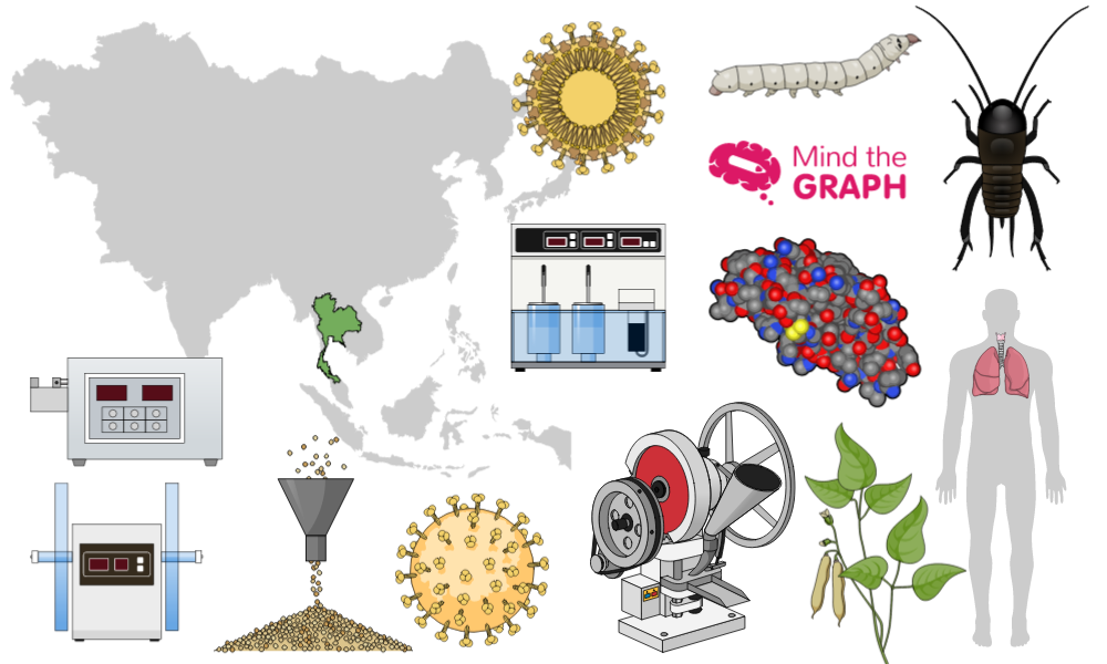
Agora, vamos ver as novas ilustrações científicas da semana:
Coronavírus

Acidificação do oceano em conchas

Sonda criogênica

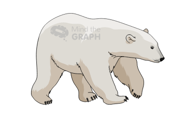
Urso polar
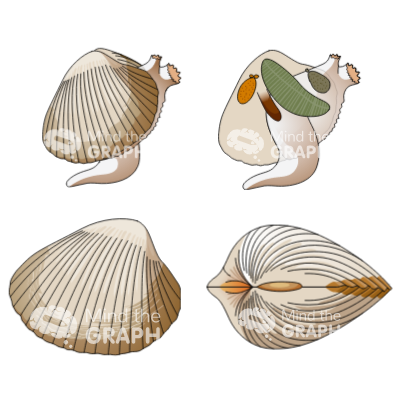
Cerastodermia
Ciclo de vida de um bivalve

Eu preciso de ilustrações científicas diferentes. O que devo fazer?
Você pode ver todas as ilustrações e modelos disponíveis em nosso site. Mesmo com todas essas ilustrações disponíveis, é possível que você ainda não encontre a que precisa. Principalmente se estiver trabalhando em um novo experimento ou tratamento. Mas não se preocupe . A maioria de nossas ilustrações são baseadas em pedidos de nossos assinantes, sem custo adicional .
Então, se você quiser uma ilustração específica que não encontrou no Mind the Graph, você pode se tornar um assinante e solicitá-la agora:


Subscribe to our newsletter
Exclusive high quality content about effective visual
communication in science.