
Color is an essential part of life and science. It can draw your attention, evoke emotions, and communicate information without using words. In scientific illustrations, good color combinations enhance clarity and impact, helping academics convey complex ideas visually. Using the right color palette ideas, you can elevate your visuals from ordinary to impactful—whether it’s figures for a research paper, conference poster, or graphical abstract—and engage better with your intended audience.
For years, artists and designers have been using color science and theory to create designs that use color with purpose. A strong grasp of color science can help academics create color palettes that highlight patterns, clarify complex relationships, and enhance audience understanding. Experts recommend using a trusted scientific illustrator or color schemes generator to come up with color palette ideas and find the best match.
Understanding Color Theory and the Color Wheel
Color theory is a framework that informs the use of color in art and design, guides the curation of color palettes, and facilitates the effective communication of a design message on both an aesthetic and a psychological level.
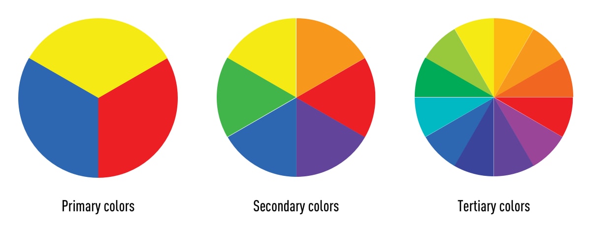
Modern color theory is largely based on Isaac Newton’s color wheel, which he created in 1666. The basic color wheel displays three categories of color, i.e., primary colors, secondary colors, and tertiary colors. If you remember learning about these in art class, well done—you’ve already grasped the basics of color science!
Let’s have a quick refresh on what these color categories entail:
Primary colors are colors you can’t create by combining two or more other colors. The primary colors are red, blue, and yellow.
Secondary colors are orange, purple, and green. In other words, colors that can be created by combining any two of the three primary colors.
Tertiary colors are created by mixing a primary color with a secondary color. The tertiary colors are magenta, vermillion, violet, teal, amber, and chartreuse. You can create color palettes and find many good color combos from these mixtures.
You might be thinking, “there are way more than 12 colors out there.” You’re right, and they can all be found on a more advanced version of the color wheel, including different shades of green color used for categorizing natural elements or biological visuals.
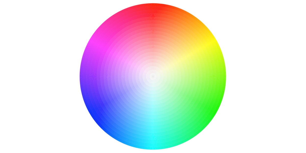
The color wheel doesn’t just chart each primary, secondary, and tertiary color; it also charts their respective hues, tints, tones, and shades. By visualizing how each color relates to the color that comes next to it on a rainbow color scale, the color wheel helps designers (and academics) create color palettes that promote aesthetic harmony.
Hue, Saturation and Value (HSV)
In the HSV model, colors of every hue are arranged in a radial fashion and represented as degrees from 0° to 360°. In this model, red has a hue value of 0° and going counterclockwise at 120° we have green and further at 240° we have blue. Going further we return to red at 0°. For instance, this shows that the opposite color of yellow is violet/purple, which can be used for strong contrasts when designing figures.
- A hue is defined as the degree to which a stimulus can be described as similar to or different from stimuli that are described as red, green, blue, and yellow. In other words, Hue is how we identify colors in terms of red, blue, green, and yellow. For example, we identify colors like rose, hibiscus, apple, and tulip as red even though they don’t exactly have the same color. And we identify turquoise as greenish-blue color not green or blue because it appears as a mix of both.
- Saturation is the intensity of the color with respect to the brightness of the light source. Think of new clothes vs. faded ones; the vivid colors have high saturation. You can experiment with saturation levels using a color schemes generator.
- Value is the amount of lightness (white) or darkness (black) in a color. Sometimes, the use of a single color with different values can create a controlled and attractive color palette for a homogeneous and refined look.
What are different types of color palettes?
A color palette is a combination of colors that can help you visualize your ideas effectively. When used correctly, good color combinations can form the visual foundation for your work, helping to maintain consistency and make your visuals aesthetically pleasing.
While color palette ideas have existed for thousands of years, color palettes are now commonly used in digital design as a combination of HEX codes. Today, these codes use hexadecimal values to tell a computer exactly which color to display, giving you precise control over your visuals. In the 1990s, most digital color palettes were limited to eight colors but now designers can choose from myriad shades and hues in the color wheel.
Color combinations should be chosen with purpose—whether to differentiate data types or call attention to results. Here’s how some key relationships help:
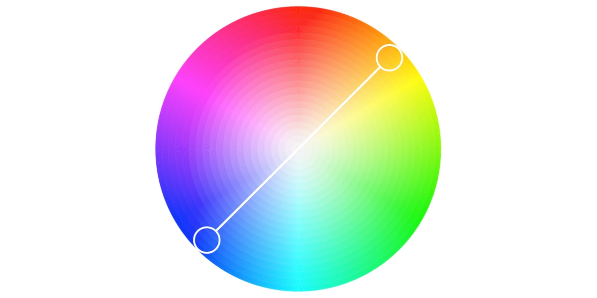
Complimentary colors are two colors that are on opposite sides of the color wheel. This combination provides a high-contrast, high-impact color combination that make these colors appear brighter and more prominent.
Analogous farge scheme is formed of three colors located next to each other on the color wheel. Analogous color palettes are commonly used when no contrast is needed, for example, on the background of web pages or banners.
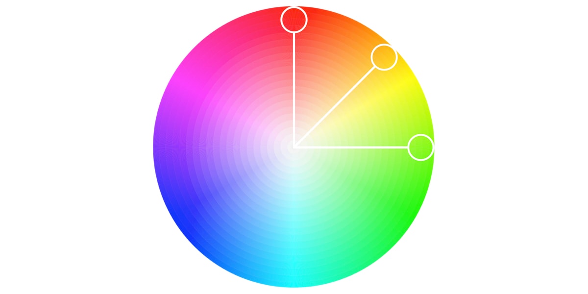
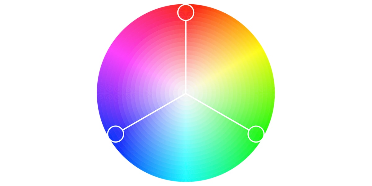
Triadic farge scheme uses three colors, equally spaced around the color wheel. Compared to complementary color schemes, triadic color combinations tend to be easier on the eye. This works well if you want more than one hue to play with, but don’t want as bold a contrast as a complementary pair would have.
These schemes establish visual hierarchy and reduce cognitive load, essential when your audience is scanning a detailed scientific poster.
How to Choose a Color Palette for Scientific Illustrations?
Choosing a color palette for scientific illustrations is a balance between clarity, accuracy, and visual appeal. The first step is to identify the nature of your data:
- For categorical data (e.g., different species or treatment groups), use clearly distinguishable hues.
- For quantitative or continuous data (e.g., temperature gradients or concentration levels), opt for a gradient using a color schemes generator.
Avoid overly saturated or neon tones, and prioritize good color combinations that work across screens. Ensure there is enough contrast between foreground and background for readability, especially in charts, diagrams, or figures that may be printed or projected. For instance, use a blue green color palette and different colors of green for biological visuals and keep the background neutral.
Use trusted platforms like Mind the Graph, a scientific illustration tool that help you create color palettes and provides a range of templates to help you quickly produce clear, engaging, and accurate academic visuals.
Med Mind the Graph, you can:
- Access scientifically appropriate templates with built-in color palettes.
- Use the color schemes generator to experiment with harmonious combinations.
- Ensure accessibility with colorblind-friendly options.
- Instantly preview how illustrations will appear in poster format or in journal-ready figures.
Whether you’re preparing an academic poster for a neuroscience conference or submitting a graphical abstract to Nature Communications, Mind the Graph helps you create impactful, professional visuals even without any design expertise.
Do’s and Don’ts of Scientific Color Use
✅ Do’s:
✔ Use good color combinations with a high contrast (e.g., dark blue text on a light background).
✔ Stick to colorblind-safe color combinations like blue–orange or blue–gray.
✔ Preview your poster in gråtoner to ensure clarity in print.
✔ Label charts explicitly—don’t rely solely on color for meaning.
✔ Keep your audience in mind (e.g., avoid too-bright schemes for older readers or clinicians).
❌ Don’ts:
❌ Avoid neon shades—they reduce professionalism and legibility. Don’t use red/green contrasts without additional markers (e.g., icons or patterns).
❌ Skip using too many similar shades—it causes confusion.
❌ Don’t make low-opacity overlays that obscure underlying text/data.
A color palette is more than just aesthetics—it’s a tool for clear, ethical, and inclusive communication that helps you reach your audience effectively.
Use Color to Clarify, Not Confuse
Color can transform your scientific communication, from confusing to compelling, from bland to brilliant. As you design your next scientific illustration, poster, or research figure, remember: the right color palette and a good color combination will help tell your story better.
Explore color palette ideas directly on Mind the Graph, where science meets design. With easy drag-and-drop design functionality and the world’s largest gallery of scientifically accurate illustrations, Mind the Graph helps academics visualize their research and ideas with purpose, not guesswork. Sign up on Mind the Graph and see the difference for yourself!

Abonner på nyhetsbrevet vårt
Eksklusivt innhold av høy kvalitet om effektiv visuell
kommunikasjon innen vitenskap.