2분 읽기
11/05/2025
마인드 더 그래프 과학 블로그는 과학자들이 복잡하지 않은 방식으로 과학을 전달하는 방법을 배울 수 있도록 돕기 위한 것입니다.
AI has quietly become a co-author in modern research. From grammar checks to literature reviews, tools powered by artificial intelligence are helping academics write faster and smarter. But there’s a growing challenge — most researchers don’t disclose their use of AI, even when journals require it. In fact, recent data shows that over 75% of […]
Over the past few years, AI tools for researchers have become crucial, simplifying everything from […]
Choosing the right color palette is one of the most important steps in creating clear, […]
AI tools have revolutionized the way researchers work, making academic writing and scientific communication more […]
In a world where attention spans are shrinking, visual learning is no longer a “nice-to-have” […]
Great academics know that powerful visuals can transform research—but not all tools give you that […]
A scientific poster is an important and widely used format for sharing research in academic […]
Creating compelling scientific illustrations shouldn’t require a PhD in graphic design or drain your research […]
Research design is the backbone of any successful study—it’s the structured plan that guides how […]
Generative AI tools are transforming how researchers and students write, yet many still face uncertainty […]
As social media grows noisier, infographics in social media have become one of the most […]
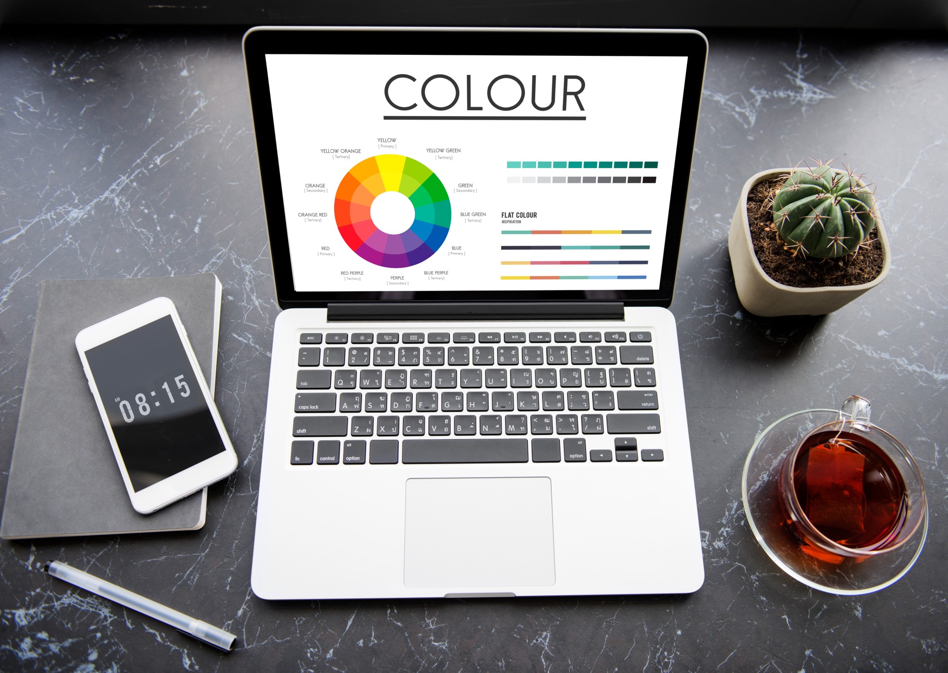
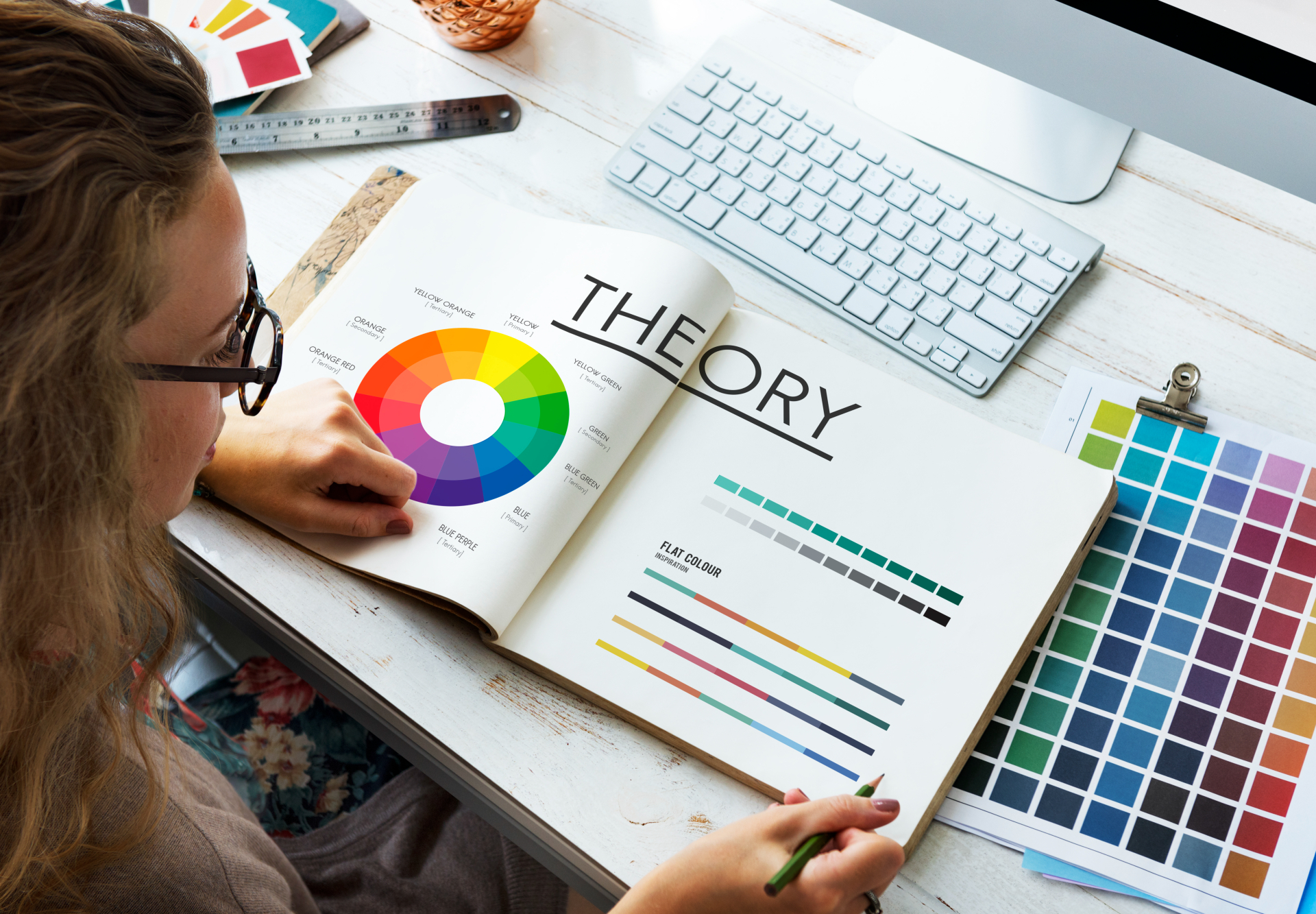
색은 삶과 과학의 필수적인 부분입니다. 주의를 끌고 [...]를 불러일으킬 수 있습니다.
과학적 일러스트레이션은 학문과 지역 간의 격차를 해소하는 보편적인 언어로 여겨집니다. [...]