2 perc olvasás
06/12/2020
A Mind The Graph tudományos blog célja, hogy segítsen a tudósoknak megtanulni, hogyan lehet a tudományt egyszerű módon kommunikálni.
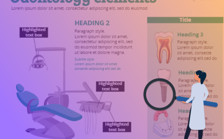
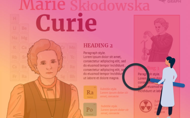
Ez az oktatóvideó bemutatja, hogyan készíthet tudományos posztert az Mind the Graph-ben, mint a díjnyertes tudományos poszterek. Nem kell a nulláról kezdenie. Így könnyebb lesz valami mutatós és érdekes dolgot létrehozni a kutatásod kommunikálásához, kevesebb időt ráfordítva. Tudósokból tervezőket csinálunk, hogy növeljük a hatásukat! Tanuljon [...]
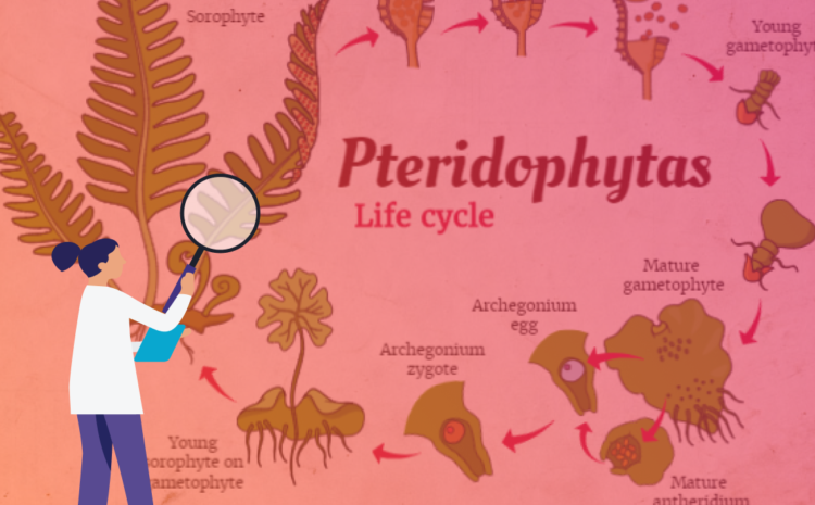
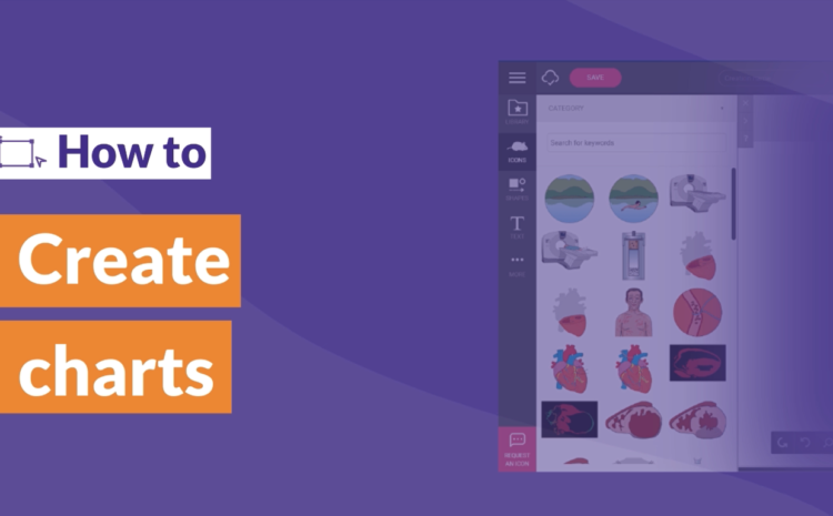
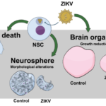
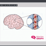
Ez a bemutató videó megmutatja, hogyan lehet létrehozni tudományos diagramok szem előtt tartva a grafikon. Ön [...]