4 minutos de lectura
10/28/2020
El blog científico Mind The Graph pretende ayudar a los científicos a aprender a comunicar la ciencia de forma sencilla.
Una tesis es un documento que se presenta para apoyar una afirmación basada en su [...]
Un trabajo de investigación es un ensayo que explica tus opiniones e interpretaciones sobre un [...]
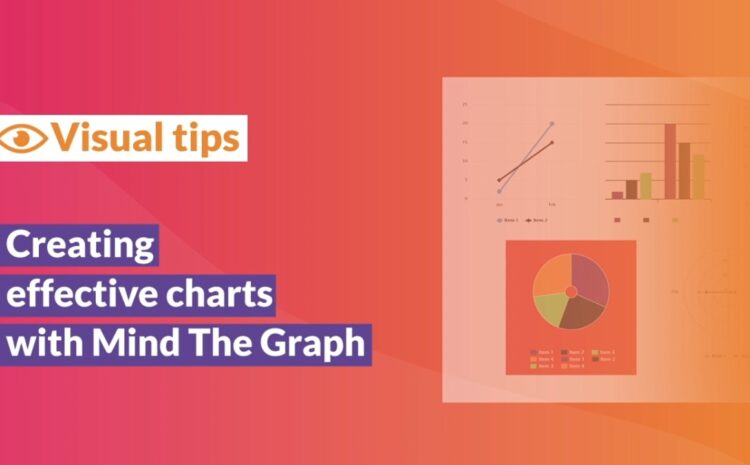
Este vídeo tutorial muestra cómo se puede crear un gráfico eficaz en Mind the Graph. [...]
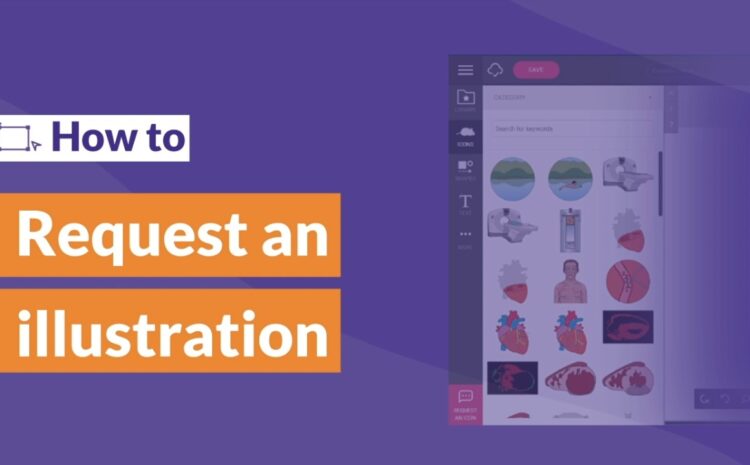
Este vídeo tutorial muestra cómo se puede solicitar una ilustración en Mind the Graph. Usted [...]