2分钟阅读
11/05/2025
Mind The Graph科学博客旨在帮助科学家学习如何以一种简单的方式交流科学。
AI has quietly become a co-author in modern research. From grammar checks to literature reviews, tools powered by artificial intelligence are helping academics write faster and smarter. But there’s a growing challenge — most researchers don’t disclose their use of AI, even when journals require it. In fact, recent data shows that over 75% of […]
Over the past few years, AI tools for researchers have become crucial, simplifying everything from […]
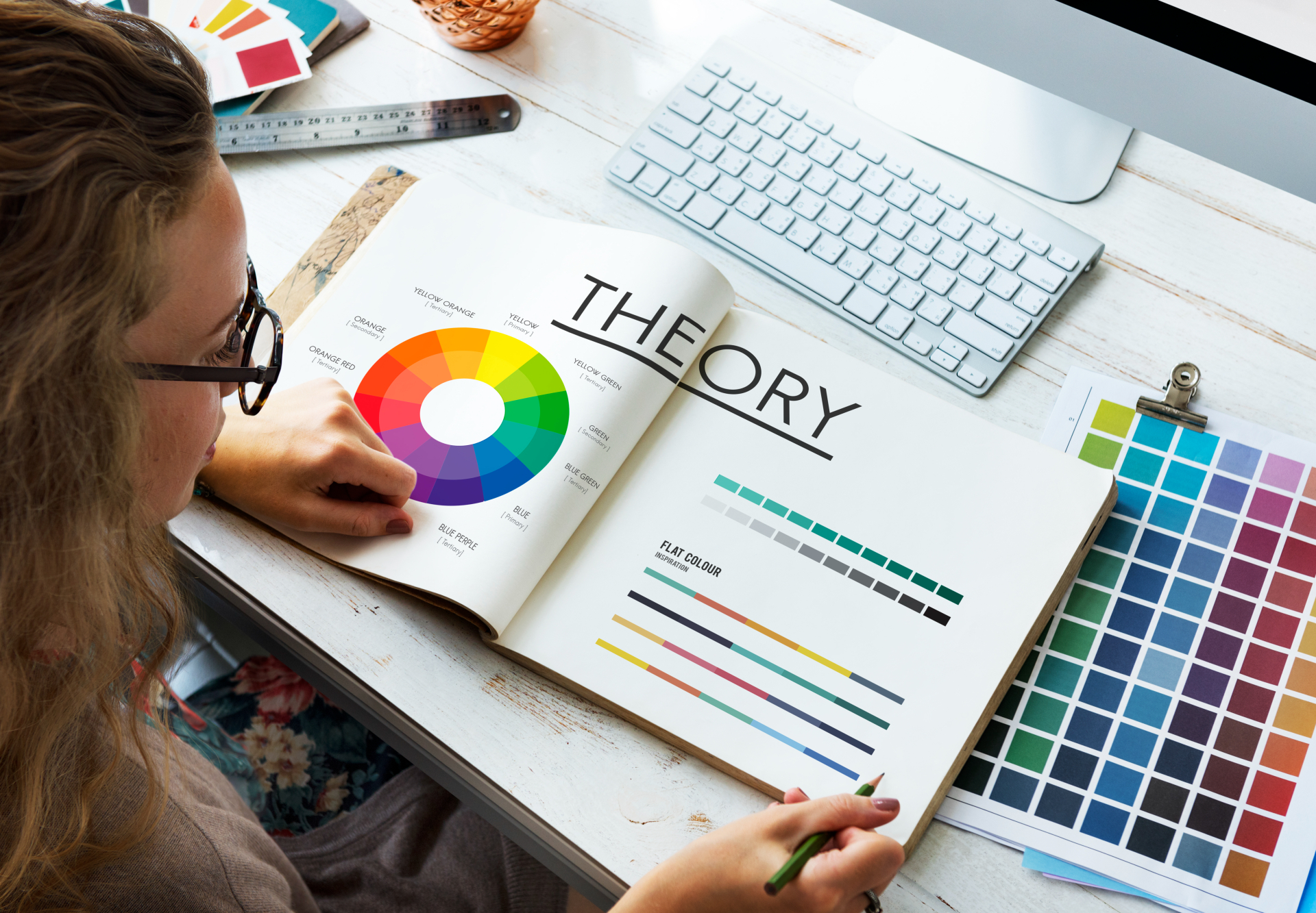
Choosing the right color palette is one of the most important steps in creating clear, […]
AI tools have revolutionized the way researchers work, making academic writing and scientific communication more […]
In a world where attention spans are shrinking, visual learning is no longer a “nice-to-have” […]
Great academics know that powerful visuals can transform research—but not all tools give you that […]
A scientific poster is an important and widely used format for sharing research in academic […]
Creating compelling scientific illustrations shouldn’t require a PhD in graphic design or drain your research […]
Research design is the backbone of any successful study—it’s the structured plan that guides how […]
Generative AI tools are transforming how researchers and students write, yet many still face uncertainty […]
As social media grows noisier, infographics in social media have become one of the most […]
色彩是生活和科学的重要组成部分。它可以吸引你的注意力,唤起 [...] 你的注意。
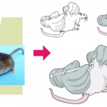
科学插图被视为一种通用语言,可以跨越学科和地域的鸿沟。[...]