
Data visualization is the graphical representation of data and is used for understanding and communication, including common graphics such as pie charts and plots. Data visualization helps convey complex data relationships in an easy-to-understand manner, making it a critical part of research. For example, if numerical data in a table requires considerable effort to conceptualize a trend, plotting the data visually makes the trend immediately clear to the reader.
The way information is visually presented can influence human perception. Consider the pie chart, a visual representation designed to display how individual components contribute to a whole. It offers a simple way to organize data, allowing users to easily compare the size of each component with the others. Therefore, if a researcher needs to visualize proportions or relative contributions within a single category, a pie chart serves as a straightforward visualization tool.
Let’s explore how to make pie charts, common pie chart uses, pie chart examples, and more!
What is a Pie Chart?
A simple pie chart definition is “a circular statistical graphic that is divided into radial slices to illustrate numerical proportion.” In this chart type, each categorical value corresponds to a single slice, and the size of that slice—measured by its area, arc length, and central angle—is designed to be proportional to the quantity it represents. Thus the main strength of the pie chart lies in how it helps convey data at a glance by instantly communicating the part-to-whole relationship.
Uses of a Pie Chart in Research
Did you know that the pioneer of data visualization, Florence Nightingale, used an adaptation of the pie chart, the polar area diagram or rose diagram as early as in 1858? She used this diagram to illustrate seasonal sources of patient mortality in military hospitals during the Crimean War, demonstrating that deaths due to disease (represented by a large segment) far outweighed deaths caused by wounds or other factors.
Pie chart uses are limited to visualizing proportions where the primary objective is to show each group’s contribution relative to the total. Pie charts are especially useful when highlighting a particular slice whose proportion is close to a common fraction like 25% or 50%. They are highly effective in scenarios where simplicity and quick comprehension are paramount and where the chart needs to be compact. Note that pie charts are inappropriate for non-proportional data (data exceeding 100%) or when the goal is to compare groups to each other, rather than to the whole.
In modern social science, pie charts or effective alternatives are employed for data where the components must sum to 100%. Relevant pie chart examples include distribution of aggregate income, population demographics, and election results.
To handle complex data, researchers may turn to pie chart subtypes. For instance, treemaps can break down cumulative global CO2 emissions by country, and sunburst diagrams may be used for visualizing hierarchical data, such as an employee directory of a company divided by country and department, where the size of the segment represents the number of employees.
How to Calculate a Pie Chart Formula
To create a pie chart, you need to first know the pie chart formula. The steps to calculate it are as follows:
1. Add up the individual numbers to calculate the total number.
2. Divide 360 (the total number of degrees in the pie chart) by the total number. The resulting value will tell you the angle, in degrees, that each category equates to in terms of a pie chart.
3. Multiply each frequency by this angle value to get the angle for each segment of the pie chart. Remember, the segment angles should add up to 360°.
Put simply, to calculate the angle of each slice of a pie chart, the pie chart formula is as follows:
Segment angle = (360/total frequency) x category frequency
How to Create a Pie Chart?
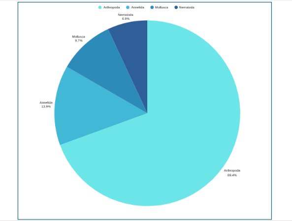
Now that you have understood how to calculate the pie chart formula, the next question is how to draw a pie chart? Suppose an ecologist has been tasked with understanding species distribution of various animal phyla in a forest understory. Here are the steps she will follow:
Adım 1: Collect the data
Adım 2: Tabulate the data:
| Animal phyla | Number of species |
| Arthropoda | 50 |
| Mollusca | 7 |
| Annelida | 10 |
| Nematoda | 5 |
The data above can be represented by a pie chart as following and by using the circle graph formula, i.e. the pie chart formula explained above.
Adım 3: Add up the individual numbers to calculate the total number. In this case: 50 + 7 + 10 + 5 = 72.
Adım 4: Divide 360 (the total number of degrees in the pie chart) by the total number. In this case: 360 ÷ 72 = 5, so each species is equal to 5° in the pie chart.
Adım 5: Multiply each frequency by this angle value to get the angle for each segment of the pie chart:
| Animal phyla | Number of species | Angle |
| Arthropoda | 50 | 50 × 5° = 250° |
| Mollusca | 7 | 7 × 5° = 35° |
| Annelida | 10 | 10 × 5° = 50° |
| Nematoda | 5 | 5 × 5° = 25° |
Adım 6: Draw a circle and use a protractor to measure the degree of each sector (see Figure 1). You can also use online pie chart makers as well.
Adım 7: Label the sections and provide annotations and a legend.
Pie Chart Examples
Beyond the basic standard pie chart, there are several variants based on the circular concept, which are often used as alternatives for specific visualization needs.
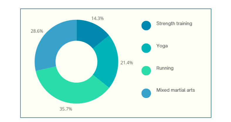
1. Donut chart: This is a variant of the pie chart with a hole in the center. Its primary purpose is to visualize data as a percentage of the whole (Figure 2).
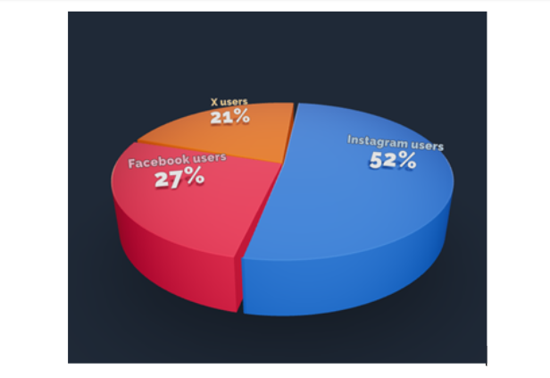
2. 3D Pie chart: This variant gives an aesthetic, three-dimensional look (see Figure 3). However, the use of perspective distorts the proportional encoding of the data, making these plots difficult to interpret accurately.
3. Exploded pie chart: This chart features one or more sectors “pulled out” from the rest of the disk to highlight a specific sector for emphasis.
4. Square chart (waffle chart): This chart uses color-coded squares, typically arranged in a 10 × 10 grid, where each cell represents 1%, instead of a circle, to represent proportions.
5. Polar area diagram (Nightingale diagram/rose diagram): This chart is similar to a pie chart, but the sectors all have equal angles and differ in how far they extend from the center (radius).
6. Treemaps: This is a “square” version of the pie chart that uses a rectangular area divided into sections; the area of the sections is proportional to the corresponding value. Treemaps can handle hierarchies, and visualize many more categories than a traditional pie chart.
Dos and Don’ts When Creating a Pie Chart
When designing pie charts, careful consideration must be given to their specific limitations to ensure accurate and effective communication of data.
Dos when creating a pie chart
- Include annotations: Annotations, showing exact values or percentages, are a standard and critical inclusion for pie charts.
- Limit the number of slices: Pie charts are generally most effective when displaying a small number of categories, typically around five or fewer.
- Order slices strategically: A typical ordering is from the largest slice to the smallest slice, often starting at the 12 o’clock position and progressively decreasing in the clockwise direction. However, if categories have an inherent sequential order (such as age classes), plotting them in that established order is usually better.
- Ensure high contrast and accessibility: For inclusive data visualization, ensure sufficient color contrast between pie segments, especially for users with visual impairments like color blindness. Provide text alternatives for screen readers and ensure keyboard compatibility for interactive elements.
- Leverage familiar proportions: Pie charts are easiest for the human eye to read when the slices form right angles or multiples thereof (i.e., 25%, 50%, and 75%).
Don’ts when creating a pie chart
- Do not use 3D or distorting effects: Avoid using 3D pie charts or depth effects. The 3D perspective distorts the proportional representation.
- Do not use non-proportional data: A common mistake is using a pie chart for data that does not represent a complete part-to-whole comparison, such as percentages that sum up to more than 100%.
- Do not use pie charts for close comparisons: Avoid using pie charts when precise comparisons between categories are necessary, especially when slices are of similar size.
- Do not overuse color: While color distinguishes slices, too much color can detract from the message and be overwhelming, especially when many slices force the use of similar or confusing color combinations.
Advantages and Disadvantages of Pie Chart
Pie charts have a specific, narrow use case, which contributes both to their enduring popularity and the intense criticism from data visualization experts.
Pie chart advantages
- Clarity in part-to-whole relationship: The major benefit and the pie chart’s principal purpose is to immediately fulfil the part-to-whole comparison objective. The circular shape naturally and intuitively encodes the concept of a total (100%), allowing readers to quickly perceive proportions.
- Familiarity and simplicity: They are particularly effective when the goal is quick understanding of an insight rather than decimal-place accuracy.
- Compactness: Pie chart advantages make them useful in contexts such as mobile applications (e.g., showing battery percentage or installation progress) because they are very compact.
Pie chart disadvantages
- Poor for comparisons: Pie charts are ineffective for tasks requiring the comparison of one group (slice) to another group (slice), or for comparing data across multiple instances of the chart.
- Inefficient space utilization: Pie charts are space-inefficient because their circular nature and the necessary addition of labels or legends take up a larger amount of space than rectilinear charts, like bar charts, which provide the same or greater clarity.
- Limited data capacity: They are ill-suited for large amounts of data. When slices become numerous or very small, the chart relies excessively on labels, arguably defeating the purpose of visualization and offering less value than a simple table.
- Lack of flexibility: Pie charts are less flexible than alternatives, struggling to effectively handle complex data, sequential categories, or the addition of extra reference data like targets or ranges without becoming cluttered or distorted.
In closing
Pie charts are a simple yet powerful tool for visually representing how each component contributes to a whole, making them invaluable for part‑to‑whole comparisons in research papers. They excel in quick, intuitive communication of proportion and are most effective when used with a suitable pie chart maker and an accurate pie chart formula that ensures all segments sum to 100%. However, they are limited to scenarios where data segments represent parts of a single whole; therefore, researchers should use them sparingly, ideally with five or fewer categories, clear labels, and accessible annotations that align with recommended pie chart uses. While alternatives like donut charts, waffle charts, and treemaps can address specialized visualization needs and overcome several pie chart disadvantages, one should steer clear of pie charts when precise group comparisons, complex data structures, or large datasets are involved, where other visuals are more suitable. To maximize effectiveness and truly leverage pie chart advantages, researchers should avoid 3D distortions, unnecessary colors, and non‑proportional data; follow best practices for how to create a pie chart; and always prioritize clarity and accessibility in visual design.
Pie charts show how each part contributes to a whole, ideal for visualizing proportions, while bar charts are better for comparing different categories or values across groups.
A 3D pie chart presents data with a three-dimensional look, but it distorts proportions and should generally be avoided for accurate interpretation of research data.
Pie charts are most effective with five or fewer categories; more slices can make interpretation difficult and cluttered.
Popular pie chart makers include Google Sheets, Microsoft Excel, Flourish Studio, and Tableau.
Mind the Graph is an easy-to-use visualization platform for researchers and scientists that enables fast creation of precise publication-ready graphical abstracts, infographics, posters, and slides. With 75,000+ scientifically accurate illustrations made by experts and hundreds of templates across 80+ major research fields, you can produce polished visuals in minutes — no design skills required.

Haber bültenimize abone olun
Etkili görseller hakkında özel yüksek kaliteli içerik
bilimde iletişim.