
Choosing the right color palette is one of the most important steps in creating clear, accurate, and engaging research visuals. A thoughtful color palette for data visualization helps your audience distinguish patterns, spot trends, and interpret results effortlessly. Whether you’re selecting colors for graph elements, deciding on a color for pie chart, or curating a consistent chart colors palette, your choices directly affect how your findings are understood. Understanding how to pick a color palette ensures that every shade serves a purpose rather than distracting from your message.
In research graphics, your color palette for graph should enhance readability while maintaining aesthetic harmony. The pie chart color palette must balance contrast and consistency, while bar chart colors should remain distinct enough to compare values easily. By focusing on accessibility, consistency, and meaning, you can identify the best colors for graphs and build a cohesive color palette that strengthens your scientific storytelling.
Types of a Color Palette
Choosing the right color palette ensures that your visualizations communicate meaning effectively. Each palette type conveys a different kind of data relationship — whether distinguishing categories, showing progression, or highlighting deviation. The table below summarizes the main types and includes example color sets.
| Palette Type | Use Case | Key Characteristics | Example Colors (Hex Codes) | Visual Example |
| Qualitative | Distinct categories with no inherent order (e.g., departments, regions) | Multiple distinct hues; each category gets its own unique color. Limit to ~10 colors for clarity. | #1F77B4, #FF7F0E, #2CA02C, #D62728, #9467BD, #8C564B | 🟦 🟧 🟩 🟥 🟪 🟫 |
| Sequential | Ordered or numeric data showing magnitude or intensity (e.g., sales, temperature) | Gradient from light to dark or one hue to another; light = low, dark = high. | #FFF7EC, #FEE8C8, #FDBB84, #E34A33, #B30000 | ⚪️ 🟠 🟧 🟥 🔴 (light → dark red) |
| Diverging | Data centered around a critical midpoint (e.g., profit/loss, above/below average) | Two hues diverging from a neutral middle tone. Emphasizes deviation on both sides. | #1A9850, #66BD63, #F7F7F7, #F46D43, #D73027 | 🟢 🟩 ⚪️ 🟧 🔴 (green → neutral → red) |
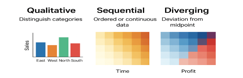
- Qualitative palettes distinguish categories.
- Sequential palettes show progression.
- Diverging palettes highlight contrast from the center.
Always keep accessibility in mind, ensuring adequate contrast and color-blind-friendly combinations. The right palette not only makes your data beautiful but also meaningful.
How to Choose a Color Palette
A color palette should be chosen with both clarity and accessibility in mind. When deciding how to choose a color palette, focus on contrast, consistency, and context—your colors should clearly distinguish categories without overwhelming the viewer.1 Start by defining your data type: use qualitative palettes for categories, sequential ones for gradients, and diverging palettes for comparisons. A well-selected color palette enhances storytelling, making colors for graphs and bar charts both visually appealing and easy to interpret. Testing your color palette for color blindness and grayscale readability ensures that your visuals remain inclusive and scientifically sound.
Table: Principles and Guidelines for Choosing Effective Color Palettes in Scientific Visualization
| Step | Action | Purpose/Consideration |
| 1. Define the Data Type | Identify if your data represents categories (qualitative), ordered values (sequential), or deviations from a midpoint (diverging). | Ensures the palette structure fits the data type. |
| 2. Determine the Key Message | Ask what you want your audience to notice first — trends, extremes, or group differences. | Helps select colors that emphasize the story, not just decorate. |
| 3. Choose a Suitable Palette Type | Qualitative → distinct hues (e.g., species, regions) Sequential → light to dark shades (e.g., temperature, time) Diverging → two hues meeting at a midpoint (e.g., profit/loss) | Matches color variation to data meaning. |
| 4. Check Context and Background | Consider where the visualization will appear (screen, print, dark/light background). | Ensures visibility and color accuracy. |
| 5. Test for Accessibility | Simulate color vision deficiencies (e.g., using Color Oracle, Coblis) and verify readability. | Ensures inclusivity for all viewers. |
| 6. Use Established Color Tools | Tools like ColorBrewer, Coolors, or Adobe Color provide balanced and tested palettes. | Speeds up selection and improves harmony. |
| 7. Validate with Your Audience | Show the palette to a few test viewers to check interpretability and comfort. | Confirms practical usability and effectiveness. |
Color Palette: Accessibility Matters
Creating an inclusive and visually effective color palette is essential for ensuring that all viewers can interpret your research graphics accurately. From selecting colors for graph clarity to optimizing your pie chart color palette for accessibility, thoughtful design choices make your visuals both professional and user-friendly.
Do’s for Accessible Color Palettes
| Dos | Why It Matters |
| Use color-blind-friendly palettes (e.g., ColorBrewer “Set2”, “Dark2”, “Viridis”). | Makes visualizations readable for those with color-vision deficiencies. |
| Maintain a minimum contrast ratio of 4.5:1 between text and background. | Ensures legibility for people with low vision. |
| Combine color with patterns, textures, or labels for data distinction. | Enables interpretation even when color perception is limited. |
| Use neutral or light backgrounds for charts and maps. | Provides good contrast and reduces visual fatigue. |
| Test your designs using accessibility tools (e.g., Coblis, Color Contrast Checker). | Helps verify accessibility before publishing. |
| Keep color meanings consistent across visualizations. | Improves clarity and user understanding. |
Don’ts for Accessible Color Palettes
| Don’ts | Why It’s a Problem |
| Don’t rely only on color to convey meaning. | Users with color blindness may miss critical information. |
| Don’t use red–green or blue–yellow combinations for key contrasts. | These are the most commonly confused pairs for people with color blindness. |
| Don’t use low-contrast text or small color differences. | Reduces readability and accessibility. |
| Don’t use bright or neon colors excessively. | Can strain eyes and make charts harder to interpret. |
| Don’t mix too many hues in one visualization. | Overcomplicates interpretation and reduces accessibility. |
Designing with accessibility in mind transforms your color palette from a simple design choice into a strong scientific communication tool, helping your insights reach every viewer with equal impact.
Learn h Mind the Graph’s PowerEdit tool to apply and fine-tune those colors directly to your research figures. PowerEdit helps you customize shades, adjust contrast, and maintain color consistency across multiple visuals effortlessly.
Best Practices for Choosing Colors for a Graph
Selecting the right colors for graph elements is key to making your data both beautiful and meaningful. A well-thought-out color palette enhances clarity, readability, and consistency across all your visual materials. Whether you’re designing a color palette for data visualization, building a chart colors palette, or selecting the best colors for graphs, the following best practices will help you make confident, research-driven choices.
Step 1: Understand Your Data
- Identify whether your data is categorical, sequential, or diverging.
- Match the palette accordingly:
- Qualitative → Distinct colors for categories.
- Sequential → Gradient for ordered or continuous data.
- Diverging → Two hues showing deviation from a midpoint.
Step 2: Choose an Appropriate Palette
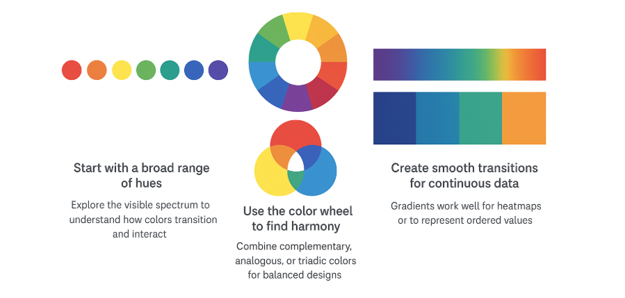
- Use trusted color sets (e.g., ColorBrewer, Viridis, Batlow, or Tableau 10).
- Avoid rainbow scales for ordered data — they distort perception.
- Opt for perceptually uniform palettes that display gradual changes accurately.
Step 3: Consider Contrast and Legibility
- Ensure adequate contrast between colors.
- Check how your graph appears on both light and dark backgrounds.
- Test for color-blind accessibility using tools such as Coblis or Color Oracle.
Step 4: Keep the Palette Simple
- Limit to 5–7 distinct colors to maintain visual clarity.
- Use neutrals or desaturated tones for secondary elements (e.g., gridlines, axes).
- Emphasize key data with accent colors sparingly.
Step 5: Maintain Consistency
- Use the same color for the same variable across multiple charts.
- Develop a color hierarchy — main data, supporting data, and background.
Step 6: Align Colors with Meaning
- Choose colors that reinforce context or meaning:
- Blue = cool/stable, Red = increase/warm, Green = growth.
- Avoid misleading color associations (e.g., red for low values).
Step 7: Adapt for Medium and Accessibility
- Adjust brightness and saturation for print vs. digital outputs.
- Verify readability on various screen types and in grayscale.
Step 8: Provide Guidance
- Always include a legend or annotations explaining the color logic.
- If colors represent intensity, show the scale or gradient bar.
A thoughtfully selected color palette ensures that every visual is not only appealing but also clear, consistent, and accessible.
Color Palette for Data Visualization: Dos and Don’ts
A carefully chosen color palette for data visualization ensures that your graphs, charts, and figures communicate data clearly and inclusively. Your choice impacts how effectively your audience can interpret your research. Use the following dos and don’ts as a quick guide to create a consistent, accessible, and visually appealing chart colors palette.
| Aspect | Dos | Don’ts |
| Audience Understanding | Choose palettes that match your audience’s familiarity and reading context. | Don’t assume all viewers interpret colors the same way. |
| Data–Color Relationship | Use logical color progressions to represent meaningful data differences. | Don’t assign random colors to unrelated categories. |
| Consistency Across Visuals | Keep similar color logic across multiple graphs or figures. | Don’t change palette meaning between figures. |
| Context Sensitivity | Test your palette on different backgrounds (light/dark) to ensure readability. | Don’t pick colors that disappear or blend into the background. |
| Cultural Meaning | Be aware of color associations (e.g., red for loss, green for gain). | Don’t ignore cultural interpretations that may mislead readers. |
| Printing and Sharing | Use palettes that retain clarity in grayscale or when printed. | Don’t rely solely on saturated hues that lose contrast when printed. |
| Tool Compatibility | Use palettes supported by major visualization tools (e.g., matplotlib, ggplot, Power BI). | Don’t use palettes that are hard to reproduce across platforms. |
In summary, following these simple dos and don’ts will help you design a color palette for graphs and other visuals that are professional, inclusive, and easy to interpret. A cohesive color palette not only improves aesthetics but also strengthens your research storytelling by keeping your chart colors palette clear, consistent, and accessible to all.
Key Takeaways
- A well-designed color palette for data visualization helps communicate research findings clearly, improving both accuracy and engagement.
- Always choose a color palette for graphs that balances contrast, accessibility, and consistency across your visuals.
- Use limited, distinct hues in your chart color palette to avoid confusion and maintain clarity.
- The best colors for graphs are those that remain legible to all viewers, including those with color-vision deficiencies.
- Keep your pie chart color palette visually consistent with your overall design style.
- Learning how to choose a color palette ensures your charts are both visually appealing and scientifically sound.
- A cohesive graph color palette strengthens readability, reinforces patterns, and enhances storytelling in your research visuals.
Frequently Asked Questions on Qualitative Research
What is the difference between qualitative and sequential palettes?
Qualitative palettes use distinct, unrelated colors to represent different categories or groups—ideal for comparing nominal data like species, regions, or departments. Sequential palettes, on the other hand, use variations in lightness or saturation of a single hue (or a gradient between hues) to represent ordered or continuous data, such as temperature or population density. In short, qualitative palettes highlight differences in category, while sequential palettes show differences in amount.
How many colors should I use in a qualitative palette?
When creating a qualitative color palette, it’s best to use between five and eight distinct colors. This range provides enough variety to differentiate categories without overwhelming the viewer or making colors too similar to distinguish. If you need to represent more groups, consider using variations in shape, pattern, or brightness to maintain clarity and visual balance.
Why is color blindness important in data visualization?
Color blindness is crucial to consider in data visualization because around one in twelve men and one in two hundred women experience some form of color vision deficiency.2 When visualizations rely solely on color differences—like red and green—to convey meaning, key insights can become invisible to part of the audience. Designing with accessible color palettes ensures that every viewer can accurately interpret patterns and relationships, making your data both clearer and more inclusive.
Mind the Graph is an easy-to-use visualization platform for researchers and scientists that enables fast creation of precise publication-ready graphical abstracts, infographics, posters, and slides. With 75,000+ scientifically accurate illustrations made by experts and hundreds of templates across 80+ major research fields, you can produce polished visuals in minutes — no design skills required.
References
- Crameri, F., Shephard, G. E., & Heron, P. J. (2020). The misuse of colour in science communication. Nature communications, 11(1), 5444.
- National Eye Institute. “Types of Color Vision Deficiency.” NIH, U.S. Department of Health & Human Services, August 7, 2023. Available at https://www.nei.nih.gov/learn-about-eye-health/eye-conditions-and-diseases/color-blindness/types-color-vision-deficiency.

Subscribe to our newsletter
Exclusive high quality content about effective visual
communication in science.