What is the first tool you think about when you need to put a presentation together? Or a poster? Or a figure for your paper? Probably Power Point or Paintbrush. If you are lucky, maybe you know someone who understands a bit about Photoshop. Am I right?
These three options are the most favorite among scientists. However, if I ask every single scientist if they are happy using these tools, chances the answer is “no” are high.
If the usage of Power Point, Paintbrush and others are not satisfactory for the scientific world, why do we use it? The answer is simple. We don’t have a tool focused on fulfilling scientific demands.
We dream about the day we will have a tool specialized in the scientific demand. In other words, we dream about a science infographic maker.
Once we have our manuscript mostly written, we must start thinking about how to present it. The presentation could be for a seminar, a conference or a committee, it doesn’t matter, at this point the scientific community divides itself in two:
- Scientists that enjoy thinking about the design of their presentations and are meticulous about every aspect of it
- Scientists that find no satisfaction in thinking about layout and just want something simple and easy
Usually when you have to talk about your own work you are thrilled about it and want to show it off. However, many of us are not sensible enough to make a good presentation.
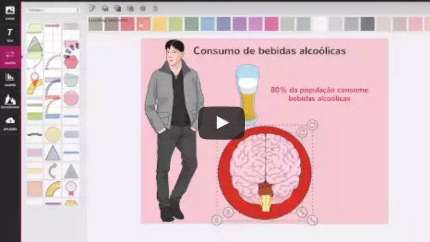
The idea behind Mind the Graph is to be the science infographic maker we are all dreaming of. At Mind the Graph, we also feel the frustation of browsing at Google Images for hours without finding the illustration we need. We also understand that using platforms that were not created to fit scientific researches get in the way of science communication.
A science infographic maker aimes to help researches. Its goal is simply to improve science communication. In addition, it stops the time waisting of looking for illustrations you will never find online.
Caring about how to create a good presentation also highlights how you manage your entire research. If you show a poor presentation, other people could think you also developed you research poorly.
Mind the Graph, as a science infographic maker, wants to empower scientists in creating scientific figures for academic works. You don’t need to be a professional. You only need a little help in getting what you want, the way you want it.


Subscribe to our newsletter
Exclusive high quality content about effective visual
communication in science.