5 min read
04/23/2024
Mind The Graph Scientific Blog is meant to help scientists learn how to communicate science in an uncomplicated way.
Master the structure of a book review. Explore the essential structure and key elements to craft insightful and captivating critiques.
In today’s world, the way we present ideas and data can shape opinions, influence decisions, and impact the world around us. One of the most important principles of communication is objectivity. Objective writing is writing that presents information in a neutral and unbiased way. This means avoiding personal opinions, beliefs, or biases. It also means avoiding using emotional language or making subjective statements. Objective writing is typically clearer and easier to understand than subjective writing. It is also seen as more credible and trustworthy. This is because readers know that the writer is not trying to persuade them or influence their opinions.
Related article: Mastering Critical Reading: Uncover The Art Of Analyzing Texts
In a world where there is so much information available, it is more important than ever to be able to distinguish between objective and subjective writing. Objective writing is essential for fostering critical thinking and making informed decisions. This article will explore the importance of objective writing and its role in communication. We will look at how objective writing can be used to foster credibility, deliver accurate information, and promote critical thinking.
Objective writing is a style of writing that presents information in a neutral and unbiased manner, without expressing personal opinions, emotions, or beliefs. The primary goal of objective writing is to provide facts, evidence, and logical reasoning to inform the reader without trying to persuade or influence their opinion.
About the question “What is objective writing?”, the author, in this kind of writing, strives to eliminate any potential bias, avoid making value judgments, and maintain a professional and impartial tone. This type of writing is commonly used in news reporting, scientific research papers, academic essays, and other forms of non-fiction writing.
Clarity and Understanding: Objective writing presents information in a clear and unbiased manner, allowing readers to conceive the facts without being influenced by the writer’s personal opinions or emotions. This promotes a deeper understanding of the subject matter.
Credibility and Trustworthiness: Objective writing enhances the credibility of the writer and the content. When information is presented without bias, readers are more likely to trust the accuracy and reliability of the material.
Unbiased Evaluation: Objectivity enables fair evaluation of different viewpoints, arguments, and evidence. It allows readers to form their own opinions based on the presented facts, rather than being persuaded by the writer’s subjective views.
Professionalism in Academic and Formal Writing: In academic and formal settings, objective writing is expected as it upholds the standards of professionalism and integrity in research, essays, and reports.
Conflict Resolution: Objective writing is particularly valuable in discussions and debates, as it helps to reduce conflicts by focusing on facts rather than personal feelings or biases.
Avoiding Stereotypes and Prejudices: Writing objectively helps to avoid reinforcing stereotypes and prejudices, promoting a more inclusive and open-minded perspective.
Enhanced Critical Thinking: By analyzing information objectively, writers and readers can engage in deeper critical thinking, questioning assumptions, and considering alternative viewpoints.
Appropriate in Scientific and Technical Fields: In scientific and technical writing, objectivity is essential to maintain the accuracy and validity of research findings and technical information.
Global Audience Accessibility: Objective writing is more accessible to a diverse global audience, as it transcends cultural and individual differences, making the content relevant to a broader readership.
Ethical Reporting: Journalists and reporters strive for objectivity in their news reporting to provide unbiased and truthful information to the public, upholding ethical standards in journalism.
Overall, writing objectively fosters transparency, fairness, and respect for differing perspectives, contributing to more informed, trustworthy, and inclusive communication.
Subjectivity and objectivity are two fundamental aspects of writing that influence how information is presented and perceived. Subjectivity refers to the presence of personal opinions, feelings, and biases in writing. It involves the writer’s perspective, emotions, and interpretations, which can impact how they convey information to the reader.
Subjective writing is a style of writing where the author expresses their personal opinions, emotions, and viewpoints on a particular subject. In subjective writing, the author’s feelings, beliefs, and individual experiences play a significant role in shaping the content. This type of writing often uses first-person pronouns, such as “I” or “we,” and employs emotional language to convey the author’s thoughts and emotions.
Subjective writing is prevalent in creative writing, personal essays, memoirs, and certain types of journalistic pieces, such as opinion columns or editorials. It allows writers to connect with the reader on a more personal level, sharing their unique perspectives and inviting the audience to empathize with their point of view.
It’s essential to recognize that both objective and subjective writing have their place in various contexts. Objective writing provides factual information and encourages critical thinking, while subjective writing allows for self-expression and emotional engagement. The choice between the two depends on the writer’s intentions, the subject matter, and the target audience.
Understanding the difference between objective and subjective writing enables writers to choose the appropriate style based on their intended purpose and the expectations of their audience. It also empowers readers to identify when they are encountering subjective content and approach it with a discerning mindset, acknowledging the presence of the author’s perspective.
| Aspect | Objective Writing | Subjective Writing |
|---|---|---|
| Tone | Neutral and impartial | Personal and emotional |
| Perspective | Third-person or no personal pronouns | First-person and personal pronouns |
| Bias | Minimizes or eliminates bias | Embraces author’s bias |
| Purpose | Inform and present facts | Express opinions and emotions |
| Use of evidence | Relies on evidence and data | May rely on personal experience |
| Language and style | Formal and professional | Informal and more engaging |
| Common applications | News reporting, scientific writing | Creative writing, personal essays |
| Examples | Textbook, research paper | Opinion column, personal journal |
Objective writing is characterized by its neutral and unbiased approach to presenting information. Writers strive to eliminate personal biases and emotions, focusing on factual accuracy and logical reasoning. Several key elements contribute to achieving objectivity in writing:
Objective writing minimizes the use of personal pronouns like “I,” “we,” or “you.” By avoiding these pronouns, the writer maintains a level of distance between themselves and the content, making it less likely for their personal opinions or biases to influence the information presented. Instead of writing, “I believe that,” or “In my opinion,” the objective writer would present the information without explicitly inserting themselves into the narrative. For example, “According to research,” or “Studies indicate that.”
Objective writing prioritizes the presentation of verifiable facts, evidence, and data over personal emotions or opinions. The writer should refrain from using emotionally charged language or expressing their feelings about the subject matter. Instead, they rely on evidence-based information to support their claims. When presenting an argument or discussing a topic, the focus is on logical reasoning and empirical support rather than emotional persuasion.
The active voice is preferred in objective writing because it clearly identifies the subject and the action they are performing. This contributes to clarity and directness in the writing. In contrast, the passive voice can sometimes be used to obscure responsibility or agency, potentially leading to less objective writing. Ergative verbs, which don’t require an object to complete their meaning, can also help make sentences more concise and focused.
Example (Active Voice): “The committee made the decision.”
Example (Passive Voice): “The decision was made by the committee.”
Objective writing relies heavily on evidence and support from reputable sources. By referencing and citing authoritative works, research studies, experts, and reliable data, the writer reinforces the credibility of their writing. These citations also allow readers to verify the information independently, adding transparency and accountability to the content.
A neutral tone is crucial in objective writing. The language used should be professional, impartial, and devoid of emotional bias. The writer should avoid overly positive or negative language that could sway the reader’s perception. Instead, the content should present information objectively, allowing the readers to draw their conclusions based on the facts and evidence provided.
Example (Neutral Tone): “The study findings suggest a correlation between X and Y, according to the researchers’ analysis.”
Objective writing fosters transparency, credibility, and the dissemination of reliable information across various domains, contributing to an informed and knowledgeable society. This type of writing has distinct purposes: ensuring clear communication in instruction manuals, providing unbiased information in news reporting, and maintaining scientific rigor in natural science reports.
Instruction manuals are a classic example of objective writing. These documents provide step-by-step guidance on how to use a product or perform a specific task. Objective writing in instruction manuals focuses on clarity, precision, and neutrality. It avoids subjective language and personal opinions, instead using concise and straightforward language to ensure readers can follow the instructions accurately. The emphasis is on providing clear directions and information, leaving no room for ambiguity or misinterpretation.
Example (Objective Writing in an Instruction Manual):
“Insert the round end of the cable into the designated port until you hear a click.”
News reporting is one of the primary domains where objective writing is crucial. Journalists aim to present news stories in a fair, accurate, and unbiased manner. Objective news articles provide the who, what, where, when, why, and how of an event without injecting personal opinions or emotions. They rely on credible sources, facts, and verified information to inform the public objectively. While opinion pieces and editorials allow for subjectivity, standard news reporting adheres to objective principles.
Example (Objective News Reporting):
“In a press conference today, the Prime Minister announced new economic measures to address unemployment. The plan includes tax incentives for businesses and increased funding for job training programs.”
Objective writing is a fundamental aspect of scientific reports, particularly in the field of natural sciences. Scientific reports present research findings, experiments, and observations without personal bias or emotional influence. The language used is precise and technical, and statements are supported by empirical evidence and data. Objectivity ensures that other researchers can replicate experiments and validate the conclusions, promoting the advancement of scientific knowledge.
Example (Objective Writing in a Natural Science Report):
“The results of the study show a significant correlation between the increase in temperature and the rate of plant growth. The experiment was conducted over a three-month period, and the data were collected and analyzed using standard statistical methods.”
Mind the Graph is a valuable platform that aids scientists by providing access to over 75,000 scientifically accurate illustrations in 80+ popular fields. With a user-friendly interface and customizable graphics, researchers can efficiently create visually appealing figures, diagrams, and infographics to enhance their visual communication and effectively convey complex concepts in their publications, presentations, and research materials. The high-quality graphics available on the platform ensure publication-ready visuals, saving time and streamlining the content creation process for scientists across diverse scientific disciplines.

Skimming, a technique that allows individuals to rapidly assess and grasp the key points of a text, has emerged as a valuable tool in the pursuit of efficient reading. Whether it’s for academic purposes, work-related documents, or staying up-to-date with current events, mastering the art of skimming can save valuable time and enhance overall comprehension.
However, skimming is not a one-size-fits-all approach, and knowing when to use it is essential. While it is ideal for quickly gathering insights from a wide range of sources, it may not be suitable for tasks requiring in-depth analysis of literary appreciation. Determining the appropriate context to employ skimming ensures that its advantages are maximized while preserving the integrity of more intensive reading endeavors.
This article delves into the intricacies of skimming, exploring how it works, when to employ it, and the various methods and strategies that can be employed to become a proficient skimmer.

Skimming is a reading technique that involves quickly glancing over the content of a text to identify essential information without reading every word. It is a rapid and strategic approach to extract the main ideas and key points from a piece of writing without delving deeply into the details. Skimming is commonly used to gain a general overview of the material, assess its relevance, and decide whether it requires further, more thorough reading.
When skimming, readers typically focus on elements such as headings, subheadings, bolded or highlighted text, bullet points, and illustrations. By scanning through these visual cues and selectively reading parts of the text, the brain processes the information efficiently and quickly infers the content’s main message.
This technique is widely employed in various scenarios, including academic settings to quickly review research papers or textbooks, in professional environments to skim through reports or lengthy documents, and in daily life to catch up on news articles or other informative pieces. Skimming enables individuals to manage the overwhelming volume of information available and helps them make informed decisions about what to read more comprehensively based on their specific needs and interests.
While skimming is not suited for gaining in-depth knowledge, it serves as an invaluable tool for filtering through vast amounts of information rapidly and making efficient use of time during the reading process. Mastering skimming can significantly enhance reading productivity and overall comprehension in today’s information-rich world.
The process involves selectively focusing on specific visual cues within the text and leveraging the brain’s natural ability to infer meaning from partial information. Here’s how skimming works:
Skimming serves as an initial step to determine the content’s significance and whether further, more thorough reading is necessary based on the reader’s specific goals and requirements. Mastering the art of skimming can greatly enhance reading efficiency and productivity in today’s information-driven world.
Knowing when to employ the skimming technique is crucial to its effective use. Skimming is particularly useful in the following situations:
Despite its advantages, there are situations where skimming may not be appropriate:
Ultimately, the decision to skim or read in-depth depends on your specific goals, the nature of the material, and the time available. Skimming is a valuable skill for efficiently processing information, but it should be combined with other reading techniques as needed to ensure a comprehensive and well-rounded understanding of the content.
Here are some popular skimming techniques that can help enhance your reading speed and comprehension:
By incorporating these skimming methods and strategies into your reading routine, you can become a more efficient and effective reader in today’s information-driven world.
Unlock the Power of Impactful Science Communication with Mind the Graph! Our revolutionary platform offers over 75,000 accurate and captivating scientific figures to supercharge your research impact. Simplify data visualization, engage your audience, and save valuable time and resources. Join our thriving scientific community and experience the ease of creating stunning visuals, accelerating publication, and amplifying your reach. Don’t miss this opportunity to elevate your research to new heights with Mind the Graph! Sign up now and unleash the full potential of your scientific discoveries!
Educational posters play a powerful role in enhancing science communication, particularly for scientists and researchers. One platform that focuses on this purpose is Mind the Graph, which offers an online space for creating visually appealing scientific figures, infographics, graphical abstracts, presentations, and posters. With a user-friendly interface suitable for both beginners and professionals, Mind the Graph aims to make scientific communication more accessible and visually engaging. It addresses the challenge faced by many researchers in visualizing complex scientific data without specialized design skills. By providing a wide range and selection of visually captivating illustrations in over 80 popular fields, Mind the Graph caters to the diverse needs of the scientific community.
Over the years, educational posters have grown in popularity within the scientific community. They have emerged as an influential tool for sharing complex scientific information in a condensed and visually appealing format. The rise of educational posters in science can be attributed to their ability to present a large amount of data in a way that is easy to understand and retain. They offer a unique blend of graphics and text, allowing scientists to communicate their research findings, methodologies, and concepts effectively. This trend of educational posters has been further fueled by the digital revolution, making the creation, distribution, and accessibility of these educational posters easier than ever before. As such, educational posters have become an integral part of science communication, aiding in the dissemination and understanding of scientific knowledge.
Creating an educational poster is an art that requires skill and precision. The primary objective of posters is to encapsulate complex scientific data into a condensed, visually engaging format that is easy to read and comprehend. The process begins with meticulous data selection. It’s crucial to include key findings and information that effectively convey the research’s core message. Next is the design phase, which involves arranging the data in a structured manner that guides the viewer’s eyes through the poster. Here, visuals play a crucial role. Graphs, charts, and images are used to represent data and information visually, making them easier to understand. Moreover, the use of color and contrast can highlight critical points, making them stand out. Finally, the text must be concise and clear, providing context and explanation without overwhelming the viewer. This art of compiling complex data into a poster is a skill that can greatly enhance the impact of scientific communication.
An educational poster is a powerful tool that goes beyond the realm of words. It brings together a unique combination of visuals and text to tell a compelling story. The use of imagery, color, and design elements can evoke emotions, stimulate interest, and create a lasting impression, which words alone may not achieve. For instance, graphical representations of data can instantly highlight patterns and trends that would be difficult to comprehend in a text-based format. Similarly, the use of metaphoric or symbolic visuals can intuitively elucidate complex scientific concepts. Moreover, a well-designed educational poster can guide the viewer’s eye movement, subtly directing their attention to the most important information. This ability to convey more than words is particularly significant in science communication, where complex data and concepts often need to be conveyed to a broad audience. Thus, the power of an educational poster extends beyond its physical boundaries, making it an indispensable tool in modern science communication and classroom itself.
Mind the Graph is an online platform dedicated to enhancing the visual appeal and understanding of scientific data. It is designed to enable scientists, researchers, and professionals to create educational posters, infographics, graphical abstracts, and presentations. With a focus on user-friendliness, the platform is accessible to beginners who are just starting their journey in scientific communication, as well as professionals who are looking to improve and elevate their visual communication skills. Mind the Graph offers a vast library of scientifically accurate illustrations across 80+ popular fields, providing users with the resources they need in order to create visually captivating content. The platform upholds the value of visually engaging content in science communication, empowering users to translate their complex research data into digestible, impactful visual narratives. Therefore, getting to know Mind the Graph opens doors to a host of possibilities in effective science communication.
Using Mind the Graph provides several key advantages for those involved in science communication. One of its most compelling features is found in its user-friendly interface, which allows both beginners and professionals to navigate the platform with ease. The vast selection of scientifically accurate illustrations available in a wide array of fields provides users with endless possibilities in order to make their data visually engaging. Moreover, the tool doesn’t require users to have expert design skills. With easy-to-use design tools, it enables users to create their own educational posters and infographics without the need for external graphic design help. This feature allows scientists and researchers to focus on their core work while ensuring their findings are communicated effectively. Lastly, Mind the Graph understands the importance of customizability. It provides users the freedom to tailor their creations to their needs, whether that means representing complex data or conveying intricate scientific concepts. Thus, the edge of using Mind the Graph lies in its ability to make science communication accessible, personalized, and impactful.
One of the standout features of Mind the Graph is its extensive array of fields and illustrations. With over 80 popular fields covered, users can find visuals that align with their specific areas of research. This broad range caters to diverse scientific disciplines and research areas, making the platform a versatile tool for all in the scientific community. The platform also boasts a robust library of scientifically accurate illustrations, designed to add a visual dimension to the data. These illustrations can be easily incorporated into posters, infographics, presentations, or graphical abstracts. Moreover, Mind the Graph is not just about using pre-existing visuals. It offers users the flexibility to choose to customize these illustrations to fit their specific needs, whether it’s changing colors, resizing, or combining different elements. This ability to choose to customize your poster amplifies the platform’s potential to create personalized, visually captivating scientific communication materials. With Mind the Graph, the power to transform complex data into compelling visuals is truly in the user’s hands.
From a psychological perspective, visuals play a crucial role in how we process and retain information. Research suggests that the human brain can process visual information 60,000 times faster than text. This is because visuals are processed by the brain’s long-term memory, where over time they get encoded for more extended retention. In contrast, text is processed by short-term memory where it can be quickly forgotten. Furthermore, visuals improve comprehension, especially when dealing with complex information or data, as they help to break down complexity and make the content more digestible. Visuals also have an emotional impact. They can stimulate a viewer’s emotions, which in turn can influence their understanding, engagement, and recall of the information. Additionally, visuals can cross language barriers, making the information accessible to a diverse, global audience. In the realm of science communication, where complex data and concepts often need to be conveyed, the psychological impact of visuals becomes even more significant. Thus, understanding the psychological perspective of why visuals matter can greatly enhance the effectiveness of our communication efforts.
Visual content plays an instrumental role in the scientific community. It aids in the communication of complex scientific ideas, theories, and data, making them more accessible and engaging. A well-designed visual can distill complicated information into a format that’s easy to read, understand and remember, thereby facilitating knowledge sharing and learning. Furthermore, visuals can help draw attention and interest to a serious subject or piece of scientific work, thus increasing its impact and reach. They can also serve as a universal language, breaking down barriers and enabling scientists from different parts of the world to share and understand each other’s work. Additionally, in the era of digital communication, visuals play a crucial role in online engagement. They make content more shareable and can significantly increase its online visibility. As such, visual content has become an invaluable tool for scientists, researchers, and educators, helping to advance scientific knowledge and promote a culture of learning and discovery.
Creating your first educational poster with Mind the Graph is a straightforward process, thanks to its user-friendly tools. The platform provides a range of templates that can serve as a starting point. These templates cater to various scientific fields and can be customized to fit your specific needs. Once you’ve chosen a template, you can start adding your content. There is a plethora of scientifically accurate illustrations available for you to choose from. These can be easily dragged and dropped onto your poster, resized, and positioned as you see fit. The platform also allows you to incorporate your own data in the form of graphs, charts, or images. To add text, simply select the text tool and click where you want the text to go. You can change the font, size, and color to suit your design. Once your poster is complete, you can download it in various formats suitable for print or online use. With these user-friendly tools, making your first educational poster on Mind the Graph is an easy and enjoyable process.
As you continue to use Mind the Graph, you’ll find that the platform is designed to grow with you, providing opportunities to enhance your skills and improve yourself. With every poster you create, you’ll gain familiarity with the tools and features available, allowing you to explore more complex designs and layouts. The platform also offers a variety selection of resources to help you improve your skills. These include tutorials, blog posts, and guidelines on best practices in designing educational posters and infographics. You can learn tips on effective visual communication, how to choose the right visuals for your data, and how to create a visually coherent and impactful design. Moreover, the tool is constantly evolving, with new features and illustrations being added regularly. This means there’s always something new to learn and try, keeping your poster creation process fresh and exciting. With Mind the Graph, you’re not just creating posters – you’re on a journey of continuous learning and skill enhancement in the realm of visual science communication.

Mind the Graph is not only beneficial for individual scientists and researchers, but it’s also a valuable tool for laboratories. For individuals, the platform offers the opportunity to visually enhance and update their research presentations, making them more engaging and comprehensible. This can be particularly beneficial when sharing research findings at conferences, seminars, or during educational lectures. For laboratories, Mind the Graph can serve as a centralized tool for creating and managing scientific illustrations and posters. It allows team members to collaborate on designs, ensuring consistency in the visual representation of lab findings. Furthermore, the platform’s user-friendly interface and extensive resources make it easy for everyone in the lab to use, regardless of their design proficiency. The variety of fields and illustrations available also cater to the diverse research areas found within a laboratory setting. Thus, whether you’re an individual researcher or part of a lab team, Mind the Graph has the tools and resources to enhance your science communication efforts.
For large organizations, Mind the Graph proves to be an invaluable asset. It provides a platform where diverse teams across different departments or research fields can create and share consistent, visually engaging scientific content. This consistency is critical in maintaining a unified brand image and voice across the organization. Furthermore, the platform allows for secure data handling, ensuring that proprietary information and research findings are kept confidential. Mind the Graph also supports collaboration, allowing teams to work together on designs, share feedback, and contribute to the final product. This can significantly take time and enhance the efficiency and effectiveness of the organization’s science communication efforts. Moreover, the platform’s scalability makes it suitable for organizations of any size, whether they’re creating a few posters for a single project or managing large-scale communication campaigns. By empowering large organizations with the tools and resources to effectively communicate their science, Mind the Graph helps them make a bigger impact in their field and beyond.
One of the key goals of science communication is to make scientific information and data accessible to all, and this is precisely what Mind the Graph aims to achieve. By simplifying the process of creating visually engaging educational posters and infographics, the platform enables scientists and researchers to convey complex data in a format that is easily understandable by a wide range of audiences. This is particularly important in an era where science plays a significant role in everyday life and decision-making. Making scientific data accessible to all helps to promote a broader understanding and appreciation of science, fosters informed decision-making, and encourages public participation in scientific discourse. Moreover, it helps to democratize science, making it more inclusive and diverse. By empowering everyone, regardless of their scientific background, to understand and engage with scientific data, Mind the Graph is playing a crucial role in shaping the future of science communication.
Mind the Graph is indeed changing the face of science communication. By prioritizing visual appeal in the presentation of scientific data, enhances the accessibility and understanding of complex scientific information. Its user-friendly platform enables scientists and researchers, regardless of their design skills, to create visually captivating educational posters, infographics, posters, and presentations. This not only amplifies the reach and impact of their work but also fosters a culture of visual learning in the scientific community. Furthermore, Mind the Graph’s commitment to continuously evolving and adding new features ensures that it stays at the forefront of the science communication landscape. It reflects the changing needs and preferences of its users, thus ensuring that it remains relevant and effective in its mission. As such, Mind the Graph is not just a tool for creating visually engaging scientific information and content; it’s a catalyst for change in science communication, driving a shift towards more accessible, engaging, and visually compelling presentations of scientific data.
In the domain of data analysis, the meticulous understanding and application of levels of measurement represent a cornerstone in the quest for precision and reliability. This comprehensive guide aims to shed light on the fundamental ways to measure data and their significance in scientific analysis.
In this overview, you’ll navigate through four principal types of measurement: nominal, ordinal, interval, and ratio scales, each playing a crucial role in interpreting and understanding data.
Levels of measurement categorize data according to their characteristics and the mathematical operations permissible for analysis. The hierarchy encompasses four primary types: nominal, ordinal, interval, and ratio. Each level holds distinct attributes defining the nature and scope of quantitative assessment.
Understanding levels of measurement is pivotal in interpreting and analyzing data accurately. These levels dictate the statistical operations applicable to the data, influencing the choice of analytical methods and the depth of insights extracted from the information.
At the foundational level, nominal measurement classifies data into separate categories or labels without inherent order or quantitative significance. As we advance to ordinal measurement, data assumes a ranked or ordered structure, allowing for comparative analysis but without precise intervals. Moving beyond, interval and ratio measurements offer heightened precision and quantitative scales, enabling rigorous comparisons and intricate calculations.
The nominal level of measurement forms the bedrock of categorical classification within data analysis. Unlike other measurement levels, nominal measurement involves grouping data into distinct categories or labels without an inherent order or numerical value.
Nominal measurement focuses on classifying data into discrete groups or categories, assigning labels without implying any quantitative significance or order among the categories. It establishes a framework for differentiating between groups without indicating magnitude or value distinctions.
Nominal measurement finds widespread application across diverse fields, providing a categorical framework for data classification. Its utility spans beyond demographic data and research surveys to various practical scenarios.
Nominal measurement’s versatility in categorizing discrete attributes across multifaceted domains underscores its importance as a fundamental tool for classification and structured data organization in numerous fields.
Let’s delve deeper into the advantages and limitations of nominal measurement:
The ordinal level of measurement stands as a pivotal classification system in data analysis, delineating ordered sequences or rankings within datasets. Unlike nominal measurement, ordinal measurement introduces a sense of order or ranking among the categories, portraying a relative position without implying specific measurement intervals.
Ordinal measurement categorizes data with the attribute of order or hierarchy, allowing for the arrangement of items in a sequence based on their relative magnitude or preference. It provides a structured ranking system that portrays which categories are greater or lesser but does not quantify the magnitude of differences between them.
The interval level of measurement represents a significant categorization system in data analysis, portraying precise interval scales between values. Unlike ordinal or nominal measurements, interval measurement not only orders data but also establishes equidistant intervals between the measurements, allowing for meaningful numerical representations.
Interval measurement involves categorizing data wherein the intervals between values are equal and consistent. It denotes ordered categories with precisely defined intervals, allowing for meaningful mathematical operations like addition and subtraction. However, it lacks a true zero point, signifying absence rather than a zero quantity.
The ratio level of measurement represents the most comprehensive and precise categorization system in data analysis. It not only encompasses all the attributes of nominal, ordinal, and interval measurements but also introduces a true zero point, allowing for proportional comparisons and meaningful ratio calculations.
Ratio measurement involves categorizing data with a true zero point, where zero signifies the complete absence of the measured quantity. It exhibits ordered categories, uniform intervals, and enables precise ratio comparisons, allowing for multiplication, division, addition, and subtraction operations.
Selecting the appropriate level of measurement in data analysis stands as a critical step, in shaping the accuracy and depth of insights derived from datasets. Understanding the nuances of nominal, ordinal, interval, and ratio measurement levels is pivotal in aligning data with the most suitable analytical approach.
Mind the Graph revolutionizes scientific communication by offering access to an extensive library of over 75,000 scientifically accurate illustrations covering 80+ fields, it allows researchers to effortlessly create custom infographics tailored to their research needs. The user-friendly interface saves valuable time, while the platform’s efficiency simplifies complex data, aiding in impactful communication of research findings.
In everyday discussions and decision-making, strong and convincing arguments play a vital role. They are like a roadmap guiding us through the maze of ideas and choices. Understanding what makes these arguments solid, like how they are built, what they are made of, and why they matter, helps us communicate better and make smarter decisions. Sound arguments, with their facts and solid structure, are the foundation of good reasoning. They are made of parts like premises (the reasons) and conclusions (the big ideas) that fit together logically. These arguments are super important because they help us think better, make choices wisely, and have better conversations where everyone can learn and grow.
Sound arguments are important in various aspects of communication, reasoning, and decision-making. An argument is a set of statements where one statement (the conclusion) is supported by the others (the premises). A sound argument, specifically, is not only valid in its structure but also has true premises, which logically lead to a true conclusion. Below are key points outlining the significance of sound arguments:
Logical Coherence: Sound arguments ensure that the reasoning is logically consistent. They demonstrate a valid structure, where the conclusion follows logically from the premises.
Convincing Persuasion: In debates, discussions, and persuasive writing, sound arguments help persuade others because they’re built on factual, reasonable foundations, making it more likely for people to accept the conclusion.
Critical Thinking: Understanding sound arguments involves analyzing information, evaluating evidence, and making reasoned judgments. Engaging with sound arguments helps in developing these skills.
Avoiding Fallacies: Recognizing sound arguments helps in identifying fallacious reasoning. By understanding the structure of a valid and sound argument, one can more easily spot errors in reasoning, false assumptions, or deceptive tactics in discussions or debates.
Constructive Dialogue: Sound arguments foster constructive discussions. They encourage individuals to present evidence and reasoning, leading to a more fruitful exchange of ideas. They form the basis for healthy discourse and a better understanding of different perspectives.
Understanding the characteristics and benefits of sound arguments is essential for constructing, analyzing, and engaging in rational discourse and decision-making. Some of the characteristics and benefits are:
True Premises: In addition to being valid, the premises of a sound argument are true. This truthfulness ensures the credibility and reliability of the argument’s foundation.
Clear Structure: Sound arguments have a clear and coherent structure. They typically follow recognized forms of logical reasoning (like modus ponens and modus tollens) and are free from ambiguity or confusion.
Relevance: The premises presented in a sound argument are relevant to the conclusion. They directly support the conclusion without introducing irrelevant or unrelated information.
Consistency: There are no contradictions or conflicting statements within the premises or between the premises and the conclusion.
Non-Circularity: A sound argument avoids circular reasoning, where the conclusion merely restates the premises without offering new information or support.
Non-Fallacious: Fallacies are errors in reasoning that can weaken an argument’s validity, and sound arguments steer clear of these pitfalls.
Debate-Worthy: Sound arguments can withstand scrutiny and critical analysis. They hold up under examination and are suitable for use in debates, discussions, or rational discourse.
Deductive Reasoning In Sound Arguments
Deductive reasoning forms the backbone of sound arguments. A sound argument is a specific type of deductive argument that fulfills two conditions: it is valid and has true premises. If a deductive argument is valid (the conclusion logically follows from the premises) and its premises are true, then the conclusion must also be true. Deductive reasoning ensures the certainty and truthfulness of the argument, forming a strong foundation for soundness. For more details about Deductive Reasoning, access: “What is Deductive Reasoning“.
Inductive Reasoning In Sound Arguments
Inductive reasoning contributes by providing support to an argument without guaranteeing absolute truth. While deductive reasoning ensures the conclusion’s certainty, inductive reasoning provides a high level of probability to the conclusion. In a sound argument, inductive reasoning might be used to offer strong, though not definitive, support for the conclusion. This adds weight to the argument and enhances its persuasiveness. In this article are more details about Inductive Reasoning: “What is Inductive Reasoning“.
In essence, deductive reasoning ensures the logical validity and truth of the premises, resulting in a guaranteed true conclusion in a sound argument. Inductive reasoning, on the other hand, supplements the argument by providing strong but not absolute support for the conclusion. Together, these two types of reasoning contribute to the strength and persuasiveness of a sound argument, creating a robust and logically convincing line of reasoning. To learn more about Inductive vs Deductive Research: Inductive vs Deductive Research“.
Here are a few examples of sound arguments that demonstrate the structure and components of logically valid and persuasive reasoning:
Example 1:
Premise 1: All humans are mortal.
Premise 2: Socrates is a human.
Conclusion: Therefore, Socrates is mortal.
This argument is sound because the premises are true and the conclusion logically follows from those premises. It follows a valid syllogistic form.
Example 2:
Premise 1: If it rains, the ground gets wet.
Premise 2: It is raining.
Conclusion: Therefore, the ground is wet.
This argument is sound because the premises are true, and the conclusion logically follows from the established cause-effect relationship between rain and the ground getting wet.
Example 3:
Premise 1: All students who study diligently pass their exams.
Premise 2: Sarah studied diligently.
Conclusion: Therefore, Sarah will pass her exams.
This argument is sound because it follows a valid conditional relationship and the premises are true, leading logically to the conclusion.
Developing and presenting sound arguments involves several key steps and considerations. Here is a guide to compelling logically sound arguments:
Identify the Main Point: Clarify the central claim or conclusion you wish to establish. This will guide the development of the argument.
Gather Relevant Information: Collect factual evidence, data, expert opinions, and logical reasoning that support your claim. Ensure the information is accurate and credible.
Construct Clear Premises: Develop premises that directly support the main point. Make sure these premises are true and logically connected to the conclusion.
Consider Counterarguments: Anticipate potential opposing viewpoints or objections. Addressing these counterarguments strengthens your argument by showing its resilience.
Avoid Logical Fallacies: Be mindful of logical fallacies, such as ad hominem attacks or straw man arguments. Ensure your argument is free from these errors in reasoning.
Organize Your Argument: Structure your argument clearly and coherently. Follow a logical sequence, starting with the premises and leading to the conclusion.
Introduction: Clearly state the main point or thesis. Engage the audience and provide an overview of what your argument will cover.
Supporting Evidence: Present the premises and evidence in a systematic and organized way. Use data, statistics, expert opinions, and examples to bolster your argument.
Logical Flow: Ensure a smooth and logical flow from one point to another. Each premise should naturally lead to the conclusion without gaps or leaps in reasoning.
Address Counterarguments: Acknowledge potential objections or opposing viewpoints. Then, refute or address these counterarguments thoughtfully to strengthen your argument.
Clarity and Conciseness: Use clear, straightforward language. Avoid jargon or overly complex sentences that could obscure your point. Be concise and precise in explanations.
Concluding Statement: Summarize the argument, reiterate the main point, and emphasize the strength of your reasoning. End with a strong concluding statement.
Mind the Graph is a cutting-edge platform designed to empower scientists to create high-quality, visually engaging scientific graphics. The platform is a powerful tool for researchers, allowing them to craft visuals that not only capture attention but also effectively convey complex scientific messages. Its user-friendly interface and a wide array of customizable templates enable scientists to produce graphs, charts, and illustrations that enhance the visual appeal of their research findings. By offering an extensive library of icons, illustrations, and design elements, Mind the Graph streamlines the process of generating scientifically accurate and visually compelling graphics, aiding researchers in effectively communicating their discoveries to diverse audiences.
Welcome to the world of research, where you’ll journey through a universe brimming with questions and curiosity. In this cosmos, a hypothesis is one celestial object you can’t miss! Today’s expedition invites you on board an exploration to ‘Define Hypothesis.’ Hop in; it wouldn’t be hyperbole to state we’re about to unlock the nucleus behind every ever scientific theory and inquiry!
Picture yourself as a detective solving a case. Right from inspecting clues, formulating potential theories on whodunit, putting these theories under rigorous tests until finally reaching that elusive conclusive evidence – exciting, isn’t it?
Now replace detective with researcher and voila – here comes our heavyweight term: Hypothesis. Much like how any plausible theory drives detectives’ investigations, scientific hypotheses are vital navigational compasses guiding researchers in their quest for scientific evolutions.
A hypothesis – popularly known as an educated guess or predictive statement – represents an initial supposition or proposed explanation made on limited information but founded on validation-grounded knowledge. It forms the basis for preliminary exploration into a specific set of circumstances or natural phenomena beyond.
Formulated prior to conducting research, scientists employ hypotheses as testable conjectures to explain an observed behavior or event. Confused? Fret not. To put it simply and by example: “If I increase the frequency of watering my plants twice daily (instead of solely relying upon weather conditions), then they will grow faster.” Now that’s what we call an everyday-life hypothesis!
Remember, hypotheses are not wild guesses plucked out of thin air but rather preconceived assertions open to empirical verification. They mark the inception point for any scientific investigation and serve as cornerstones for further experiments.
Before plunging into the deep end to define a hypothesis, let’s brush up on the features that contribute to effective hypotheses. For starters, a strong hypothesis is testable. This means it must be possible for empirical evidence to either support the word hypothesis or contradict it. The proposal should also be logically consistent and grounded firmly in existing knowledge.
Further down the line, another salient feature is specificity. Good hypotheses are not broad statements but instead focus on a specific aspect or phenomenon within the intended research field. Moreover, they are typically succinct and easily understandable ensuring information isn’t lost in translation among researchers.
Moreover, any well-structured hypothesis connects the independent and dependent variables together – typically, there’s at least one independent and one dependent variable involved. These elements form a relationship where changes instigated in the independent variable affect the values observed for the dependent variable.
Lastly but importantly, a solid hypothesis often carries potential implications for future research areas and can potentially lead to further tests and studies if verified.
Delving deeper into what shapes up a robust hypothesis, we realize that certain crucial components determine its effectiveness.
Firstly, every good hypothesis or test has clear variables which essentially refer to specific aspects of the study subject matter being measured or manipulated during research. These aspects are segregated as:
Next comes ‘Predicted Outcome’ – what you anticipate happening as repercussions due to modification of two or more variables under scrutiny.
The ‘Testability’ factor also holds veritable importance comprising experimental procedures capable enough to refute or accept your claims.
The last element circles the argument around presenting a capacity called ‘Relationship’ correlating IV with DV believed to either causing some effect or showcasing an association.
Hence, these prime facets further accentuate your endeavor to adequately define the hypothesis.
Understanding the Role of a Hypothesis in Research
First, let’s delve into the overarching role that hypothesis plays within research scenarios. As we define the hypothesis, you should view this as an underlying pillar or guiding star for your investigation. A well-articulated hypothesis steers your exploration by providing clarity on what specifically you aim to examine.
A meaningful analogy would be considering a hypothesis as a compass during a voyage. If research is the vast ocean where confusing whirlpools of data and evidence abound, then it can guide us in our direction rather than letting us drift aimlessly. Furthermore, the formulation of a quality hypothesis inherently demands clarity about your objectives upfront – this essentially sets your research vessel on course bearing towards effective outcomes.
Exploring Why Formulating A Hypothesis is Crucial in Scientific Investigations
So why precisely is nurturing such a detailed forecast vital?
In essence, remember that formulating hypotheses smoothes the path towards solid conclusions by being the architect’s blueprints of robust investigations. Never underestimate the forward thrust they provide for progress within scientific inquiry!
Once we understand to define a hypothesis, we’ll find that hypotheses come in several types. Different classifications of plural hypotheses depend on their formulations and the nature of predictions or assumptions they lead towards – simple, complex, directional, non-directional, null, associative and causal. Let’s explore some of these.
A simple hypothesis is a type of prediction or an educated guess that carries one independent variable and one dependent variable. In essence, it creates a relationship between two singular entities; for instance, ‘Exercise improves memory.’ This suggests that there’s an impact (of improvement) on the ‘memory’ (dependent variable) by ‘exercise’ (independent variable).
On the contrary to its name mate – a simple hypothesis – a complex hypothesis involves more than just two variables. It points out multiple variables and how they interlink with each other. The effects aren’t just limited to cause-and-effect but can be interactive or combined impact-dependent variables too – for instance,’Diet and exercise affect weight loss and heart health.’ Here, diet and exercise are your independent factors influencing multifold aspects like weight loss (a dependent variable) alongside heart health(another dependent variable).
One might argue that the path laid by a directional hypothesis is less twisted as it predicts the directionality of an effect – whether one variable will increase or decrease another variable. An example here could be “Cutting down on alcohol will reduce liver disorders.” Here a reduction in ‘drinking alcohol’ implicitly identifies fewer occurrences of ‘liver disorders.’
Sometimes science requires open-ended answers; henceforth comes into play our non-directional hypothesis which merely stipulates that there’s going to be an impact without specifying its course – good, bad or otherwise. For example, “Exposure to secondhand smoke influences lung health.” It infers that there’s an effect on ‘lung health’ due to ‘secondhand smoke,’ without indicating if it’s an improvement or deterioration.
The null hypothesis, often symbolized as H0, makes things pretty straight with assumptions; basically, it purports no existence of a relationship between the variables. Researchers utilize this hypothesis chiefly for statistical testing. In lay terms – “Smoking is not linked to lung cancer.” Here a nonexistence of association is suggested between ‘smoking’ and ‘lung cancer.’
Now leaving the train station named Null-ville we enter into quite associative terrain where the associative hypothesis foretells ‘relationships’ but are shy when it comes to cause-effects. An instance could be “Students scoring high also tend to play chess.” These fellows here don’t claim that playing chess outrightly shoots up scores yet suggests a specific pattern.
On another spectrum brightful cause-effect claims jump in bravely shouting out not just relationships but boldly stating their causes too – “Consumption of fast food leads to obesity” is being so certain about fast food consumption (cause) escalating obesity levels(effect).
Navigating through these alternative hypotheses and variants allows us to step into researchers’ shoes better while also helps defining complex constructions bit by bit, making them simple outcomes anyone can interpret.
In the world of research, it’s not uncommon to hear someone say “Let’s define hypothesis!” This term may seem complex at first glance, but its essence falls within our natural instinct to question and learn. To give structure to this innate curiosity, we form hypotheses and navigate through the rigorous process of testing them.
Forming an effective hypothesis is both an art and a science. It involves finding a perfect blend between creativity and logical reasoning. Here are some simple yet essential steps you’d want to follow:
Remember that the key is formation clarity in statement-making; overly complex language might obscure rather than clarify your central idea.

Testing a hypothesis isn’t simply about proving it right or wrong; it’s much more refined than that – it’s about validation and advancement of human knowledge. By applying empirical methods such as observation or experimentation, logic meets practice in real-world scenarios.
These hands-on approaches afford us precious insights into how our theories hold up under scrutiny outside the confines of abstract thought alone.
Consider this: hypotheses are our best-educated guesses – smart hunches rooted in what we know so far. To move beyond guessing and into knowledgeable assertion, we define hypothesis structure as one that can be empirically tested. Only then do we truly start to shape our understanding with any level of certainty.
Indeed, it’s fundamental to understand that hypotheses are not confined to a single discipline but span across numerous fields. To better illuminate this, let’s delve into various examples.
In the realm of scientific research studies, hypotheses play a pivotal role in shaping the basis for investigations research hypotheses and experiments. Let’s consider an elementary example: studying plant growth. A researcher might formulate the hypothesis – “If a specific type of fertilizer is used, then plants will grow more rapidly.” This hypothesis aims to validate or refute the assumption that given fertilizer perceptibly affects plant growth rate.
Another common example arises from investigating causal relationships between physical activity and heart health. The scientist may hypothesize that “Regular aerobic exercise decreases the risk of heart disease.”
When we transition towards social sciences, which deals with human behavior and its relation to societal constructs, our formative definitions undergo a change as well.
Imagine researchers examining how socioeconomic status influences educational attainment rates. They could pose a hypothesis saying, “High socioeconomic status positively correlates with higher levels of formal education.” This hypothesis attempts to tie economic background directly to education outcomes.
The correlation between gender diversity within workplace teams and improved business performance presents another illustration. A possible hypothesis could be – “Teams comprising diverse genders exhibit superior business performance than homogenous teams.”
Within psychology – the study dedicated to how individuals think, feel, and behave; clearly stated hypotheses serve as essential stepping stones for meaningful findings and insights.
Take, for instance, predicting performance under pressure: psychologists may propose an assumption like – “Stress triggers increased errors on complex tasks”. Or when researching cognitive development in children – they may hypothesize – “Language acquisition accelerates once children start attending school”.
Lastly but importantly, in medical research, well-articulated hypotheses help probe pressing healthcare questions and identify effective treatments.
For instance: “Patients receiving chemotherapy experience significant weight loss”. Or regarding disease transmission during pandemics – they might propose “Regular hand sanitation reduces the risk of COVID-19 infection.”
In conclusion, these examples hopefully underline the importance and versatility of a hypothesis in scientific inquiry. Irrespective of its utilization within various research fields, a scientific hypothesis still essentially remains an educated assumption that offers direction and purpose to the investigation. Interestingly enough, each study’s defined hypothesis sets forth a path leading towards a better comprehension of our world and life within it.
Many researchers, especially those new in the field, may sometimes falter while crafting their hypotheses. Here are some frequently observed mistakes:
After identifying the commonly made errors when forming a hypothesis, let’s now consider some proactive measures you can adopt:
In truth, it takes practice to strike the right balance and formulate a solid, practical hypothesis for your research. With these tips in mind, you’re better equipped to avoid common pitfalls that can compromise the quality of your investigation as they guide your approach when you define hypotheses.
Laying out a hypothesis is merely the first stage of an intricate journey. Testing and refining this conjecture is equally pivotal in perfecting your next scientific method of undertaking. This pathway comprises evaluation for validity, and relevance, followed by refinement through research findings.
To define a hypothesis of meticulosity, we need to subject it to rigorous scrutiny. Utilizing statistical tests enables you to judge the validity of your hypothesis. Here’s a brief look at some key methods that can assist in assessing your theory:
Let me reemphasize here, that relevance plays an integral part too especially when defining hypotheses linked with pragmatics like social sciences or business studies.
A relevant hypothesis will hold significance to not just existing knowledge but also pave the way for future work within the particular area of expertise. It should address gaps in current scientific theories while shedding light on possible solutions.
Our job doesn’t end up on developing an initial proposition; it’s crucial to use findings from our research to refine that preliminary conception further. This essential process breathes life into what was once purely speculative.
While refining your conjecture can sound daunting initially, I assure you it’s nothing more complicated than diagnosing any missing links between your original theory and novel evidence you’ve discovered along this research journey.
If H0 (null hypothesis) contradicts your empirical results, then getting back onto the drafting board becomes necessary for crafting H1 (alternative hypothesis). This scientific cycle of formulating, testing then reformulating the hypotheses can continue till we eventually reach statistically significant results.
Remember, it’s important to be open-minded and responsive towards indications from your research findings. They will guide you intuitively in tweaking your working hypothesis in sync with your target goals.
Hence we must embrace this intricate art of defining a hypothesis while simultaneously embracing its dynamic nature which requires periodic refinement based upon insightful feedback from meticulous research.
Having delved into the concept extensively, we can confidently define a hypothesis as an informed and testable guess or prediction that acts as a guiding light in research studies and scientific investigations. When formulated correctly, it comprises two essential elements: clarity and specificity. It should be free from ambiguity, allowing other researchers to easily understand its proposed idea and the direction the study is heading.
In addition, a robust hypothesis exhibits predictability. As a researcher, you’re not only stating what you think will happen but also defining the variables in your experiment – your assumption confines your investigation’s parameters to make it manageable. Lastly, remember that any meaningful hypothesis must be verifiable — capable of being supported or refuted through data collection and analysis.
This discourse wouldn’t be complete without reaffirming how indispensable hypotheses are within scientific explorations and research inquiries. A conceptualized hypothesis serves as a foundational block upon which every aspect of a research project is built. It directs your observations along assumed patterns, thereby saving time during investigations.
We also need to note that formulating hypotheses promotes critical thinking skills among researchers because they require logical reasoning backed by empirical evidence rather than just empty conjectures.
Henceforth, whether you’re treading through unchartered waters of complex scientific endeavors or conducting social science research with less strict rules for predictions – keeping these insights on “define hypothesis” at hand would surely enhance your journey towards revealing valuable truths.
In essence, cultivating a comprehensive understanding of what constitutes a well-formed hypothesis not only lends credibility to our investigative ventures but also enables us to bring precision, focus, and relevance to our chosen field of exploration. The power lies in its simplistic yet profound ability to guide us from uncertainty towards concrete evidential findings – truly embodying scientific inquiry’s spirit!
As a scientist, your hypothesis is the cornerstone of your research journey. But what if you could take it beyond mere words and equations, and transform it into a visual masterpiece that captivates your audience? Enter Mind the Graph, your ultimate ally in scientific visualization. With our intuitive platform, you can seamlessly translate complex hypotheses into stunning graphs, charts, and illustrations that speak volumes. Whether you are presenting at a conference, publishing a paper, or simply sharing your findings with the world, Mind the Graph empowers you to convey your hypotheses with clarity, precision, and undeniable impact. Join the scientific revolution today and let your hypotheses shine like never before with Mind the Graph.
The world is moving towards innovation and technological advancements happen not only in the tech field but also in every other field. This is the same for the scientific field as well. The nature of scientific publishing is changing with time.
Suppose you are someone who’s into scientific research and wants to publish your work. In that case, this article is the right place for you to start as the traditional scientific publishing practices have been modified with the future of scientific publishing. Let us understand more about the future of scientific publishing in this article so read till the end to know the nuances of it.
Scientific publishing is the main way scientists share their discoveries with the world. Imagine it as a big library where new discoveries and studies are added all the time.
Scientists write about their work, and then other scientists check it to make sure it’s done well before it gets added to the library. This is super important because it helps everyone learn new things and make sure that the information is reliable. It’s also how scientists get recognized for their hard work, and it helps everyone figure out what to study next or how to solve big problems.
There are some problems with how things are done right now. Not everyone can access these scientific papers because they’re often behind a paywall, which means you have to pay to read them. This makes it hard for people who don’t have a lot of money or resources to get the latest information. Also, there’s a lot of pressure on scientists to come up with something totally new and exciting to get into these special libraries, which can make it hard for studies that double-check previous work to get noticed.
Related article: Pros and Cons of Open Access Publishing: Empowering Academics
Plus, the way other scientists check the work before it gets published can be slow and not always fair. So, while sharing scientific discoveries is really important, the way it’s done right now has some issues that need fixing so that everyone can benefit from the knowledge and science gets the attention it deserves.
Let us see the merits that current scientific publishing methods give scientists:
Getting published in one of these journals is like getting a gold star. It means your work is really good because it passed some serious checks. This helps build the scientist’s reputation and trust in their work.
The review process is thorough. Experts in the field read over the work carefully to make sure the experiments were done right and the conclusions make sense. It’s like having a team of chefs taste-test a recipe before it goes in the cookbook.
Articles published this way get a lot of respect in the science world. For a scientist, landing a paper in a top journal is a bit like winning an award. It can help with getting jobs, promotions, and funding for more research.
Pros are always accompanied by cons. The demerits that lie in current scientific publishing methods are:
The biggest downside is that most people can’t read the research unless they pay or their library pays for it. This can keep important information locked away from the public, other scientists, and even students.
Getting research published can take a long time. There’s a lot of back and forth, and it can take months or even years before the work is out there for the world to see. This delay can slow down progress in science.
Sometimes, scientists have to pay fees to get their work published, especially if they want it to be open access in a traditional journal. This can be a big burden, especially for researchers without a lot of funding.
The current scientific publishing is like the old-school, elite way of sharing science. It has its perks, like making sure research is top-notch before it gets the seal of approval. But, it also has some big drawbacks, mainly that it keeps a lot of knowledge locked up behind paywalls and the process can be slow and costly.
Open Access Publishing is one of the emerging trends in the future of scientific publication that is like a library that lets everyone read its books for free, with no library card needed.
When scientists do experiments and discover new things, they write about their findings. In the open-access publishing world, these writings are shared online and anyone can read them without paying. It’s like sharing recipes in a community cookbook; everyone can see, use, and learn from them.
The biggest plus is that anyone with the internet can read the latest science stuff without paying. It’s great for students, teachers, and just about anyone curious.
Since there’s no waiting to get through a paywall, important discoveries get around quicker. This can help scientists build on each other’s work faster and even help solve big problems sooner.
With more people able to read the research, more ideas and feedback can flow back to the scientists. This can help improve the quality of the research over time.
Even though it’s free to read, someone has to pay to get the work published. Often, the scientists or their funders have to cover this cost, which can be pretty high.
Since publishing in open access can be quicker, some people worry that not all studies get checked as thoroughly as they should. It’s like if you were in a rush to share your recipe and didn’t notice you forgot to mention how much sugar to add.
With so much available for free, it can be overwhelming to shift through what’s good and what’s not. It’s like trying to find the best chocolate chip cookie recipe in a pile of thousands; it takes time to find the gems.
Open Access Publishing is changing the game by making science open to everyone, breaking down the walls that keep knowledge locked up. While it’s not perfect and comes with its own set of challenges, the benefits—like spreading knowledge far and wide and making research more accessible—are huge.
The way scientists share their discoveries is changing as the future of scientific publishing is changing at a rapid pace. Let’s talk about some new trends that are making a big difference in how we get to see and use scientific research.
Imagine being able to read about new discoveries before they’re even officially published. That’s what preprint platforms do. Scientists can quickly share their findings with everyone, getting feedback and making their research known much faster than before. It’s like sharing a draft of their work to get early opinions.
As we saw in the previous section, open access is like a free online library of research papers. Instead of having to pay to read about the latest discoveries, anyone can access them for free. This is great because it helps more people learn and use new knowledge without worrying about cost.
Peer review is when other experts check a scientist’s work to make sure it’s solid. Now, this process is becoming more open. Sometimes, everyone can see who reviewed the work and what they said. This helps make the process more transparent, showing that the research has been properly checked.
Also read: Peer Review Process: Understanding The Pathway To Publication
Now, there’s a big push for scientists to share the data from their experiments when they publish their work. This means other researchers can look at the data themselves, check the findings, or use the data for their own research. It’s all about making science more open, transparent, and trustworthy.
Thanks to the internet, scientists from all over the world can work together more easily. Some special websites and tools help them share their work and ideas, even if they’re in different countries. This makes it possible to tackle big questions by combining knowledge from different fields.
Instead of just counting how many times other researchers cite a paper, there are now new ways to see how much impact research has. This includes looking at how much it’s talked about on social media or in the news. It gives a fuller picture of how research is being used in the real world.
These trends are making science more open and connected. By sharing research freely, speeding up the publishing process, and working together across the globe, we’re making it easier for everyone to access and use scientific knowledge. This is really exciting because it means that discoveries can reach more people and have a bigger impact on our world.
The landscape of scientific publishing is poised for significant evolution, driven by technological advancements, shifts in academic culture, and an increasing emphasis on openness and transparency. Here’s a more detailed exploration of what we might expect in the future of scientific publishing.
The movement towards open access is expected to accelerate, with more journals adopting policies that allow free access to published research. This shift aims to dismantle barriers to information access, enabling wider dissemination and use of research findings.
As open access becomes the norm, funding agencies and institutions may adapt their support models to cover publication fees, encouraging more researchers to publish openly. Additionally, we may see the development of new platforms and tools designed to facilitate open-access publishing, further embedding it into the research ecosystem.
The use of preprint platforms is anticipated to expand across disciplines, enabling researchers to share findings swiftly before peer review. This rapid dissemination model can accelerate the pace of scientific discovery and collaboration.
With the rise of preprints, the scientific community will need to navigate challenges related to quality control and misinformation. However, this also presents an opportunity to refine peer review processes and develop new indicators of research quality and impact.
Future peer review may incorporate more transparent and collaborative models, such as open peer review and crowd-sourced reviews. These innovations could enhance the quality and integrity of the review process by making it more inclusive and accountable.
Advances in AI and machine learning could support peer review by identifying potential reviewers, detecting plagiarism, and assessing the novelty of submissions. These technologies might streamline the review process, reducing burdens on reviewers and accelerating publication timelines.
Expect stronger mandates from publishers, funders, and institutions requiring researchers to share their raw data. This push towards open data aims to improve the reproducibility and transparency of research, fostering a culture of collaboration and verification.
To facilitate data sharing, we may see the development of more sophisticated data repositories and support services, helping researchers manage, share, and archive their data in accessible formats.
AI could revolutionize scientific publishing by automating aspects of the publication process, from manuscript submission and formatting to language editing and figure generation. This integration might reduce the time and effort required to prepare and publish research.
Blockchain technology could be employed to ensure the integrity of the scientific record and manage intellectual property rights, providing a transparent and secure method for tracking the provenance and citation of research outputs.
The future will likely bring more sophisticated online platforms that enable seamless collaboration across borders and disciplines. These platforms could support large-scale, multi-institutional projects, breaking down silos and fostering innovation through diversity.
Efforts to include more diverse voices in scientific publishing will intensify, addressing geographic, gender, and disciplinary imbalances. This could involve targeted outreach, support for researchers from underrepresented regions, and policies that promote diversity and equity in authorship and editorial positions.
As the impact of research broadens, so too will the metrics used to measure success. Altmetrics and other indicators will provide a more nuanced understanding of how research influences academia, policy, and public discourse, recognizing a wider array of contributions to society.
Publishers and funders will increasingly prioritize reproducibility, with implications for how research is conducted, reported, and published. This might include requirements for detailed methodological transparency and the use of registered reports to pre-validate research designs.
As publishing models evolve, so too will ethical considerations, encompassing issues of data privacy, consent in AI-driven research, and the equitable distribution of knowledge. Publishers, researchers, and regulators will need to collaborate closely to navigate these complex ethical landscapes.
A trajectory towards greater openness, collaboration, and technological integration marks the future of scientific publishing. These changes promise to enhance the accessibility, efficiency, and reliability of scientific communication, though they also pose challenges that the academic community will need to address collectively. As we move forward, the evolution of publishing practices will continue to reflect broader shifts in the values and priorities of the scientific ecosystem.
Whether you are a researcher or a scientist, you can elevate your classes, speeches, papers and much more with a simple scientific design tool, that too created by scientists themselves. Mind the Graph is a tool that has a gallery of scientific visuals that are ready to use. Oh yes! You can also get personalized infographics that match your needs. So what’s the wait? Sign Up now to Mind the Graph and explore more.
The power of storytelling lies in its ability to convey complex ideas and engage diverse audiences. Often, science concepts can be intimidating and abstract, so storytelling helps bridge the gap between scientists and the general public. Scientists can enhance their research’s accessibility, relatability, and memorable qualities by weaving narratives around their findings.
In this blog, we’ll delve into the fascinating world of scientific storytelling. The art and science of effective storytelling in the realm of scientific discovery will be explored as we learn about the fundamental principles of crafting compelling narratives and explore how storytelling impacts science communication. Get ready to explore real-world examples, learn practical tips, and gain insights into the future of scientific communication through the lens of storytelling.
In scientific storytelling, complex concepts, discoveries, or theories are conveyed through narrative techniques. In this approach, scientific information is framed within an engaging story structure that enables diverse audiences to understand and engage with it.
The core of scientific storytelling is the combination of scientific inquiry and narrative construction. As a result, it fosters a deeper connection between science and society by bridging the specialized language of academia and everyday language of the general public.
The roots of scientific storytelling can be traced back thousands of years in human history. The pursuit of knowledge has always been intertwined with storytelling, from ancient mythologies that used allegorical tales to explain natural phenomena during the Renaissance, when thinkers like Galileo Galilei and Isaac Newton reshaped our understanding of the cosmos through their narratives of observation and experimentation.
With the advancement of technology and communication, science has become more accessible than ever before, increasing the importance of scientific storytelling. Across the science sphere, science communicators, journalists, educators, and researchers have embraced narrative as a powerful tool for engaging audiences, fostering curiosity, and inspiring action.
Crafting a compelling narrative is essential to communicating complex ideas effectively to a diverse audience in scientific storytelling. Throughout this process, it is vital to maintain scientific accuracy while maintaining the ability to engage the reader or listener by utilizing the power of storytelling techniques to engage the reader or listener.
Understanding the key elements of a scientific narrative is crucial to laying out the structure of the details. You need a red thread that ties together the entire story to make it easier for readers to follow.
One of the key ways to engage the readers is by incorporating effectively the data that has been analyzed. It should be simple, yet catchy enough to catch the attention of the audience.
Among the most challenging aspects of scientific storytelling, this is one that must be addressed. Scientific accuracy and impact go hand in hand when telling stories.
Scientific narratives are crafted by weaving the threads of data, evidence, and storytelling techniques together to engage, educate, and inspire audiences.
Through scientific storytelling, we can bridge the gap between complex research and public understanding of science and society. There is no limit to the impact it has, reaching far beyond the confines of academia. The influence of scientific storytelling can be seen in a number of key ways:
In a compelling and accessible manner, scientific storytelling breaks down barriers to comprehension. It is possible for researchers to reach audiences with varying levels of scientific literacy by weaving narratives around scientific concepts. Whether it’s through articles, videos, podcasts, or social media posts, storytelling captivates attention and makes scientific content more relatable and engaging. Educators, students, policymakers, and the general public can benefit from this approach.
People relate to science more when it is humanized through storytelling. Storytelling builds empathy and understanding with audiences by sharing scientists’ personal journeys, challenges, and triumphs. By cultivating this connection, scientific institutions and the scientific process themselves become more trustworthy. Scientific narratives that engage the public emotionally lead to the public becoming more involved with scientific concerns, participating in scientific discussions, and supporting evidence-based decision-making. Additionally, storytelling strengthens public trust in science by sharing transparently the uncertainties and limitations of scientific inquiry.
Storytelling’s ability to elicit emotions and inspire action is one of its most powerful characteristics. Through storytelling, individuals and communities are motivated to act on pressing issues, such as climate change and public health crises, by highlighting the real-world impacts of scientific research. Through compelling narratives, scientists can advocate for policy changes, promote sustainable behaviors, and mobilize collective efforts towards positive societal outcomes. By framing scientific information within a narrative context, storytelling empowers people to see themselves as agents of change, capable of making a difference in the world.
Through the power of narrative, scientific storytelling transcends traditional modes of science communication to inform, inspire, and transform society’s relationship with science. In the 21st century, scientific storytelling will play an increasingly important role in shaping an informed, engaged, and scientifically literate society as we navigate complex challenges.
Using scientific storytelling as a communication tool, engagement tool, and advocacy tool, scientists can effectively share their research and inspire a more informed and engaged society. There are many advantages to scientific storytelling:
Although scientific storytelling is powerful, it is not without its challenges and ethical dilemmas. It is vital to address these concerns if the scientific community and the general public are to maintain credibility and trust. This will require careful thought and consideration, as well as clear communication of scientific findings and objectives. Additionally, it is important to ensure that scientific storytelling is ethical, responsible, and accurate.
A major concern in scientific storytelling is the possibility of inadvertently spreading misinformation or sensationalizing results. Maintaining accuracy and integrity should always be paramount, even if it means sacrificing a more dramatic narrative. Fact-checking and peer review processes are essential safeguards against the propagation of inaccuracies.
There are often uncertainties and controversies surrounding complex and evolving scientific issues. In order to tell ethical stories, it is essential to acknowledge uncertainty, represent different viewpoints fairly, and acknowledge uncertainty when it does exist. Trust and credibility can be lost by ignoring controversies or oversimplifying complex issues.
Integrity in science involves adhering to ethical standards, being transparent in research practices, and avoiding conflicts of interest. When telling a story, it’s important to portray the research process accurately, disclose any potential biases or conflicts, and clearly distinguish between established facts and hypotheses. Furthermore, it is critical to respect the boundaries of scientific evidence, avoiding overinterpreting or extrapolating beyond what is available.
To overcome these challenges, we need to maintain vigilance, apply critical thinking, and adhere to scientific principles. Considering these ethical issues thoughtfully can help scientists ensure that their storytelling efforts contribute to public understanding and trust in science.
By incorporating these tips into your scientific storytelling, you can effectively engage and inspire your audience while presenting complex scientific concepts in an accessible and engaging way.
A few examples of how and what science storytelling looks like can be seen below. These case studies highlight the diverse ways in which storytelling can enhance science communication across different mediums and platforms.
Storytelling in Science Journalism
Science Communication through Visual Storytelling
Storytelling in Scientific Presentations and Talks
With the advancement of technology and platforms, we will be able to find new innovative ways to engage audiences as the landscape of scientific storytelling continues to evolve. As long as we stay true to the principles of accuracy, integrity, and empathy, we will be able to harness the full potential of storytelling to shape a future where science is not just understood by all people, but is also embraced and respected by them.
Scientific storytelling is poised to make academic research and dissertations more accessible and impactful than ever. The use of tools such as Mind the Graph allows researchers to transform complex data into engaging narratives by seamlessly incorporating visuals into their drafts. An infographic that effectively communicates scientific concepts can be created with Mind the Graph using a suite of powerful tools. By making research findings more understandable and memorable, this powerful visualization tool not only improves clarity but also increases citations. Visit our website for more information.
In the fast-paced landscape of visual communication, infographics have emerged as potent instruments, adeptly translating intricate information into captivating and easily digestible visuals. These dynamic representations bridge the gap between raw data and comprehension, leaving a lasting impact on audiences worldwide. As infographics continue to soar in popularity across diverse industries, the call for inclusivity grows stronger, urging designers to prioritize accessibility as an integral facet of their creative process.
In this comprehensive article, the readers embark on an enlightening journey through the captivating realm of accessible infographics, delving into the profound significance of extending their reach to all users, including those with disabilities. Far beyond mere aesthetics, accessibility empowers individuals of diverse abilities to partake in the visual narrative, fostering a sense of unity and understanding in the world of information-sharing.
With an unwavering commitment to fostering inclusivity, the exploration goes through the intricacies of designing for accessibility, uncovering the transformative potential of infographics as a means to break barriers and forge new paths of communication.
An infographic is a visual representation of information, data, or knowledge designed to convey complex concepts clearly and concisely. It combines images, charts, graphs, icons, and text to present information in a visually appealing and easy-to-understand format.
Infographics are often used to simplify dense or extensive data sets, making them accessible and engaging to a wide audience. They are prevalent across various fields, including marketing, education, journalism, and data analysis, as they have the power to communicate complex ideas efficiently and effectively. Infographics play a crucial role in modern visual communication, enabling audiences to grasp information quickly and retain it for a longer duration.
Infographic accessibility is crucial for several reasons, as it ensures that information is available and understandable to a broader audience, including people with disabilities. Infographics, which are visual representations of data and information, can be an effective way to convey complex ideas and data quickly. However, without considering accessibility, they may exclude individuals with certain impairments from accessing the content. Here are some key reasons why infographic accessibility is so important:
Understanding users with disabilities is essential in creating an inclusive and accessible digital environment. People with disabilities comprise a significant portion of the population, and their needs must be considered to ensure equal access to information and services. In this context, let’s explore three specific categories of disabilities: cognitive disabilities, visual disabilities, and screen reader users.
Cognitive disabilities refer to a diverse range of conditions that affect an individual’s cognitive abilities, including memory, learning, problem-solving, and attention. Such disabilities can be congenital or acquired due to various factors, such as traumatic brain injuries or neurodevelopmental disorders like autism or intellectual disabilities.
When designing digital content or interfaces for individuals with cognitive disabilities, it’s essential to consider simplicity, clarity, and consistency. Avoiding complex language, using straightforward navigation, and providing clear instructions can significantly improve accessibility for this user group. Presenting information in a structured and organized manner with minimal distractions enhances their ability to comprehend and engage with the content effectively.
Visual disabilities encompass a range of impairments, from partial sight to complete blindness. People with visual disabilities rely on assistive technologies like screen readers, magnifiers, or Braille displays to access digital content.
To accommodate individuals with visual disabilities, content creators should pay attention to factors such as color contrast, font size, and readability. Using high contrast colors and large, easily readable fonts can aid those with low vision. Additionally, providing alternative text (alt text) for images enables screen readers to describe visuals to blind users accurately.
Related article: Science Color Palette: Understand the impact on your scientific study
Screen readers are assistive technologies used primarily by people with visual impairments to access digital content. These software applications convert text into synthesized speech or braille, allowing users to navigate websites, documents, and other online content audibly or tactilely.
When developing content for screen reader users, it’s crucial to create well-structured HTML and use proper semantic elements. Screen readers rely on the underlying code to interpret and present information to users. Providing clear and descriptive headings, labels for form elements, and alternative text for images ensures that screen reader users can understand and interact with the content effectively.
Creating accessible infographics is crucial to ensuring that all individuals, including those with disabilities, can access and understand the information they present. By implementing inclusive design practices, you can make infographics more user-friendly and informative for a diverse audience. In this context, explore various aspects of designing accessible infographics, including logical structure and link phrases, heading levels and background content, foreground and non-text content, image file formats and detailed transcripts, as well as color contrast checker and background colors.
Logical structure and link phrases refer to the organization and navigation within an infographic. Infographics should have a clear and coherent structure, making it easy for users to follow the flow of information. Using proper heading levels, ordered lists, and clear headings help establish this structure. When using hyperlinks within the infographic, avoid using vague or non-descriptive link phrases like “click here.” Instead, use descriptive link text that accurately describes the linked content to enhance comprehension for all users, including those using screen readers.
Headings play a vital role in creating a well-structured infographic. Each section or subsection should have an appropriate heading level, from H1 (main title) to H6 (subsections). Headings assist screen reader users in understanding the content hierarchy and facilitate navigation. Additionally, when overlaying text on images or backgrounds, ensure sufficient contrast between the text and the background to make the content easily readable for all users.
In an infographic, various elements, such as icons, charts, and images, contribute to its visual appeal. It’s essential to provide alternative text (alt text) for non-text content so that individuals with visual impairments using screen readers can understand the visual elements. Alt text should be descriptive and convey the purpose or information presented by the visual content.
Choosing the appropriate image file formats is essential for accessibility. Use widely supported formats like JPEG or PNG and avoid using images with embedded text, as it may be challenging for screen readers to recognize. For complex images or infographics, provide a detailed transcript or a text-based description of the content to supplement the visual information and ensure all users can access the full content.
Maintaining sufficient color contrast is critical to making text content readable for users with visual impairments and those viewing the infographic in challenging lighting conditions. Utilize color contrast checker tools to verify that the text and background colors meet the recommended accessibility standards. Also, be mindful of using background colors that do not clash with the text, ensuring optimal readability.
The user experience of accessible infographics is a critical aspect of ensuring that people of all abilities can interact with and comprehend the information presented. By creating infographics with accessibility in mind, you can positively impact individuals with disabilities, as well as provide benefits to infographic designers.
Accessible infographics have a profound impact on people with disabilities, as they enable equal access to information and a more inclusive online experience. Individuals with visual impairments, cognitive disabilities, or other challenges can engage with infographics effectively, thanks to features like screen reader compatibility, descriptive alt text for images, and logical structure with clear headings.
For people with visual disabilities, screen reader support and well-described non-text content allow them to understand and interpret the infographic’s visual elements. Users with cognitive disabilities benefit from clear and straightforward content presentation, making complex information more digestible. By catering to the needs of people with disabilities, accessible infographics promote inclusivity, empower individuals to access information independently and enhance their overall user experience.
Designing accessible infographics also offers several benefits for infographic creators and designers. Firstly, an accessible design approach enhances the usability and user experience for all users, not just those with disabilities. This means that the infographic’s reach is expanded to a broader audience, potentially increasing its impact and relevance.
Secondly, accessible infographics tend to be more user-friendly and organized, making it easier for designers to structure their content effectively. This encourages clear communication and visual hierarchy, leading to more engaging and compelling infographics overall.
Moreover, adherence to accessibility guidelines and best practices can also improve the search engine optimization (SEO) of the infographic. Features like descriptive alt text for images and well-structured content can improve the infographic’s visibility in search engine results, attracting more visitors and increasing its effectiveness as a communication tool.
Additionally, by considering accessibility from the outset, designers can save time and effort in making retroactive accessibility adjustments. It seamlessly integrates into the design process instead of being an afterthought.
With an extensive library of illustrations, templates, and interactive data visualization tools, you can effortlessly communicate complex information and elevate your academic work using Mind the Graph. Unleash your creativity and make a lasting impression on your audience today!
Publishing articles in renowned journals need a lot more than conducting reach. It needs a researcher to communicate their work in an appropriate way to the community. To escalate the publication process, academic editing has become a chosen tool by the research community. Academic editing involves the careful evaluation, reorganization, or restructuring of a scholar’s work to ensure it meets academic standards. It includes proofreading and correcting errors in grammar, spelling, and punctuation as well as providing feedback on content.
Academic editing helps a writer improve the organizational structure of the article in various ways by improving the flow of the content, clarity of expression, and improving formatting style (e.g., APA). Academic editing helps you adhere to article writing guidelines and helps a researcher gain maximum advantage of their writing before it reaches publication house. Let’s learn more and get the best of academic editing.
Academic editing is a specialized form of text editing. It focuses on the structure, content, and style of written academic works. It is an important part of polishing the writing process as it ensures that all parts of the document adhere to standards set by scholarly publications and professional organizations. With proper academic editing, writers can ensure their documents are accurate and high-quality and can submit them for publication or assessment.
By providing authors with personalized feedback tailored to both their field of study as well as any specific requirements from various publishers or journals. The academic editors can make sure every element meets expectations without compromising research quality or intellectual integrity. This allows writers to present clear arguments with evidence-based points while maintaining credibility within their chosen field.
The process for academic editing varies depending on individual needs but generally involves reviewing a given document line-by-line using tools such as MS Word’s Track Changes feature, Adobe Acrobat Editing Tools (for PDF files), or other similar programs designed specifically for this purpose. It also helps in identifying potential issues related to formatting conventions which may not be immediately apparent through proofreading alone.
The purpose of academic editing is to improve the clarity and coherence of writing. This involves making sure that sentences are structured logically, with text organized in a way that helps readers understand the main points being made in an article or paper. Academic editors can also use their expertise to remove any unnecessary words or phrases—or even entire sections—to make the writing as succinct and focused as possible. They’ll also check for spelling, grammar, punctuation, typos, and other errors that could detract from a reader’s understanding of your work.
Finally, they may suggest changes to enhance readability or flow by reorganizing paragraphs and rewriting awkward passages so your original arguments come across clearly and effectively. Ultimately, professional academic editing ensures accuracy while helping you create persuasive papers crafted with precision specifically tailored to meet all expectations for quality academic writing.
Academic editing services can help ensure the accuracy of all citations and references in an academic paper. With their expertise in formatting guidelines, experienced editors can correct any errors related to the style being used (APA, MLA, Harvard, etc.) ensuring consistency throughout the document. They are also able to check that all sources have been properly referenced using up-to-date information from reputable journals or databases such as ProQuest or JSTOR.
Making sure citations are correctly formatted may seem like a tedious task but it’s essential if you want to avoid any possible plagiarism issues down the line. By relying on an expert editor to take care of this aspect of your paper, you can rest assured knowing every piece of information is accurately cited and referenced by standardized conventions.
In the realm of academic editing, precision in citation and referencing is paramount. Accurate citation ensures that your work not only acknowledges the contributions of other scholars but also upholds the integrity of your own research. A skilled academic editor meticulously cross-references each citation with its corresponding source, verifying details such as authors’ names, publication dates, and page numbers to eliminate errors. This meticulous attention to detail not only enhances the credibility of your work but also safeguards against accusations of plagiarism, a serious offense in academia.
Related article: Citation vs Referencing: Understanding the Key Differences
Academic editing is a structured approach to improving the article quality. Editors will take any written piece of research through the following steps to reach the final polished version.
Review edited documents thoroughly before finalizing payment/feedback loop process completes assisting future projects also those undertaken previously.
A good editor has an eye for detail with excellent comprehension skills. He/She would be quick in recognizing subtle differences between language used e.g UK vs US English usage. Which would enable them to provide refinements accordingly.
In the student age, academic editing is carried out by your graduation guide or meteors. But with the developing importance of formal documents in the education system, it is not enough! You would need professional help from academic editors to help you crystallize your thoughts better and create an impact as an accepted publication.
The following criteria should be considered before choosing any academic editor:
Popular Tools For Academic Editing Online platforms make proofreading easier and quicker these include ProwritingAid and Grammarly. Additionally, many universities own bespoke systems dependent type coursework requirements Essays dissertations across a range of areas such as biology anthropology physics are just few among the popular ones existing.
Reference management tools are essential for keeping up with the ever-changing landscape of research and academic writing. These tools enable users to locate, organize, store, annotate, share references from scholarly databases and other sources. They also provide automated citation formatting for different styles such as APA and MLA which makes it easier to document sources in an academic paper or project.
Additionally, they offer a variety of ways to find new material quickly by way of keyword search queries or browsing through subject categories. With advances in technology over the past few years reference management tool capabilities have grown significantly allowing researchers to save time while looking for reliable information on any given topic. These invaluable resources help students and researchers alike keep track of their references easily through cloud storage options that can be accessed at any time from anywhere. Some popular reference management tools are Zotero, Mendeley, Endnote etc.
Elevate your research impact with the Mind the Graph platform’s arsenal of features tailored to empower scientists. Among these tools, infographics stand out as a powerhouse, proven to amplify the visibility and acclaim of scientific articles. Engaging visuals not only captivate readers but also facilitates a deeper comprehension of research discoveries, driving increased citations and accolades within the scientific community. Don’t miss out — join for free today!
Visuals have the power to break language barriers and make scientific exploration more accessible to everyone. Using visual elements can help to present complex data clearly and concisely making it more accessible and understandable to readers. These visual aids allow researchers to convey trends, and patterns in a visually engaging manner, facilitating reader comprehension and interpretation of the research findings. This article explains how using figures, such as figures, tables, charts, and graphs, can enhance research results, making complex data easier to understand.
Figures are a powerful tool for enhancing research findings. They can be used to present data in a clear and concise way, show trends and patterns in data, compare different sets of data, explain complex concepts, and make research papers more visually appealing.
When choosing figures, it is important to consider the type of data being presented, the purpose of the figure, the audience for the figure, and the formatting of the figure. It is also important to label all figures clearly and concisely, including the figure number, the title of the figure, and any other necessary information.
Also read: Research Infographic to Communicate Science in a Visual Way
Here are some tips to enhance findings with figures in research papers:
In research, there are Qualitative Studies and Quantitative Studies, each exploring different aspects of data. Visual elements, like charts and graphs, are vital in both types of studies. They help transform complex data into easy-to-understand visuals, making research findings accessible to a wider audience.
Qualitative studies are a form of research that explore and understand complex phenomena in-depth. Qualitative research focuses on gathering non-numerical data through methods like interviews, focus groups, observations, or content analysis. The primary goal of qualitative studies is to gain rich insights into participants’ perspectives, experiences, and behaviors. Researchers immerse themselves in the data, seeking to identify patterns, themes, and underlying meanings. The data collected in qualitative studies is often textual or visual, and the analysis involves a meticulous process of coding and interpreting the data. The results are presented through narrative descriptions and quotations, providing a comprehensive understanding of the research subject.
Quantitative studies are concerned with objective measurement and numerical data analysis. These studies use structured data collection methods such as surveys, experiments, or secondary data sources. The data is statistically analyzed to identify patterns, correlations, and significant relationships between variables. Quantitative research often involves large sample sizes, and researchers use statistical techniques to draw generalizable conclusions from the data. The findings in quantitative studies are presented in the form of tables, charts, graphs, or statistical summaries, offering a clear and concise representation of the results.
Related article: What’s the Difference: Qualitative vs Quantitative Research?
Figures play a fundamental role in enhancing the presentation and understanding of research findings in both qualitative and quantitative studies. In qualitative research, figures such as thematic maps, concept diagrams, or word clouds provide visual representations of the emerging themes and patterns in the data. These visualizations help researchers identify the interconnectedness of ideas and support the storytelling process by highlighting the most significant findings.
In quantitative studies, figures such as bar charts, line graphs, or scatter plots are invaluable tools for visualizing numerical relationships and trends. These visual representations make it easier for readers to interpret statistical findings, compare data points, and comprehend complex statistical analyses. Figures in quantitative research facilitate the communication of key results, enabling researchers to emphasize important patterns and draw attention to significant outcomes. Furthermore, interactive figures, such as dynamic data visualizations, allow users to explore the data more closely, empowering them to draw their insights and conclusions from the research findings.
In both types of studies, figures serve as powerful aids in enhancing the overall research communication process. Whether conveying nuanced qualitative insights or presenting statistical results, well-designed figures enable researchers to captivate their audience, facilitating better understanding, engagement, and knowledge dissemination.
The effective use of tables in research papers is a crucial aspect of presenting complex data in a clear and organized manner. Tables are potent tools for summarizing large datasets, comparing information, and presenting numerical results concisely. Below are some of the benefits of using tables:
Organizing and Summarizing Data: Tables are ideal for organizing and summarizing large amounts of data, especially when presenting survey results, experimental findings, or statistical data. By structuring data into rows and columns, tables provide a systematic and coherent presentation, allowing readers to quickly and easily understand the essential information.
Facilitating Data Comparison: Tables facilitate the comparison of data from different sources, groups, or periods. Researchers can use tables to present side-by-side comparisons, enabling readers to easily identify patterns, trends, and variations. This helps in drawing meaningful insights and highlighting key findings.
Presenting Complex Relationships: Complex relationships and interactions between variables can be effectively represented in tables. For instance, in multi-factor experimental designs, tables can display the results of interactions between multiple independent variables, making it simpler for readers to understand the relationships between different factors.
Supplementing Textual Explanations: Tables complement the textual content of research papers by providing a concise and visual representation of data. They act as a supplement to the narrative, presenting information in a way that is more accessible and reader-friendly.
Conveying Precise Numeric Data: Tables are handy when precise numeric data needs to be communicated. They allow researchers to present exact values, percentages, or other quantitative information accurately, avoiding potential rounding errors that may occur in the narrative text.
Reducing Repetition: Tables can reduce the need for repetition in the main text. Instead of repeatedly mentioning specific data points or results, researchers can refer readers to the corresponding table, thereby streamlining the presentation of information.
The effective use of figures in research papers is essential for helping the presentation and comprehension of complex information. Here are some applications of figures in a research paper:
Visualizing Data Trends and Patterns: Figures are potent tools for presenting data trends, patterns, and statistical relationships. Graphs and charts, like line plots, bar graphs, and scatter plots, offer clear and concise depictions of numeric data, enabling readers to identify correlations and draw insights effortlessly. Visualizing data through figures allows researchers to communicate their findings more effectively.
Clarifying Complex Concepts: Figures are particularly useful for clarifying complex concepts or processes. Diagrams and flowcharts can break down intricate systems, experimental setups, or theoretical models into easy-to-understand visual representations. By presenting these visual aids alongside textual explanations, researchers can reinforce understanding and minimize potential confusion.
Enhancing Comparative Analysis: Figures aid in comparative analysis, helping researchers present side-by-side comparisons of different groups, experimental conditions, or time periods. Figures, like stacked bar charts or grouped histograms, allow readers to assess variations and differences visually, promoting a deeper understanding of the research outcomes.
Conveying Geographic Information: Maps and geographical visualizations are invaluable for studies involving spatial data or location-based research. They can display distribution patterns, regional variations, or the impact of interventions across geographic areas, providing valuable insights to readers.
Supporting Qualitative Insights: Figures are not limited to quantitative data; they can also support qualitative research. Visual elements like thematic maps, word clouds, or concept diagrams offer innovative ways to present themes, qualitative findings, or textual content in a visually engaging manner.
Emphasizing Key Findings: Figures serve to highlight key findings and important results in research papers. Researchers can use figures to draw attention to critical data points or highlight significant trends, guiding readers to the most pertinent information within the paper.
Improving Overall Readability: Well-designed figures break up dense textual content and improve the overall readability of research papers. Visual elements provide visual relief, allowing readers to absorb information more easily and encouraging engagement with the paper’s content.
Also read: Table versus Figure: Learn When To Use Each Of Them
Using tables in research papers is the practice of presenting data, information, or results in a tabular format to organize, and clarify. Tables are an effective way to condense large amounts of data and present it in a structured and easy-to-understand manner.
A well-structured table consists of three key elements: the title, column titles, and table body. The title acts as the “topic sentence” of the table, providing a clear and descriptive overview of its content. Concise column titles simplify the table, guiding the reader’s attention sequentially from the title to the column headings. A well-organized table body is where the numerical or textual data is presented, ensuring that elements are read from top to bottom, not across.
Properly creating tables involves using programs like Excel to design the layout and format the content neatly. Clutter-free tables with consistent font styles and sizes increase readability. It is essential to avoid text wrapping, ensuring that the table remains well-organized and visually appealing.
Related article: Scientific Data Visualization: Learn How to Enhance Your Research
When choosing a figure, consider what would be easiest for the reader to understand and present the data in the most effective way. For example, photographs can be useful for showing spatial relationships. To ensure clarity, number figures and provide descriptive titles or captions. Captions should be concise, placed under the figure, and aligned to the left. Choose simple and easily understandable images, considering size, resolution, and visual attractiveness. Remember to include any necessary information, such as legends, to help the reader understand the figure fully. In manuscripts, illustrations are numbered separately from tables, maintaining a clear and organized presentation of the research findings.
For more information about how to use figures in a research paper, read this article: How to Include Figures in a Research Paper
Mind the Graph platform offers scientists a user-friendly and innovative way to enhance their research visibility and impact. With a remarkable 120% growth in citations for articles incorporating infographics, the platform has proven its effectiveness in revolutionizing scientific communication. Researchers can create captivating and informative infographics, charts, and graphical abstracts using the platform’s extensive library of templates and illustrations. These visually appealing elements help scientists communicate complex concepts and findings in a more accessible manner, making their research more appealing to a wider audience.
In the world of written communication, making sure our words hit the mark is essential. This is where substantive editing steps in. Unlike just fixing typos or grammar mistakes, substantive editing focuses on the bigger picture – refining the content and structure to make sure the message is clear and powerful.
Whether it’s a book, a report, or an academic paper, substantive editing is the secret ingredient that transforms words into a compelling and well-crafted piece of communication. In this article, we’ll explore the ins and outs of substantive editing and understand why it’s a game-changer in the world of writing.
Substantive editing, also known as developmental editing, involves a comprehensive review and refinement of a written work’s content, structure, and organization. This editing process goes beyond addressing grammatical errors or language issues; it focuses on the overall clarity, coherence, and effectiveness of the material.
Substantive editors assess the logic of arguments, the flow of ideas, and the appropriateness of the writing style, aiming to enhance the manuscript’s overall quality and impact. This type of editing is particularly valuable for improving the substance and structure of a document, ensuring that the author’s message is conveyed compellingly and coherently.
The purpose of substantive editing is to enhance the overall quality, clarity, and effectiveness of a written work by addressing its content, structure, and organization.
This type of editing goes beyond surface-level corrections, focusing on improving the substance and coherence of the material. Substantive editing ensures that the author’s message is conveyed in a compelling and logical manner, strengthening the overall impact of the document.
By refining the content, restructuring arguments, and improving the flow of ideas, substantive editing plays a crucial role in producing well-crafted and polished manuscripts, whether they are academic papers, articles, books, or other forms of written communication. It ultimately contributes to the creation of more engaging, coherent, and impactful pieces of writing.
The process of substantive editing involves a thorough and comprehensive review of a written work, focusing on content, structure, and organization. Here’s a general outline of the substantive editing process:
Initial Assessment
Content Evaluation
Structural Analysis
Stylistic Considerations
Consistency Check
Addressing Redundancy and Repetition
Feedback and Suggestions
Communication with the Author
Final Review
The goal of substantive editing is to enhance the overall quality of the document, making it more coherent, compelling, and effective in conveying the intended message to the audience. This process is particularly valuable in refining manuscripts before they proceed to the next stages of publication or dissemination.
Related article: Coherence And Cohesion: Writing Tips For Seamless Texts
The role of a substantive editor is crucial in refining and improving the overall quality of a written work. Here are key aspects of their role:
Substantive editors focus on improving the substance and content of a document. They ensure that the information is accurate, relevant, and effectively communicates the author’s message.
Substantive editors analyze the structure and organization of the document. They may suggest changes to the order of sections, improve transitions, and enhance the overall flow of ideas for better coherence.
Editors work to enhance the clarity of the writing, making sure that ideas are expressed straightforwardly. They also check for consistency in language, style, and formatting throughout the document.
Substantive editors consider the writing style and tone, ensuring they are appropriate for the intended audience and purpose. They may suggest adjustments to the language to enhance readability and engagement.
Editors identify and eliminate unnecessary repetition or redundancy in the text, helping to streamline the content and improve its efficiency.
Substantive editors provide constructive feedback to authors, offering insights into the strengths and weaknesses of the manuscript. They guide authors on how to strengthen their arguments and improve overall writing quality.
Effective substantive editing involves collaboration with authors. Editors communicate clearly about suggested changes, seek input from authors, and engage in a dialogue to ensure that the author’s voice and intentions are maintained.
Editors ensure that the document adheres to any specified guidelines, such as citation styles, formatting requirements, or publishing standards.
Also read: Citation vs Referencing: Understanding the Key Differences
Substantive editors pay attention to detail, catching errors and inconsistencies that may be overlooked in a more cursory review. This attention to detail contributes to the overall professionalism of the document.
Substantive editing is a valuable process across various industries where written communication is critical. Here are examples of how substantive editing is applied in different sectors:
In all these industries, substantive editing is essential for maintaining the quality and effectiveness of written communication. It helps to ensure that documents are well-crafted, impactful, and aligned with the specific objectives and standards of each industry.
The trends and developments in substantive editing are as follows:
The integration of technology, including artificial intelligence (AI) and machine learning, has been influencing substantive editing. Automated tools for grammar and style checks are becoming more sophisticated, aiding editors in the initial stages of the editing process.
Learn more about AI applied in science here: Artificial Intelligence in Science
With the rise of remote work, substantive editors increasingly collaborate with authors and other team members using online platforms and collaborative editing tools. This trend enhances efficiency and allows for real-time collaboration regardless of geographical location.
There is a growing awareness of the importance of diversity and inclusion in the editing process. Editors are mindful of language choices and cultural sensitivities to ensure that written works are inclusive and respectful of diverse audiences.
Substantive editors are increasingly specializing in niche industries, such as medical or technical editing. This specialization allows for a deeper understanding of industry-specific terminology, standards, and communication needs.
In industries like marketing and online content creation, substantive editing is increasingly focused on enhancing the user experience. Editors consider not only the clarity of the message but also how the audience will engage with and understand the content.
In conclusion, substantive editing plays a crucial role in making written works better. It goes beyond fixing grammar and focuses on improving the overall content and structure. Whether in books, academic papers, or business documents, substantive editing ensures that the message is clear and impactful. With trends like technology integration and a growing emphasis on inclusivity, substantive editing continues to adapt, making it an essential step in creating polished and effective written communication across different industries.
Scientific illustrations are the best way to turn complex papers, posters and presentations into easily understandable essays. But finding/creating the perfect infographic is not everyone’s cup of tea. That’s the reason we introduce Mind the Graph – the tool that has over 75,000 accurate scientific figures to boost your impact. Sign up now to learn more!

Unlock Your Creativity
Create infographics, presentations and other scientifically-accurate designs without hassle — absolutely free for 7 days!
Try it for free
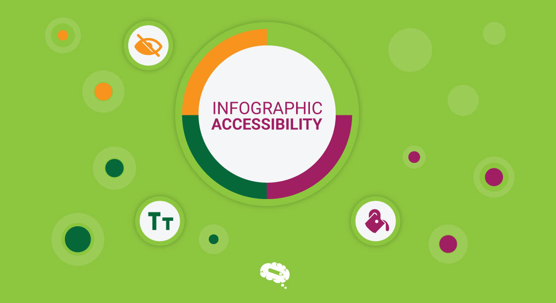


