
A blog post listed the “Common Infographic Mistakes When Transforming Data Into An Infographic”, with the 7 cardinal sins of this transformation. They are good advice for the majority of people, but some are immune to them.
Looking at this list, you can see that some of the items are not applicable to researchers, due tothe nature of their job in science and scientific publications. Four of them are not a real threat for scientists who are making infographics, but three of them are still good advice.
Here are the four most common infographic mistakes (not for scientists) and my comments. If you do not agree with something, feel free to comment.
1- Lack of references to your data sources
It seems that, in the mortal world, people do not cite references of the data. This is not exactly one of the infographic mistakes, but a true sin for a researcher. Poor people that don’t know Mendeley and sorts.
2- Using data sources of dubious authority
I know that the second thing that researchers do when reading something is check the reference, and they hate when a buzzfeed article does not show you where they got the information from or when it ends up been Wikipedia or a “The Sun” article.
Of course, standards in science are higher in this regard:
– What? The Impact Factor of the journal with this article is below 3? Oh come on!
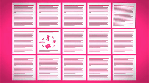
3- Your graphs are visually incorrect
When you read a scientific article, you go from the abstract to … introduction? Hell, no! You go to the figures and graphics, trying to find an error in standard error, a p with no value or a misinterpretation of any kind. That is what scientists do: they want to prove the statistics wrong. If they cannot find any problems, the work is good.
That said, we can be pretty sure that researchers don’t make mistakes like the one depicted above.
4- Visual exaggeration of statistics

As I said before, scientists jump from the abstract to figures and graphs, first to make sure of the statistics and then to sniff any bias.
Yes, people in science can smell a molecule of bias in a million particles of pie charts and trend lines. So don’t try to fool these people with stretched bars in test groups in your graphs. They know what they are doing and are less prone to commit that same mistake.
Now the 3 infographic mistakes that even scientists can make.
5- The structure of your infographic is confusing
Well, scientists are not designers, of course, and they are inclined to follow some standards that are present in the professional day-to-day life, such as reports, publications and presentations that may have some formal restrictions. If they have the liberty to make something different, such as an infographic, they have to be careful.
That is why you have the “Mind the Graph” tool – to help you with design.
Choosing a template is the same thing as designing an experiment: you have to know what you want to accomplish before you start.
Take a good look at Mind the Graph´s template categories and examples for any help.
6- You refer to too much data
I know you worked a lot and for you every single piece of your data is important, but are you sure that everything is interesting to everybody?
The nice thing of using an infographic is that they go straight to the point. If it gets too big, you don’t get the viewer’s attention. Don’t go beyond 8,000 pixels and don’t make it too heavy – 1.5MB is a good limit.
7- Your data is too complex or superficial

The important thing here is to know exactly who is going to consume that infographic: your peers, grad students or journalists? Each one of them have very different familiarities with the subject, so you have to adapt. What is the basic information that they must (and can) learn? Not too complex for a journalist and student, and not superficial for your colleagues.
Most important: don’t let your infographic fall in the limbo. That is the place where information goes when it is not new or complex enough for experts, and not comprehensible to the public. It happens when the information stays away, floating between the two publics, never touching anyone. That is why you will have to choose an audience, because it is virtually impossible to be interesting to peers and a layperson at the same time.


Subscribe to our newsletter
Exclusive high quality content about effective visual
communication in science.
