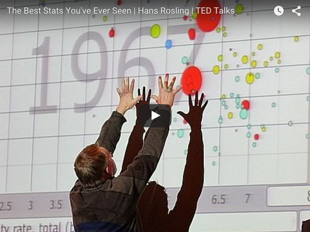
Hans Rosling is a researcher from the Karolinska Institute (Sweden) and founder of a startup company on information design and data visualization. The name of the company is GapMinder and they created a software called Trendalyzer.
It’s very very cool way to navigate through health statistics and understand it’s correlation with several other factors. Have you ever thought how health statistics correlate with GDP or available of electricity? With Trendalyzer you can. Plus, you do it for several countries independently and over time. It’s pretty cool and you can easily lose our looking at these health statistics.
The Trendalyzer software converts international statistics into moving, interactive graphics and in the video below you can watch his famous lecture at the TED talks. The Gapminder interactive animations are freely available in it’s website from the Foundation’s website.
Who is Hans Rosling? Rosling is a Swedish medical doctor, academic, statistician and public speaker. Professor of international health at Karolinska Institute, and founder of Gapminder, a nonprofit that brings vital global data to life. I just realize how it just resemble our own name, Mind the Graph.
In 2011 he was elected among the 100 most creative people in business by the Fast Company Magazine and one year later he entered the Swedish Academy of Sciences… the man is also a sword swallower. (WTF!) If you doubt, here is the proof.
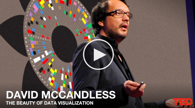
You can also present health statistics like the guru Hans Rosling using his presentation tool, Gapminder. Wanna play with health statistics and data visualization? Why not try the recent health statistics from World Health Organization. It’s a pretty reliable and dense source of information on health statistics.
It should be bigger and bigger over the years, as Google acquired the Trendalyzer software a few years ago with the intention to scale it up and make it freely available for public statistics. One year later they made available a Motion Chart Google Gadget and later on, the Public Data Explorer.

Subscribe to our newsletter
Exclusive high quality content about effective visual
communication in science.
